Wondering how your logo performs? 🧐
Get professional logo reviews in seconds and catch design issues in time.
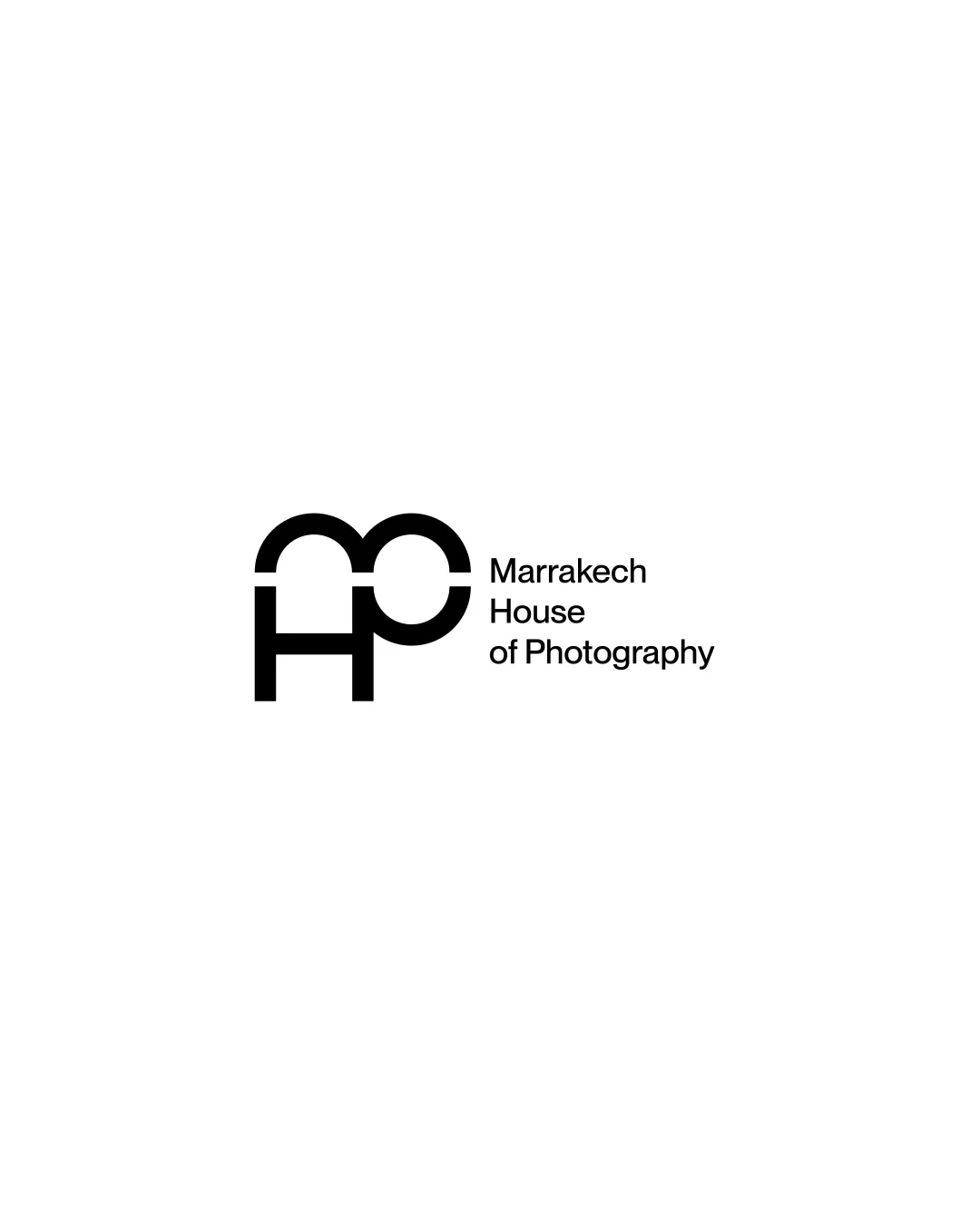
Try it Now!Logo review of Marrakech House of Photography
 Logo analysis by AI
Recognized style:
Logo type:
Detected symbol:
Detected text:
Business industry:
Review requested by Abderrazaq_gh
**If AI can recognize or misinterpret it, so can people.
Structured logo review
Legibility
![]() The text 'Marrakech House of Photography' is clear and readable.
The text 'Marrakech House of Photography' is clear and readable.
![]() The monogram 'MHP' might not be immediately recognizable.
The monogram 'MHP' might not be immediately recognizable.
Scalability versatility
![]() The simple black and white design ensures versatility across various mediums.
The simple black and white design ensures versatility across various mediums.
200x250 px
100×125 px
50×62 px
Balance alignment
![]() The monogram and the text are well-aligned creating a balanced composition.
The monogram and the text are well-aligned creating a balanced composition.
![]() The weight of the monogram might slightly overshadow the text.
The weight of the monogram might slightly overshadow the text.

Originality
![]() The monogram style adds a unique flair to the letters.
The monogram style adds a unique flair to the letters.
![]() Monograms with simple geometric shapes are relatively common.
Monograms with simple geometric shapes are relatively common.
Logomark wordmark fit
![]() The monogram and text complement each other nicely.
The monogram and text complement each other nicely.
![]() The monogram appears somewhat dominant compared to the text.
The monogram appears somewhat dominant compared to the text.
Aesthetic look
![]() The logo looks clean and professional.
The logo looks clean and professional.
Cultural sensitivity dual meaning
![]() No cultural sensitivity issues detected.
No cultural sensitivity issues detected.
Color harmony
![]() The black and white color scheme is classic and professional.
The black and white color scheme is classic and professional.