Wondering how your logo performs? 🧐
Get professional logo reviews in seconds and catch design issues in time.
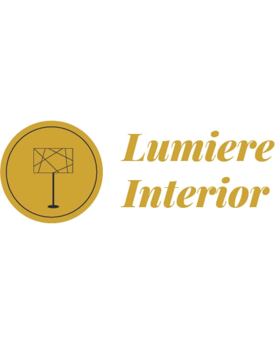
Try it Now!Logo review of Lumiere Interior
 Logo analysis by AI
Logo type:
Style:
Detected symbol:
Detected text:
Business industry:
Review requested by Daniaadil
**If AI can recognize or misinterpret it, so can people.
Structured logo review
Legibility
![]() Text is readable and clear even at a distance.
Text is readable and clear even at a distance.![]() Font choice offers a sense of elegance suitable for interior design.
Font choice offers a sense of elegance suitable for interior design.
![]() Slightly ornate typeface may reduce clarity at very small scales.
Slightly ornate typeface may reduce clarity at very small scales.![]() Italic styling may not translate well across all mediums.
Italic styling may not translate well across all mediums.
Scalability versatility
![]() Simple geometry makes the logo somewhat scalable.
Simple geometry makes the logo somewhat scalable.![]() Works for applications such as web, print, and signage.
Works for applications such as web, print, and signage.
![]() Fine lines in the lamp symbol risk being lost at small sizes (favicons, embroidery).
Fine lines in the lamp symbol risk being lost at small sizes (favicons, embroidery).![]() Circle mark may become visually heavy compared to delicate text when scaled down.
Circle mark may become visually heavy compared to delicate text when scaled down.
200x250 px
100×125 px
50×62 px
Balance alignment
![]() Visual weight of gold circle somewhat balances with the double-line italic text.
Visual weight of gold circle somewhat balances with the double-line italic text.
![]() Logo feels split: heavy icon on one side and light, airy text on the other.
Logo feels split: heavy icon on one side and light, airy text on the other.![]() Alignment between symbol and text could be improved—icon feels disconnected.
Alignment between symbol and text could be improved—icon feels disconnected.

Originality
![]() Geometric lamp with abstract lines adds some uniqueness.
Geometric lamp with abstract lines adds some uniqueness.
![]() Circular badge is generic among interior logos.
Circular badge is generic among interior logos.![]() Lamp symbol—while abstract—remains a common trope in the industry.
Lamp symbol—while abstract—remains a common trope in the industry.
Logomark wordmark fit
![]() Both mark and wordmark use a similar gold tone which aids cohesion.
Both mark and wordmark use a similar gold tone which aids cohesion.
![]() Contrasting geometry of symbol and ornate script type do not visually harmonize.
Contrasting geometry of symbol and ornate script type do not visually harmonize.![]() Mark feels static and modern; type is dynamic and classical.
Mark feels static and modern; type is dynamic and classical.
Aesthetic look
![]() Professional gold palette enhances perceived quality.
Professional gold palette enhances perceived quality.![]() Minimalistic lines prevent clutter.
Minimalistic lines prevent clutter.
![]() Mixing modern geometric mark with a classic script typeface creates visual dissonance.
Mixing modern geometric mark with a classic script typeface creates visual dissonance.![]() Overall look not highly distinctive for the industry.
Overall look not highly distinctive for the industry.
Dual meaning and misinterpretations
![]() No inappropriate or confusing dual meanings detected.
No inappropriate or confusing dual meanings detected.
Color harmony
![]() Relatively limited and harmonious color palette provides elegance.
Relatively limited and harmonious color palette provides elegance.![]() Good contrast between gold, white, and black.
Good contrast between gold, white, and black.
![]() Monotone gold/black scheme could appear flat in some applications.
Monotone gold/black scheme could appear flat in some applications.
Gold
#B7992E
White
#FFFFFF
Black
#000000