Wondering how your logo performs? 🧐
Get professional logo reviews in seconds and catch design issues in time.
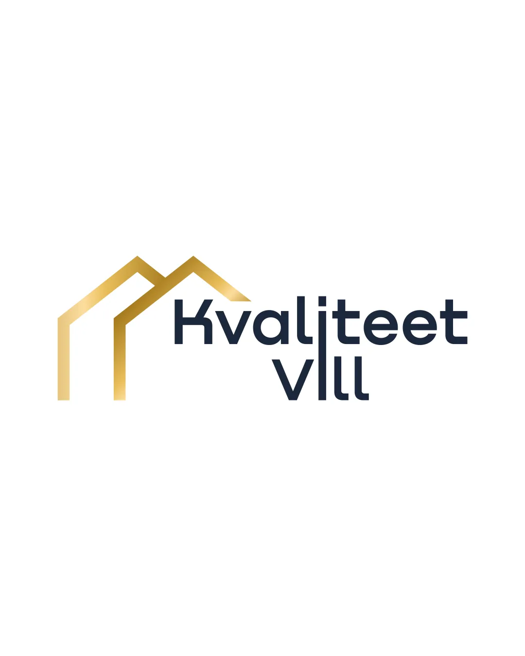
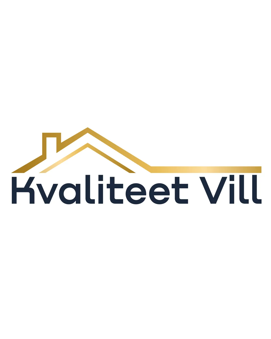
Try it Now!Logo review of Kvaliteet Vill
 Logo analysis by AI
Logo type:
Style:
Detected symbol:
Detected text:
Business industry:
Review requested by Bunbun
**If AI can recognize or misinterpret it, so can people.
Structured logo review
Legibility
![]() Text is extremely clear and legible due to clean sans-serif font.
Text is extremely clear and legible due to clean sans-serif font.![]() High contrast between background and text enhances readability.
High contrast between background and text enhances readability.
Scalability versatility
![]() Logo remains recognizable at smaller sizes.
Logo remains recognizable at smaller sizes.![]() Strong simple lines work across print and digital formats.
Strong simple lines work across print and digital formats.
![]() Gold gradient effect may be lost in embroidery or small printing applications.
Gold gradient effect may be lost in embroidery or small printing applications.![]() Very thin roofline details might blur in extremely small or low-resolution outputs.
Very thin roofline details might blur in extremely small or low-resolution outputs.
200x250 px
100×125 px
50×62 px
Balance alignment
![]() Roof symbol is well-positioned above the type, creating a clear visual hierarchy.
Roof symbol is well-positioned above the type, creating a clear visual hierarchy.![]() Horizontal line extends to align with the end of the text, providing a sense of balance.
Horizontal line extends to align with the end of the text, providing a sense of balance.
![]() The roofline extension is much longer on the right, making the left feel slightly heavier due to the chimney, causing minor visual imbalance.
The roofline extension is much longer on the right, making the left feel slightly heavier due to the chimney, causing minor visual imbalance.

Originality
![]() Clean execution of a house-roof motif.
Clean execution of a house-roof motif.![]() Professional look for real estate.
Professional look for real estate.
![]() House roofline is a generic real estate trope seen in countless industry logos.
House roofline is a generic real estate trope seen in countless industry logos.![]() No unique or ownable elements to set the brand apart.
No unique or ownable elements to set the brand apart.
Logomark wordmark fit
![]() Roofline and text have matching weights, ensuring cohesion.
Roofline and text have matching weights, ensuring cohesion.![]() Simple geometric lines complement sans-serif typeface.
Simple geometric lines complement sans-serif typeface.
![]() Detached placement of the roofline could be better integrated for unity.
Detached placement of the roofline could be better integrated for unity.
Aesthetic look
![]() Professional and polished appearance.
Professional and polished appearance.![]() Limited color palette adds to upscale aesthetic.
Limited color palette adds to upscale aesthetic.
![]() Uninspired motif makes it visually indistinct among competitors.
Uninspired motif makes it visually indistinct among competitors.
Dual meaning and misinterpretations
![]() No problematic or inappropriate visual associations detected.
No problematic or inappropriate visual associations detected.![]() Clear communication of home/building concept.
Clear communication of home/building concept.
Color harmony
![]() Gold and dark blue are complementary and suggest prestige/trust.
Gold and dark blue are complementary and suggest prestige/trust.![]() Gradient is tastefully applied, not busy.
Gradient is tastefully applied, not busy.
Gold
#C6A047
Dark Blue
#22283B
White
#FFFFFF