Wondering how your logo performs? 🧐
Get professional logo reviews in seconds and catch design issues in time.
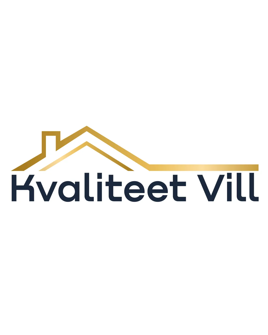
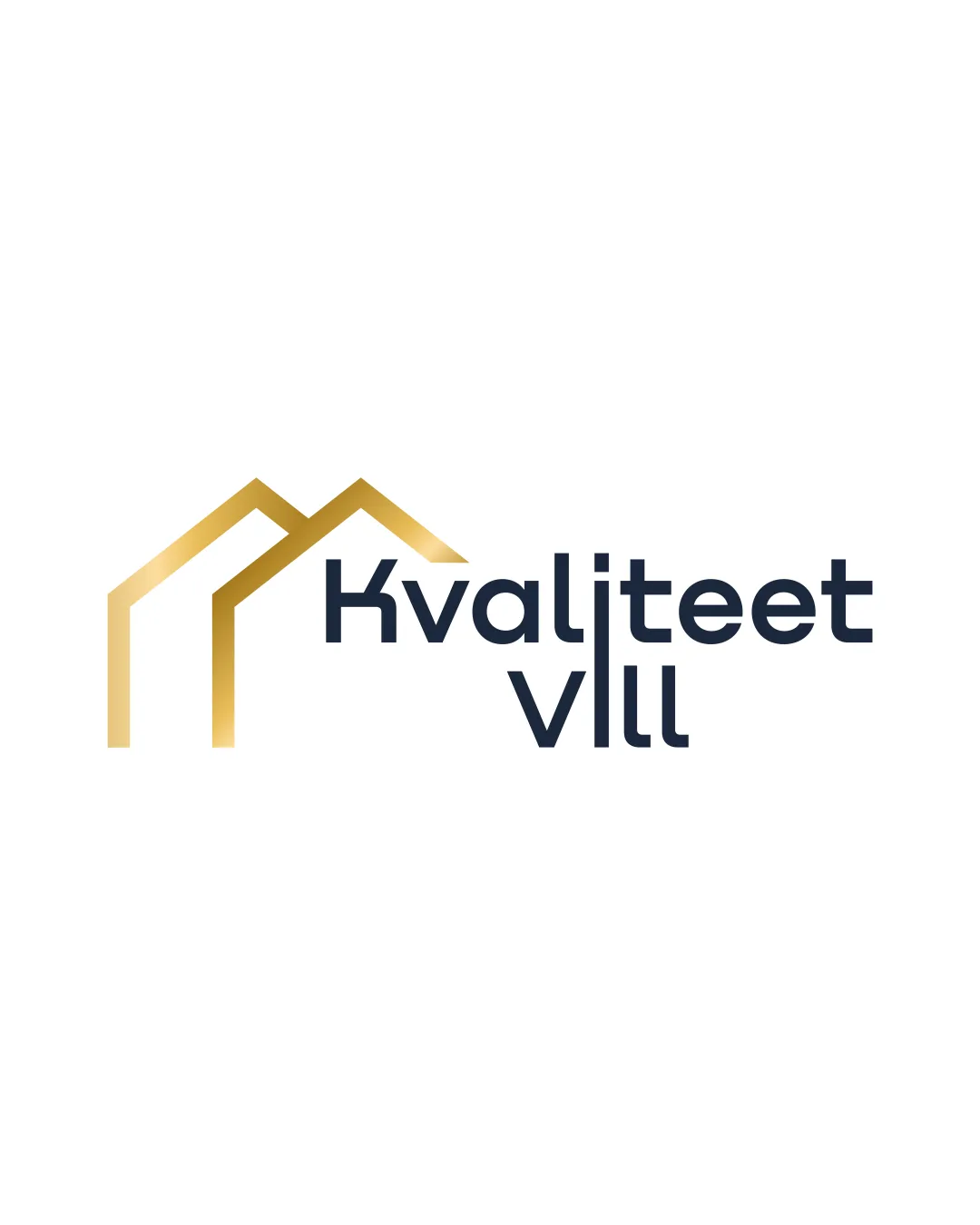
Try it Now!Logo review of Kvaliteet VIII
 Logo analysis by AI
Logo type:
Style:
Detected symbol:
Detected text:
Business industry:
Review requested by Bunbun
**If AI can recognize or misinterpret it, so can people.
Structured logo review
Legibility
![]() Typography is clear and easy to read.
Typography is clear and easy to read.![]() Good contrast between text and background.
Good contrast between text and background.
Scalability versatility
![]() Simple iconography ensures clarity at smaller sizes.
Simple iconography ensures clarity at smaller sizes.![]() Would work well on business cards, mobile apps, and billboards.
Would work well on business cards, mobile apps, and billboards.
![]() Gradient in the gold roofs may not reproduce well in small or single-color applications, such as embroidery or black-and-white prints.
Gradient in the gold roofs may not reproduce well in small or single-color applications, such as embroidery or black-and-white prints.
200x250 px
100×125 px
50×62 px
Balance alignment
![]() Decent alignment between the symbol and wordmark.
Decent alignment between the symbol and wordmark.![]() Visual weight is generally well distributed.
Visual weight is generally well distributed.
![]() Slight imbalance as the icon feels slightly detached or disconnected from the wordmark due to spacing; text placement could be tighter or more integrated with the symbol.
Slight imbalance as the icon feels slightly detached or disconnected from the wordmark due to spacing; text placement could be tighter or more integrated with the symbol.

Originality
![]() Double roof element provides a hint of uniqueness.
Double roof element provides a hint of uniqueness.![]() Modern typeface complements the geometric icon.
Modern typeface complements the geometric icon.
![]() Roof motif is overused in real estate branding and lacks strong distinctiveness.
Roof motif is overused in real estate branding and lacks strong distinctiveness.![]() No creative twist in combining symbol and text.
No creative twist in combining symbol and text.
Logomark wordmark fit
![]() Style harmony between geometric logomark and modern sans-serif wordmark.
Style harmony between geometric logomark and modern sans-serif wordmark.![]() Both elements share a contemporary visual language.
Both elements share a contemporary visual language.
![]() Spatial separation can make the relationship between mark and text feel less cohesive.
Spatial separation can make the relationship between mark and text feel less cohesive.
Aesthetic look
![]() Sleek and clean modern look.
Sleek and clean modern look.![]() Color palette is premium and appealing for the industry.
Color palette is premium and appealing for the industry.
![]() Aesthetic could be elevated further with a more creative or unique icon.
Aesthetic could be elevated further with a more creative or unique icon.
Dual meaning and misinterpretations
![]() No inappropriate dual meanings detected.
No inappropriate dual meanings detected.![]() Shapes are easily interpreted as roof structures.
Shapes are easily interpreted as roof structures.
Color harmony
![]() Limited, harmonious color palette.
Limited, harmonious color palette.![]() Gold gradient and dark blue create a premium, professional look.
Gold gradient and dark blue create a premium, professional look.
Teak
#B7996E
BigStone
#202735
White
#FFFFFF