Wondering how your logo performs? 🧐
Get professional logo reviews in seconds and catch design issues in time.
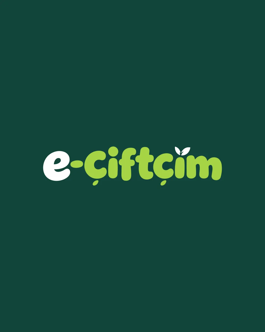
Try it Now!Logo review of e-çiftçim
 Logo analysis by AI
Logo type:
Style:
Detected symbol:
Detected text:
Business industry:
Review requested by Fth
**If AI can recognize or misinterpret it, so can people.
Structured logo review
Legibility
![]() Text is clear and sufficiently spaced.
Text is clear and sufficiently spaced.![]() Distinct contrast between white and green elements.
Distinct contrast between white and green elements.
![]() The rounded, chunky font may reduce clarity at very small sizes, especially for the dotless 'i' and 'ç', which could blend.
The rounded, chunky font may reduce clarity at very small sizes, especially for the dotless 'i' and 'ç', which could blend.![]() Some diacritical marks, such as the cedilla and the leaf, may become unclear at thumbnail size.
Some diacritical marks, such as the cedilla and the leaf, may become unclear at thumbnail size.
Scalability versatility
![]() Simple forms enhance clarity at medium-to-large sizes (e.g., website headers, packaging).
Simple forms enhance clarity at medium-to-large sizes (e.g., website headers, packaging).![]() Limited colors help keep reproduction straightforward.
Limited colors help keep reproduction straightforward.
![]() Details like the leaf and diacritical marks may get lost in small applications such as favicons or pens.
Details like the leaf and diacritical marks may get lost in small applications such as favicons or pens.![]() Chunky letterforms may not embroider cleanly or work well in extremely compact spaces.
Chunky letterforms may not embroider cleanly or work well in extremely compact spaces.
200x250 px
100×125 px
50×62 px
Balance alignment
![]() Wordmark feels visually balanced with even weight distribution.
Wordmark feels visually balanced with even weight distribution.![]() Leaf motif above 'i' is playful but not disruptive to overall flow.
Leaf motif above 'i' is playful but not disruptive to overall flow.

Originality
![]() Leaf detail integrates agricultural message subtly.
Leaf detail integrates agricultural message subtly.![]() Soft, playful letter shapes add distinctiveness.
Soft, playful letter shapes add distinctiveness.
![]() Leaf as an agriculture cue is somewhat common and does not feel highly unique.
Leaf as an agriculture cue is somewhat common and does not feel highly unique.
Aesthetic look
![]() Color palette is fresh and harmonious, conveying eco-friendliness.
Color palette is fresh and harmonious, conveying eco-friendliness.![]() Overall design is visually appealing and approachable.
Overall design is visually appealing and approachable.
![]() The playful style may limit appeal for more serious or B2B agricultural brands.
The playful style may limit appeal for more serious or B2B agricultural brands.![]() Could be perceived as targeted only toward a youthful or casual audience.
Could be perceived as targeted only toward a youthful or casual audience.
Dual meaning and misinterpretations
![]() No inappropriate or unintended double meanings detected.
No inappropriate or unintended double meanings detected.![]() All motifs feel wholesome and relevant to the sector.
All motifs feel wholesome and relevant to the sector.
Color harmony
![]() Excellent use of a limited, nature-inspired palette.
Excellent use of a limited, nature-inspired palette.![]() Strong contrast provides legibility.
Strong contrast provides legibility.
White
#FFFFFF
Conifer
#A2D96D
Eden
#194F43