Wondering how your logo performs? 🧐
Get professional logo reviews in seconds and catch design issues in time.
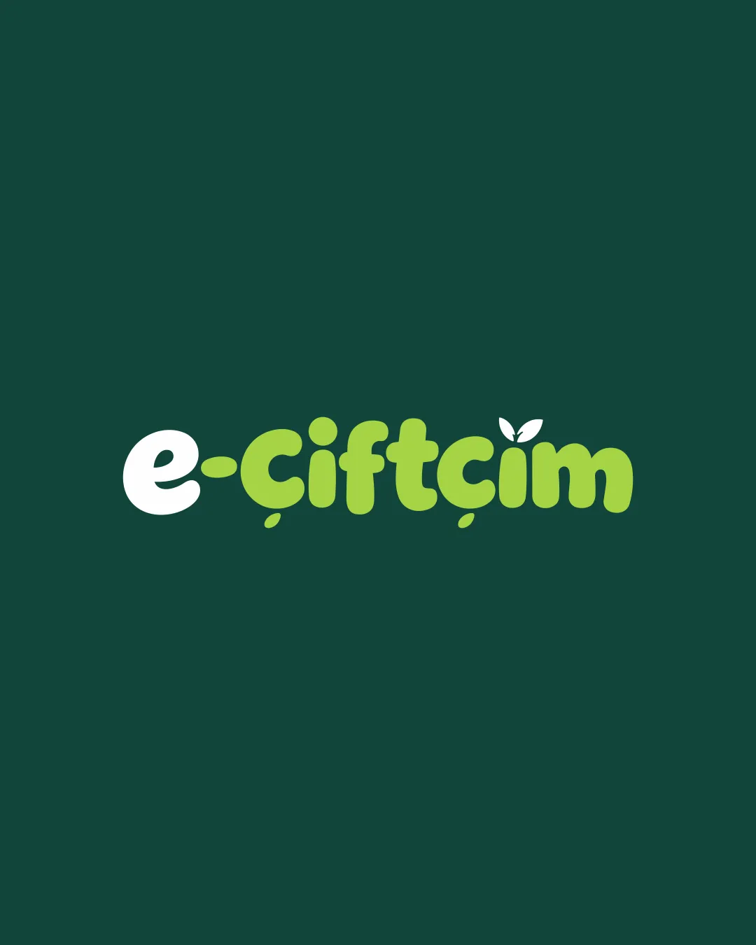
Try it Now!Logo review of e-çiftçim

 Logo analysis by AI
Logo type:
Style:
Detected symbol:
Negative space:
Detected text:
Business industry:
Review requested by Fth
**If AI can recognize or misinterpret it, so can people.
Structured logo review
Legibility
![]() Text is bold and highly readable even at smaller sizes.
Text is bold and highly readable even at smaller sizes.![]() Contrast between dark green and orange colors ensures clarity.
Contrast between dark green and orange colors ensures clarity.
Scalability versatility
![]() Logo uses solid shapes and bold lines, which scale well to small applications like business cards and social media icons.
Logo uses solid shapes and bold lines, which scale well to small applications like business cards and social media icons.![]() Simple form is easy to reproduce on signage and embroidery.
Simple form is easy to reproduce on signage and embroidery.
![]() Details such as the small leaf accents may lose clarity at extremely small sizes.
Details such as the small leaf accents may lose clarity at extremely small sizes.
200x250 px
100×125 px
50×62 px
Balance alignment
![]() Overall alignment between the symbol and wordmark is solid.
Overall alignment between the symbol and wordmark is solid.![]() The visual weight is distributed evenly with no awkward gaps.
The visual weight is distributed evenly with no awkward gaps.
![]() The orange 'e' may visually dominate due to color contrast compared to the rest of the wordmark.
The orange 'e' may visually dominate due to color contrast compared to the rest of the wordmark.

Originality
![]() Smart integration of leaf shapes for agricultural relevance.
Smart integration of leaf shapes for agricultural relevance.![]() Unique use of a circular 'e' as both symbol and letter.
Unique use of a circular 'e' as both symbol and letter.
![]() Leaf accents are somewhat common in agricultural branding.
Leaf accents are somewhat common in agricultural branding.![]() Minimal abstraction in the logomark limits uniqueness.
Minimal abstraction in the logomark limits uniqueness.
Logomark wordmark fit
![]() The style and thickness of the logomark matches the wordmark.
The style and thickness of the logomark matches the wordmark.![]() Consistent use of orange and green ties both parts together.
Consistent use of orange and green ties both parts together.
![]() The 'e' logomark’s different color may pull too much focus away from the rest of the logo.
The 'e' logomark’s different color may pull too much focus away from the rest of the logo.
Aesthetic look
![]() Clean, modern aesthetic with harmonious typography.
Clean, modern aesthetic with harmonious typography.![]() Balanced color palette appropriate for agriculture.
Balanced color palette appropriate for agriculture.
Dual meaning and misinterpretations
![]() No inappropriate or accidental visual references detected.
No inappropriate or accidental visual references detected.![]() Symbol is clearly agricultural and easily understood.
Symbol is clearly agricultural and easily understood.
Color harmony
![]() Balanced use of two harmonious colors suiting the brand context.
Balanced use of two harmonious colors suiting the brand context.![]() Good contrast, not overwhelming or visually busy.
Good contrast, not overwhelming or visually busy.
California
#FBAC32
Evergreen
#124734