Wondering how your logo performs? 🧐
Get professional logo reviews in seconds and catch design issues in time.
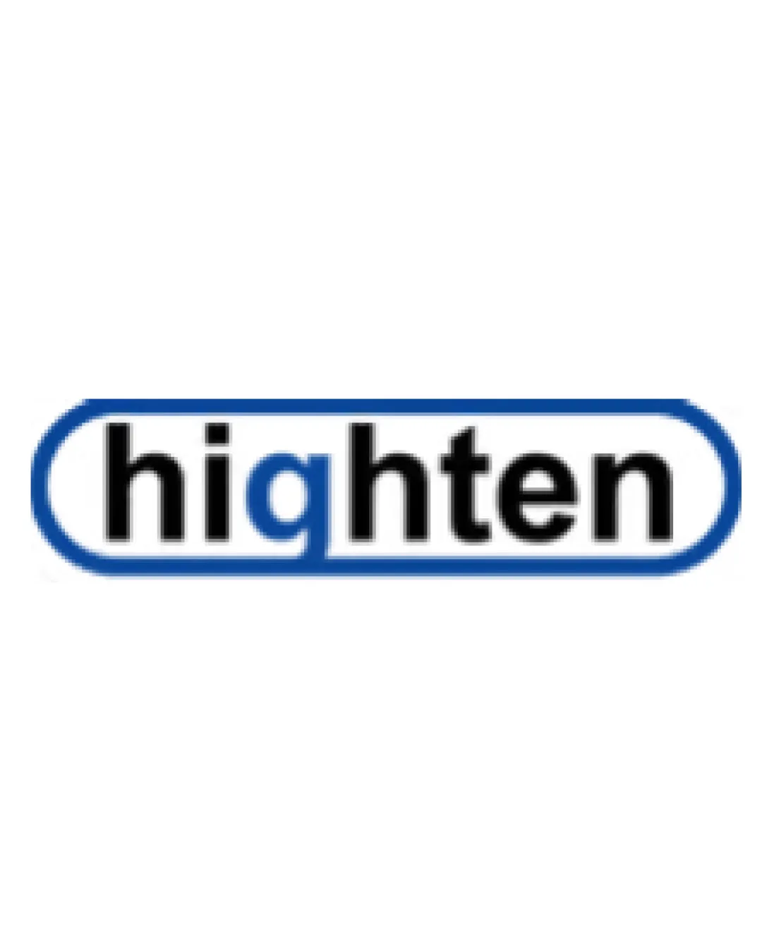
Try it Now!Logo review of highten
 Logo analysis by AI
Logo type:
Style:
Detected symbol:
Detected text:
Business industry:
Review requested by Zahrah_maniar
**If AI can recognize or misinterpret it, so can people.
Structured logo review
Legibility
![]() Text is clear and easy to read.
Text is clear and easy to read.![]() 'g' character is distinct, all letters have good space between them.
'g' character is distinct, all letters have good space between them.
![]() Subtle merging of 'g' with the enclosure line may hinder legibility at smaller sizes. Slight blur on the edges may reduce clarity in tiny formats.
Subtle merging of 'g' with the enclosure line may hinder legibility at smaller sizes. Slight blur on the edges may reduce clarity in tiny formats.
Scalability versatility
![]() Simple design should scale decently for web, business cards, and signage.
Simple design should scale decently for web, business cards, and signage.![]() Can work in black-and-white versions due to minimal color usage.
Can work in black-and-white versions due to minimal color usage.
![]() Line thickness of enclosure could become difficult to see when scaled down for app icons or small merchandise.
Line thickness of enclosure could become difficult to see when scaled down for app icons or small merchandise.![]() Slight complexity with the lower section of the rounded rectangle complicates very small usages.
Slight complexity with the lower section of the rounded rectangle complicates very small usages.
200x250 px
100×125 px
50×62 px
Balance alignment
![]() Centered text within the enclosure maintains overall visual balance.
Centered text within the enclosure maintains overall visual balance.![]() Consistent margin between text and blue border.
Consistent margin between text and blue border.
![]() The descending 'g' interrupts the lower line of the enclosure, creating a minor alignment imbalance that draws unnecessary attention.
The descending 'g' interrupts the lower line of the enclosure, creating a minor alignment imbalance that draws unnecessary attention.

Originality
![]() Basic integration of the enclosure with text gives the logo minimal distinction.
Basic integration of the enclosure with text gives the logo minimal distinction.
![]() Rounded rectangle wordmark is highly generic and visually similar to established technology hardware brands.
Rounded rectangle wordmark is highly generic and visually similar to established technology hardware brands.![]() No unique letter treatments or graphic elements that set it apart.
No unique letter treatments or graphic elements that set it apart.
Aesthetic look
![]() Clean and modern sans-serif conveys professionalism.
Clean and modern sans-serif conveys professionalism.![]() Color choice is simple and not overwhelming.
Color choice is simple and not overwhelming.
![]() Overall look is unremarkable and lacks visual impact.
Overall look is unremarkable and lacks visual impact.![]() Feels utilitarian rather than inviting or memorable.
Feels utilitarian rather than inviting or memorable.
Dual meaning and misinterpretations
![]() No inappropriate symbols or accidental connotations present.
No inappropriate symbols or accidental connotations present.
Color harmony
![]() Good contrast between blue, black, and white.
Good contrast between blue, black, and white.![]() Limited palette avoids visual clutter.
Limited palette avoids visual clutter.
![]() Nondescript blue shade doesn't provide any emotional resonance or strong brand personality.
Nondescript blue shade doesn't provide any emotional resonance or strong brand personality.
Black
#000000
Blue
#2161AA
White
#FFFFFF