Wondering how your logo performs? 🧐
Get professional logo reviews in seconds and catch design issues in time.
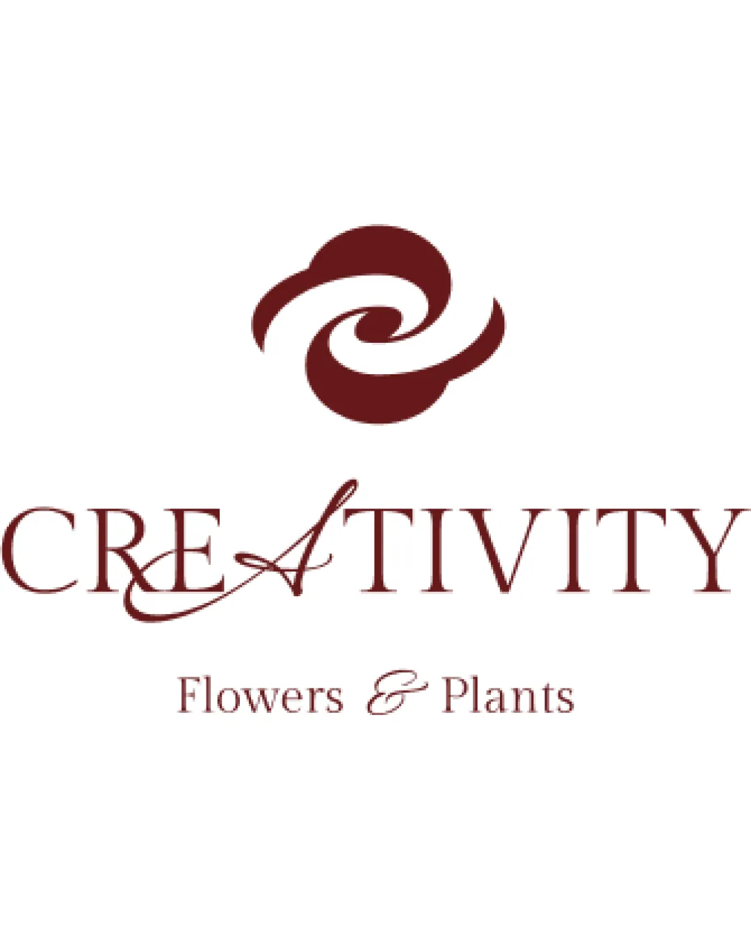
Try it Now!Logo review of CREATIVITY Flowers & Plants
 Logo analysis by AI
Logo type:
Style:
Detected symbol:
Detected text:
Business industry:
Review requested by Akuma8Tenshi
**If AI can recognize or misinterpret it, so can people.
Structured logo review
Legibility
![]() Main text is generally readable.
Main text is generally readable.![]() Serif style adds sophistication appropriate for a floral brand.
Serif style adds sophistication appropriate for a floral brand.
![]() Swash on the 'A' in 'CREATIVITY' reduces clarity and competes visually with the surrounding letters.
Swash on the 'A' in 'CREATIVITY' reduces clarity and competes visually with the surrounding letters.![]() Mix of standard and decorative script in body text detracts from immediate legibility.
Mix of standard and decorative script in body text detracts from immediate legibility.
Scalability versatility
![]() Simple color palette aids in single-color adaptability.
Simple color palette aids in single-color adaptability.![]() Symbol is recognizable at midsize usages (e.g., business cards).
Symbol is recognizable at midsize usages (e.g., business cards).
![]() Fine decorative lines in the swashed 'A' and script ampersand will likely disappear at small sizes.
Fine decorative lines in the swashed 'A' and script ampersand will likely disappear at small sizes.![]() Complexity may impact clarity on embroidery or in minimal icons.
Complexity may impact clarity on embroidery or in minimal icons.![]() Not ideal for favicon or mobile app icon use; loses detail.
Not ideal for favicon or mobile app icon use; loses detail.
200x250 px
100×125 px
50×62 px
Balance alignment
![]() Logo mark is centered over the wordmark, creating formal hierarchy.
Logo mark is centered over the wordmark, creating formal hierarchy.
![]() Swash from the 'A' disrupts visual alignment across the wordmark, making the left side heavier.
Swash from the 'A' disrupts visual alignment across the wordmark, making the left side heavier.![]() Upper and lower text lack cohesive visual flow, with the ampersand differing stylistically.
Upper and lower text lack cohesive visual flow, with the ampersand differing stylistically.

Originality
![]() Custom swirling mark hints at florals in an abstract way; semi-distinctive.
Custom swirling mark hints at florals in an abstract way; semi-distinctive.
![]() Swirl-flower motifs are common in floral branding.
Swirl-flower motifs are common in floral branding.![]() Swash usage and script ampersand are generic for this industry, lacking a fresh creative twist.
Swash usage and script ampersand are generic for this industry, lacking a fresh creative twist.
Logomark wordmark fit
![]() Both logomark and wordmark share similar color schemes.
Both logomark and wordmark share similar color schemes.
![]() The abstract motif is highly stylized while the wordmark is more literal; this mismatch weakens brand cohesion.
The abstract motif is highly stylized while the wordmark is more literal; this mismatch weakens brand cohesion.![]() Mark's curves are not echoed by the majority of letterforms.
Mark's curves are not echoed by the majority of letterforms.
Aesthetic look
![]() Color is refined and relevant for florals.
Color is refined and relevant for florals.![]() Serif font adds elegance desired for a flower shop.
Serif font adds elegance desired for a flower shop.
![]() Decorative flourishes verge on cluttered, risking a busy feel.
Decorative flourishes verge on cluttered, risking a busy feel.![]() The use of different font styles decreases overall harmony.
The use of different font styles decreases overall harmony.
Dual meaning and misinterpretations
![]() Abstract mark clearly reads as floral; no inappropriate symbolism detected.
Abstract mark clearly reads as floral; no inappropriate symbolism detected.
Color harmony
![]() Monotone approach ensures strong harmony.
Monotone approach ensures strong harmony.![]() Color feels organic and structure-appropriate.
Color feels organic and structure-appropriate.
![]() Single color might be too subdued to stand out in competitive retail contexts.
Single color might be too subdued to stand out in competitive retail contexts.
Crimson
#601F1D