Wondering how your logo performs? 🧐
Get professional logo reviews in seconds and catch design issues in time.
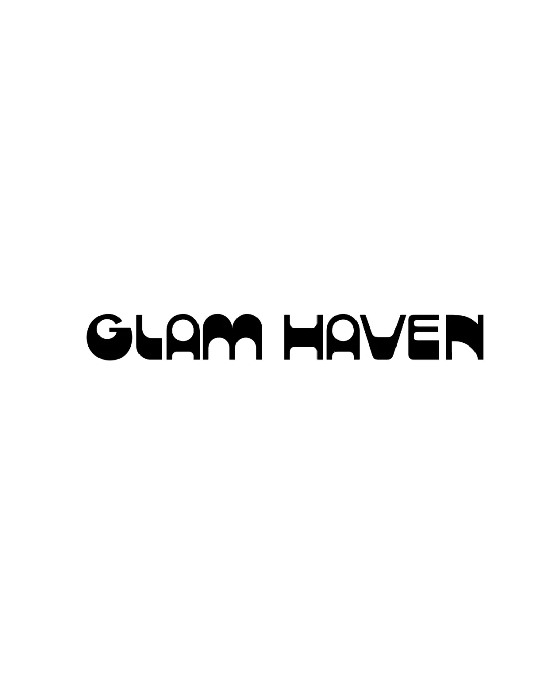
Try it Now!Logo review of GLAM HAVEN
 Logo analysis by AI
Logo type:
Style:
Detected text:
Business industry:
Review requested by Mara_aa_
**If AI can recognize or misinterpret it, so can people.
Structured logo review
Legibility
![]() Consistent thickness and geometric character create a recognizable aesthetic.
Consistent thickness and geometric character create a recognizable aesthetic.
![]() Letterforms are overly stylized, making some characters (G, L, H, V, E) hard to distinguish at a glance.
Letterforms are overly stylized, making some characters (G, L, H, V, E) hard to distinguish at a glance.![]() Letter spacing is irregular, which further reduces quick readability.
Letter spacing is irregular, which further reduces quick readability.![]() Low readability at smaller sizes or from a distance.
Low readability at smaller sizes or from a distance.
Scalability versatility
![]() Bold forms ensure the logo remains visible at larger sizes (e.g., store signage, billboards).
Bold forms ensure the logo remains visible at larger sizes (e.g., store signage, billboards).
![]() Excessive stylization and geometric detail may not translate well to smaller applications like website favicons or business cards.
Excessive stylization and geometric detail may not translate well to smaller applications like website favicons or business cards.![]() May lose legibility in embroidery or small merchandise due to thin counter spaces within some letters.
May lose legibility in embroidery or small merchandise due to thin counter spaces within some letters.
200x250 px
100×125 px
50×62 px
Balance alignment
![]() Overall structure is centered with a reasonable horizontal balance between the two words.
Overall structure is centered with a reasonable horizontal balance between the two words.
![]() The visual weight fluctuates between letters, especially with G and H being heavier, causing slight optical imbalance.
The visual weight fluctuates between letters, especially with G and H being heavier, causing slight optical imbalance.![]() Mixed geometric treatments result in inconsistent rhythm.
Mixed geometric treatments result in inconsistent rhythm.

Originality
![]() Custom, geometric letterforms give a distinct and memorable character.
Custom, geometric letterforms give a distinct and memorable character.![]() The playfulness of the typography indicates a unique attempt to differentiate from typical beauty or glam brands.
The playfulness of the typography indicates a unique attempt to differentiate from typical beauty or glam brands.
![]() Despite custom elements, the geometric/retro wordmark aesthetic is trending and not entirely original in this sector.
Despite custom elements, the geometric/retro wordmark aesthetic is trending and not entirely original in this sector.
Aesthetic look
![]() The logo has a striking, fashionable presence.
The logo has a striking, fashionable presence.![]() Bold geometric style aligns with 'glam' positioning.
Bold geometric style aligns with 'glam' positioning.
![]() Aesthetic is subjective and could polarize; some may find the letter style forced or dated.
Aesthetic is subjective and could polarize; some may find the letter style forced or dated.![]() Not universally appealing for a wide audience.
Not universally appealing for a wide audience.
Dual meaning and misinterpretations
![]() No inappropriate symbols or unintended imagery were detected in the composition.
No inappropriate symbols or unintended imagery were detected in the composition.
Color harmony
![]() Simple black and white palette is timeless and versatile.
Simple black and white palette is timeless and versatile.![]() No risk of color clashing or overuse.
No risk of color clashing or overuse.
Black
#000000
White
#FFFFFF