Wondering how your logo performs? 🧐
Get professional logo reviews in seconds and catch design issues in time.
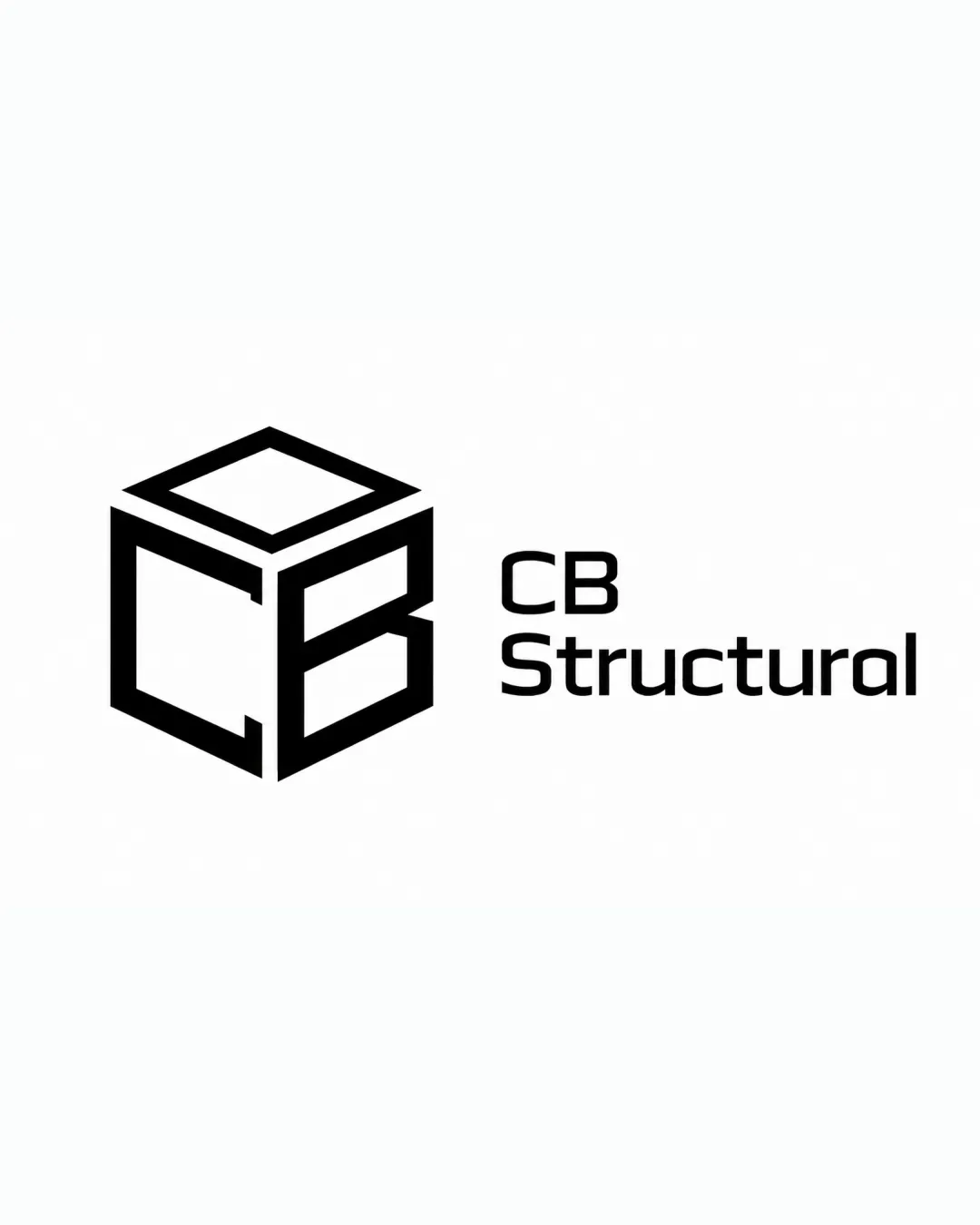
Try it Now!Logo review of CB Structural
 Logo analysis by AI
Logo type:
Style:
Detected symbol:
Negative space:
Detected text:
Business industry:
Review requested by Burrrty
**If AI can recognize or misinterpret it, so can people.
Structured logo review
Legibility
![]() Text is clean, simple, and highly legible in all caps.
Text is clean, simple, and highly legible in all caps.![]() Contrasting color ensures strong visibility on most backgrounds.
Contrasting color ensures strong visibility on most backgrounds.
Scalability versatility
![]() Bold, geometric lines ensure the logo is visible at small sizes.
Bold, geometric lines ensure the logo is visible at small sizes.![]() Logo would perform well on business cards, construction signage, and digital platforms.
Logo would perform well on business cards, construction signage, and digital platforms.
![]() Very thin lines and open geometric shapes may lose some clarity at extremely small sizes such as favicons or embroidery.
Very thin lines and open geometric shapes may lose some clarity at extremely small sizes such as favicons or embroidery.
200x250 px
100×125 px
50×62 px
Balance alignment
![]() Excellent visual balance between the mark and the wordmark.
Excellent visual balance between the mark and the wordmark.![]() Logo and text are aligned in a way that feels stable and grounded.
Logo and text are aligned in a way that feels stable and grounded.

Originality
![]() Creative use of negative space to form both a cube and the CB monogram.
Creative use of negative space to form both a cube and the CB monogram.![]() Distinct, memorable geometric structure.
Distinct, memorable geometric structure.
![]() Geometric cube-based monograms are seen frequently in construction/architecture industries, slightly reducing uniqueness.
Geometric cube-based monograms are seen frequently in construction/architecture industries, slightly reducing uniqueness.
Logomark wordmark fit
![]() Stylistic coherence between the geometric logomark and modern, sans-serif wordmark.
Stylistic coherence between the geometric logomark and modern, sans-serif wordmark.![]() Proportions are suitable for both digital and print applications.
Proportions are suitable for both digital and print applications.
Aesthetic look
![]() Minimalist and modern style is visually pleasing and professional.
Minimalist and modern style is visually pleasing and professional.![]() Monochrome palette feels sophisticated and focused.
Monochrome palette feels sophisticated and focused.
![]() Might feel a bit cold or corporate; lacks warmth or human touch.
Might feel a bit cold or corporate; lacks warmth or human touch.
Dual meaning and misinterpretations
![]() No risky or inappropriate interpretations in the mark.
No risky or inappropriate interpretations in the mark.
Color harmony
![]() Monochrome scheme achieves maximum clarity and timelessness.
Monochrome scheme achieves maximum clarity and timelessness.![]() No color clash—black on white/transparent is universally versatile.
No color clash—black on white/transparent is universally versatile.
Black
#000000
White
#FFFFFF