Wondering how your logo performs? 🧐
Get professional logo reviews in seconds and catch design issues in time.
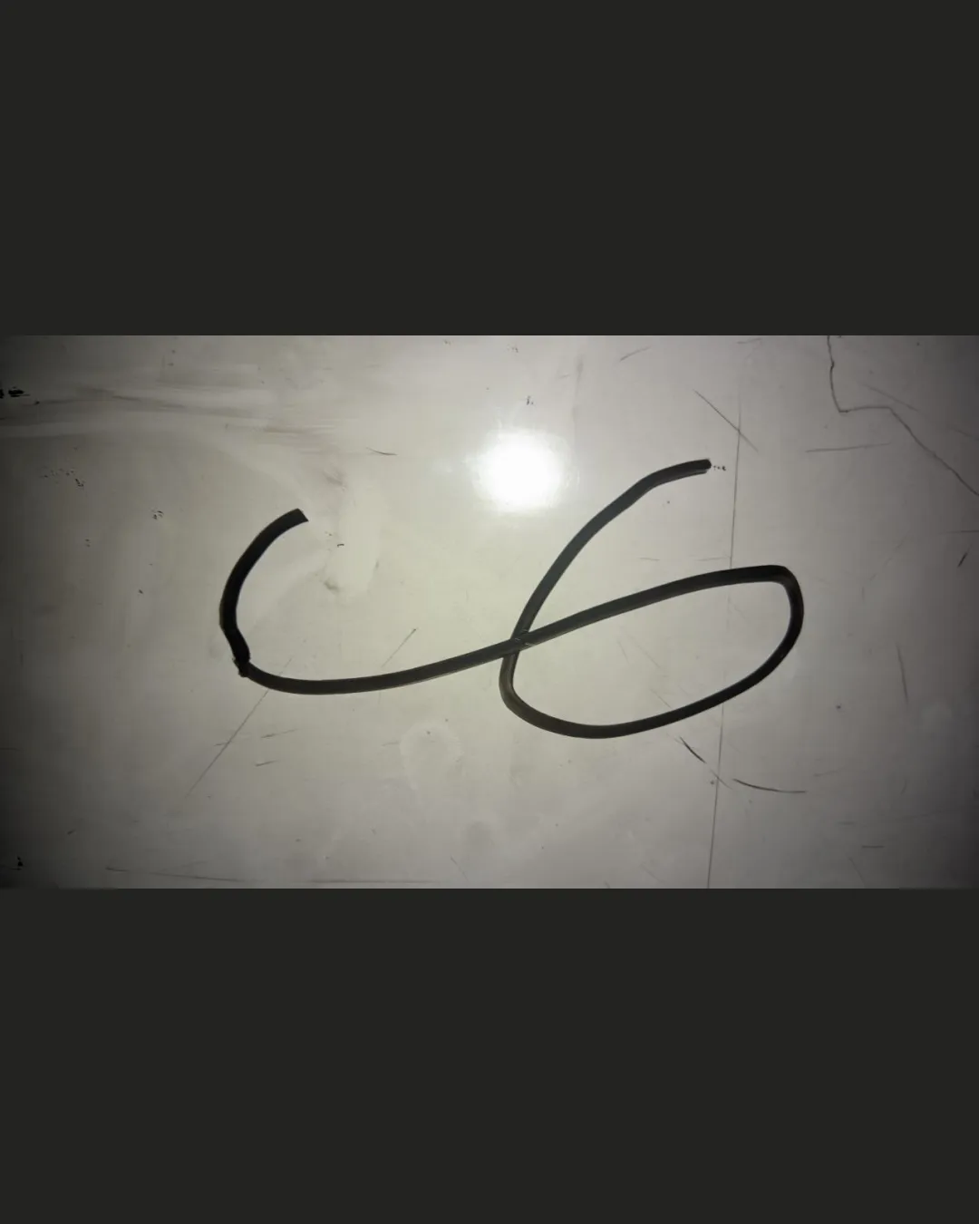
Try it Now!Logo review of 46, Ub
 Logo analysis by AI
Logo type:
Style:
Detected symbol:
Detected text:
Business industry:
Review requested by Ryryryry9
**If AI can recognize or misinterpret it, so can people.
Structured logo review
Legibility
![]() The hand-formed wire makes discerning the intended numbers or letters challenging.
The hand-formed wire makes discerning the intended numbers or letters challenging.![]() Ambiguity between 4/6 and U/b leads to confusion about what the logo represents.
Ambiguity between 4/6 and U/b leads to confusion about what the logo represents.
Scalability versatility
![]() Wire-thin lines lack presence when scaled down and may disappear in small applications such as favicons or business cards.
Wire-thin lines lack presence when scaled down and may disappear in small applications such as favicons or business cards.![]() Logo would not reproduce well in embroidery, engraving, or at varying sizes due to unstable line weight and unstructured form.
Logo would not reproduce well in embroidery, engraving, or at varying sizes due to unstable line weight and unstructured form.
200x250 px
100×125 px
50×62 px
Balance alignment
![]() Logo feels visually unbalanced, with the lower curve dominating the composition.
Logo feels visually unbalanced, with the lower curve dominating the composition.![]() Alignment is off-center, making the logo feel amateurish.
Alignment is off-center, making the logo feel amateurish.

Originality
![]() A tangible, hand-formed wire design is less common in logo design, lending some uniqueness.
A tangible, hand-formed wire design is less common in logo design, lending some uniqueness.
![]() The form itself (looking like '46' or 'Ub') does not contain a strong conceptual element or creative twist.
The form itself (looking like '46' or 'Ub') does not contain a strong conceptual element or creative twist.
Aesthetic look
![]() The logo looks crude and unfinished, lacking polish and intentional design decisions.
The logo looks crude and unfinished, lacking polish and intentional design decisions.![]() Minimalist to a fault, making it appear random rather than purposeful.
Minimalist to a fault, making it appear random rather than purposeful.
Dual meaning and misinterpretations
![]() The ambiguous form is open to misinterpretation and could resemble random scribbles depending on context.
The ambiguous form is open to misinterpretation and could resemble random scribbles depending on context.
Color harmony
![]() A simple black wire on a neutral background is relatively harmonious.
A simple black wire on a neutral background is relatively harmonious.
![]() The color scheme lacks vibrancy or branding strength; the background appears dirty and inconsistent, lowering perceived professionalism.
The color scheme lacks vibrancy or branding strength; the background appears dirty and inconsistent, lowering perceived professionalism.
black
#212121
alabaster
#EFEDE8
dark gray
#323232