Wondering how your logo performs? 🧐
Get professional logo reviews in seconds and catch design issues in time.
Try it Now!Logo review of 46
 Logo analysis by AI
Logo type:
Style:
Detected symbol:
Detected text:
Review requested by Ryryryry9
**If AI can recognize or misinterpret it, so can people.
Structured logo review
Legibility
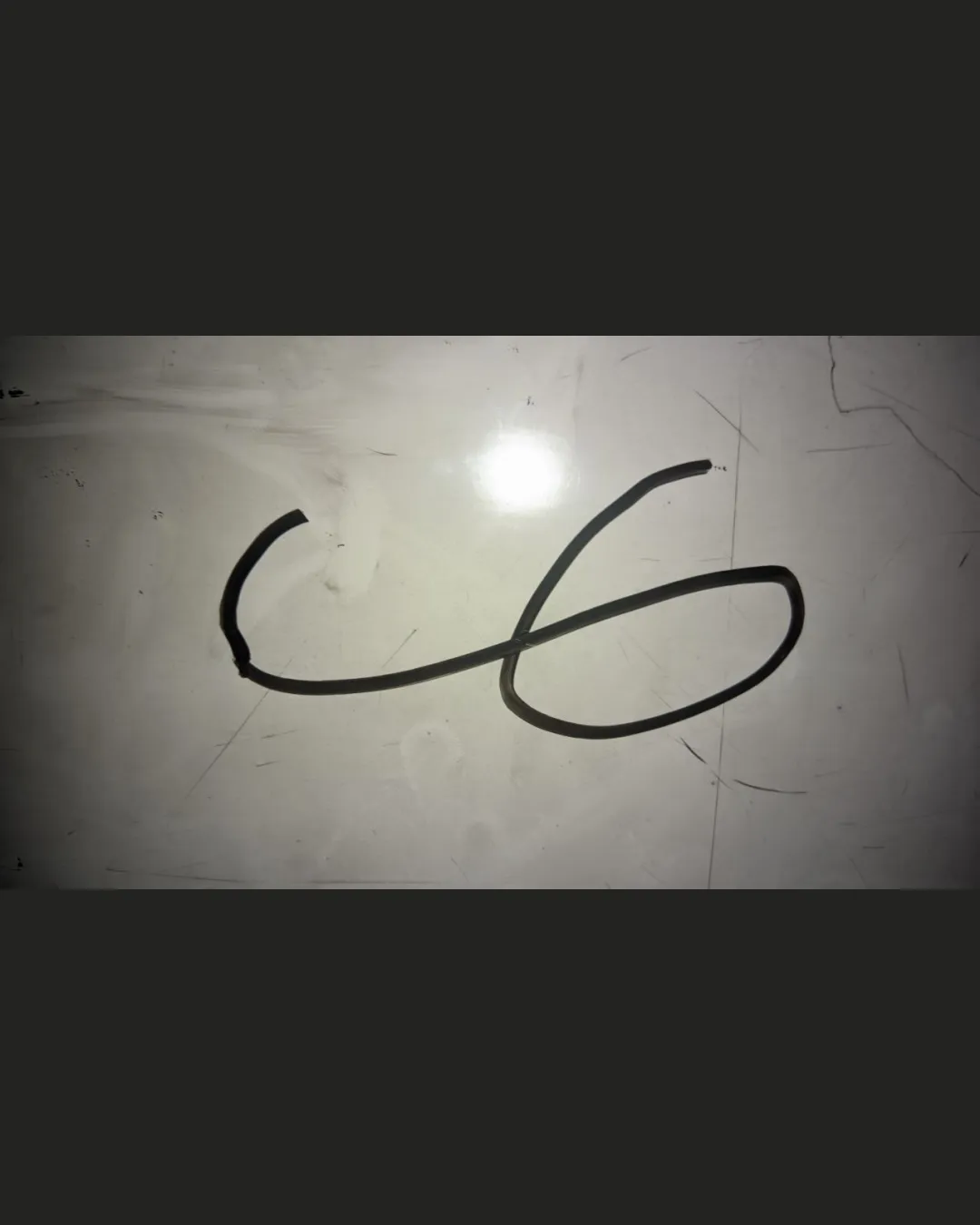
![]() Numerals are minimally recognizable as '46'.
Numerals are minimally recognizable as '46'.
![]() The freeform, uneven handwriting or wire style makes the numbers ambiguous.
The freeform, uneven handwriting or wire style makes the numbers ambiguous.![]() Lack of strong contrast with the background impairs quick recognition.
Lack of strong contrast with the background impairs quick recognition.![]() Thinness and lack of clarity diminish readability, especially at small sizes.
Thinness and lack of clarity diminish readability, especially at small sizes.
Scalability versatility
![]() Simple structure could technically be resized without pixelation.
Simple structure could technically be resized without pixelation.
![]() Line is too thin for small-scale reproduction (e.g., business cards, embroidery, mobile icons).
Line is too thin for small-scale reproduction (e.g., business cards, embroidery, mobile icons).![]() Handwritten style lacks clarity on digital and print mediums.
Handwritten style lacks clarity on digital and print mediums.![]() Shadowing and photographic style limit adaptation to other mockups.
Shadowing and photographic style limit adaptation to other mockups.
200x250 px
100×125 px
50×62 px
Balance alignment
![]() Basic visual anchoring on the horizontal plane.
Basic visual anchoring on the horizontal plane.
![]() Irregular, inconsistent widths and height—lacks geometric or optical balance.
Irregular, inconsistent widths and height—lacks geometric or optical balance.![]() The flow between the two numerals is off, leading to a visually awkward composition.
The flow between the two numerals is off, leading to a visually awkward composition.

Originality
![]() Handmade, casual approach is somewhat distinct if intentional.
Handmade, casual approach is somewhat distinct if intentional.
![]() Relies on a common handwritten or wire-formed numeral style.
Relies on a common handwritten or wire-formed numeral style.![]() No unique conceptual twist or negative space integration.
No unique conceptual twist or negative space integration.
Aesthetic look
![]() Unrefined and unfinished; appears improvised rather than professionally designed.
Unrefined and unfinished; appears improvised rather than professionally designed.![]() Does not communicate polish, creativity, or intentional branding.
Does not communicate polish, creativity, or intentional branding.
Dual meaning and misinterpretations
![]() No overtly inappropriate shapes.
No overtly inappropriate shapes.
![]() The freeform shape could be mistaken for abstract scribble or accidental wire arrangement.
The freeform shape could be mistaken for abstract scribble or accidental wire arrangement.
Color harmony
![]() Minimal and monochrome approach is safe and adaptable.
Minimal and monochrome approach is safe and adaptable.![]() No clashing or excessive colors present.
No clashing or excessive colors present.
![]() The logo does not stand out against the uneven background.
The logo does not stand out against the uneven background.![]() Lacks vibrancy or any purposeful color specification.
Lacks vibrancy or any purposeful color specification.
EerieBlack
#191818
WhiteSmoke
#E8E1D9