Wondering how your logo performs? 🧐
Get professional logo reviews in seconds and catch design issues in time.
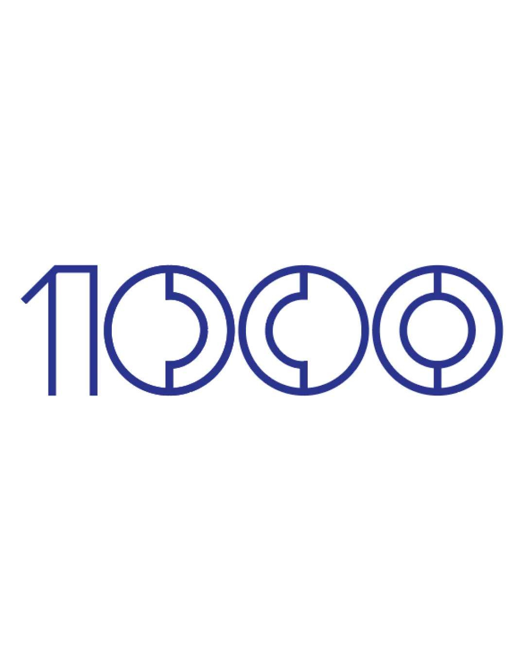
Try it Now!Logo review of 1000

 Logo analysis by AI
Logo type:
Style:
Detected symbol:
Negative space:
Detected text:
Business industry:
Review requested by Steve_LEE
**If AI can recognize or misinterpret it, so can people.
Structured logo review
Legibility
![]() Numerals are generally recognizable and bold.
Numerals are generally recognizable and bold.![]() Consistent stroke thickness makes the logo easy to read in most sizes.
Consistent stroke thickness makes the logo easy to read in most sizes.
![]() Geometric concentric circles inside zeros may cause momentary confusion, especially at small sizes.
Geometric concentric circles inside zeros may cause momentary confusion, especially at small sizes.![]() The stylization of zeros as targets can make them look like the letter 'O' or other symbols at a glance.
The stylization of zeros as targets can make them look like the letter 'O' or other symbols at a glance.
Scalability versatility
![]() Simple color palette supports versatile reproduction.
Simple color palette supports versatile reproduction.![]() Logo remains recognizable in larger applications like banners and web headers.
Logo remains recognizable in larger applications like banners and web headers.
![]() Concentric circle detail in zeros could get lost or appear as blobs at small scales, such as favicons or pen prints.
Concentric circle detail in zeros could get lost or appear as blobs at small scales, such as favicons or pen prints.![]() The design may not translate crisply to embroidery or very small promotional materials.
The design may not translate crisply to embroidery or very small promotional materials.
200x250 px
100×125 px
50×62 px
Balance alignment
![]() Consistent baseline and height among all numerals.
Consistent baseline and height among all numerals.![]() Visual weight is evenly distributed across the logo.
Visual weight is evenly distributed across the logo.
![]() The left angle in the '1' breaks uniformity and introduces slight imbalance—feels disconnected from the round forms of the zeros.
The left angle in the '1' breaks uniformity and introduces slight imbalance—feels disconnected from the round forms of the zeros.

Originality
![]() The target/zero motif is an original visual approach for the number 1000.
The target/zero motif is an original visual approach for the number 1000.![]() Geometric styling separates the logo from plain numeral designs.
Geometric styling separates the logo from plain numeral designs.
![]() Using targets inside zeros is not entirely unique—it risks echoing existing marks, like archery, shooting, or survey brands.
Using targets inside zeros is not entirely unique—it risks echoing existing marks, like archery, shooting, or survey brands.
Aesthetic look
![]() Clean, modern aesthetic with geometric harmony.
Clean, modern aesthetic with geometric harmony.![]() Repetition and symmetry add visual appeal.
Repetition and symmetry add visual appeal.
![]() The logo may feel a bit sterile or impersonal, lacking warmth or emotional connection.
The logo may feel a bit sterile or impersonal, lacking warmth or emotional connection.![]() All blue, minimalistic forms don't stand out among bold, expressive brand marks.
All blue, minimalistic forms don't stand out among bold, expressive brand marks.
Dual meaning and misinterpretations
![]() No strong accidental interpretations detected.
No strong accidental interpretations detected.![]() Targets and zeros are clear enough to not imply inappropriate meanings.
Targets and zeros are clear enough to not imply inappropriate meanings.
![]() Target imagery might connect unintentionally to unrelated industries—marksman, firearm, or survey-related sectors.
Target imagery might connect unintentionally to unrelated industries—marksman, firearm, or survey-related sectors.
Color harmony
![]() Single color scheme is harmonious and professional.
Single color scheme is harmonious and professional.![]() Good contrast with white background.
Good contrast with white background.
Light Navy
#28348A