Wondering how your logo performs? 🧐
Get professional logo reviews in seconds and catch design issues in time.
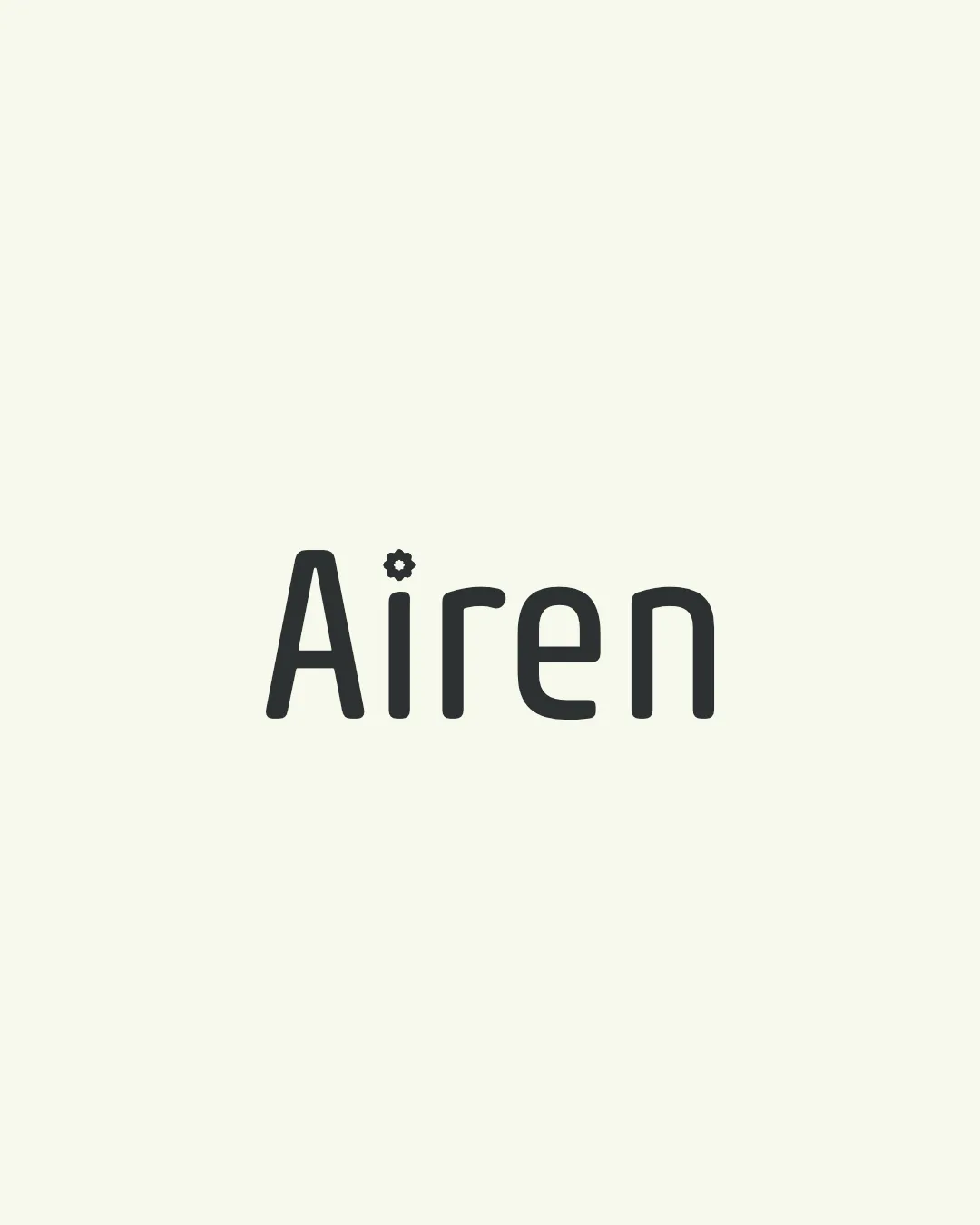
Try it Now!Logo review of Airen
 Logo analysis by AI
Logo type:
Style:
Detected symbol:
Detected text:
Business industry:
Review requested by RIDIO
**If AI can recognize or misinterpret it, so can people.
Structured logo review
Legibility
![]() Typography is clear and easy to read.
Typography is clear and easy to read.![]() Single accent symbol (gear) does not disrupt word recognition.
Single accent symbol (gear) does not disrupt word recognition.
![]() Gear symbol may slightly distract from the simplicity and flow of the text, especially in small sizes.
Gear symbol may slightly distract from the simplicity and flow of the text, especially in small sizes.
Scalability versatility
![]() Solid, bold letterforms aid in scaling for digital and most print use.
Solid, bold letterforms aid in scaling for digital and most print use.![]() Simple color scheme supports diverse applications.
Simple color scheme supports diverse applications.
![]() Gear detail above 'i' could become indistinct or muddy at smaller sizes—may be illegible in favicon or embroidery formats.
Gear detail above 'i' could become indistinct or muddy at smaller sizes—may be illegible in favicon or embroidery formats.
200x250 px
100×125 px
50×62 px
Balance alignment
![]() Good vertical and horizontal alignment of letters.
Good vertical and horizontal alignment of letters.![]() Weight of the gear symbol is appropriate relative to the font stroke.
Weight of the gear symbol is appropriate relative to the font stroke.
![]() The gear as a dot breaks the uniformity of the otherwise rounded, consistent typeface, slightly impacting harmony.
The gear as a dot breaks the uniformity of the otherwise rounded, consistent typeface, slightly impacting harmony.

Originality
![]() Gear as a dot on the 'i' is a clever, subtle integration that adds uniqueness.
Gear as a dot on the 'i' is a clever, subtle integration that adds uniqueness.![]() Avoids generic wordmark pitfalls.
Avoids generic wordmark pitfalls.
![]() Gear symbols are commonly used in tech and engineering logos, which can feel somewhat expected.
Gear symbols are commonly used in tech and engineering logos, which can feel somewhat expected.
Aesthetic look
![]() Minimalist and visually pleasing, modern typography.
Minimalist and visually pleasing, modern typography.![]() Clean and not overloaded with effects or extra elements.
Clean and not overloaded with effects or extra elements.
![]() Not visually striking or memorable in a crowded market—lacks strong graphic impact.
Not visually striking or memorable in a crowded market—lacks strong graphic impact.
Dual meaning and misinterpretations
![]() No inappropriate, confusing, or ambiguous shapes present.
No inappropriate, confusing, or ambiguous shapes present.
Color harmony
![]() Excellent contrast between text and background.
Excellent contrast between text and background.![]() Monochrome palette ensures versatility.
Monochrome palette ensures versatility.
Sea Shell
#F0F1E8
Black Olive
#32342D