Wondering how your logo performs? 🧐
Get professional logo reviews in seconds and catch design issues in time.
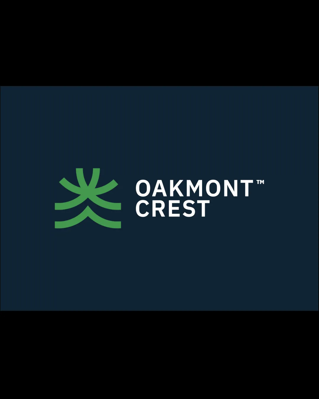
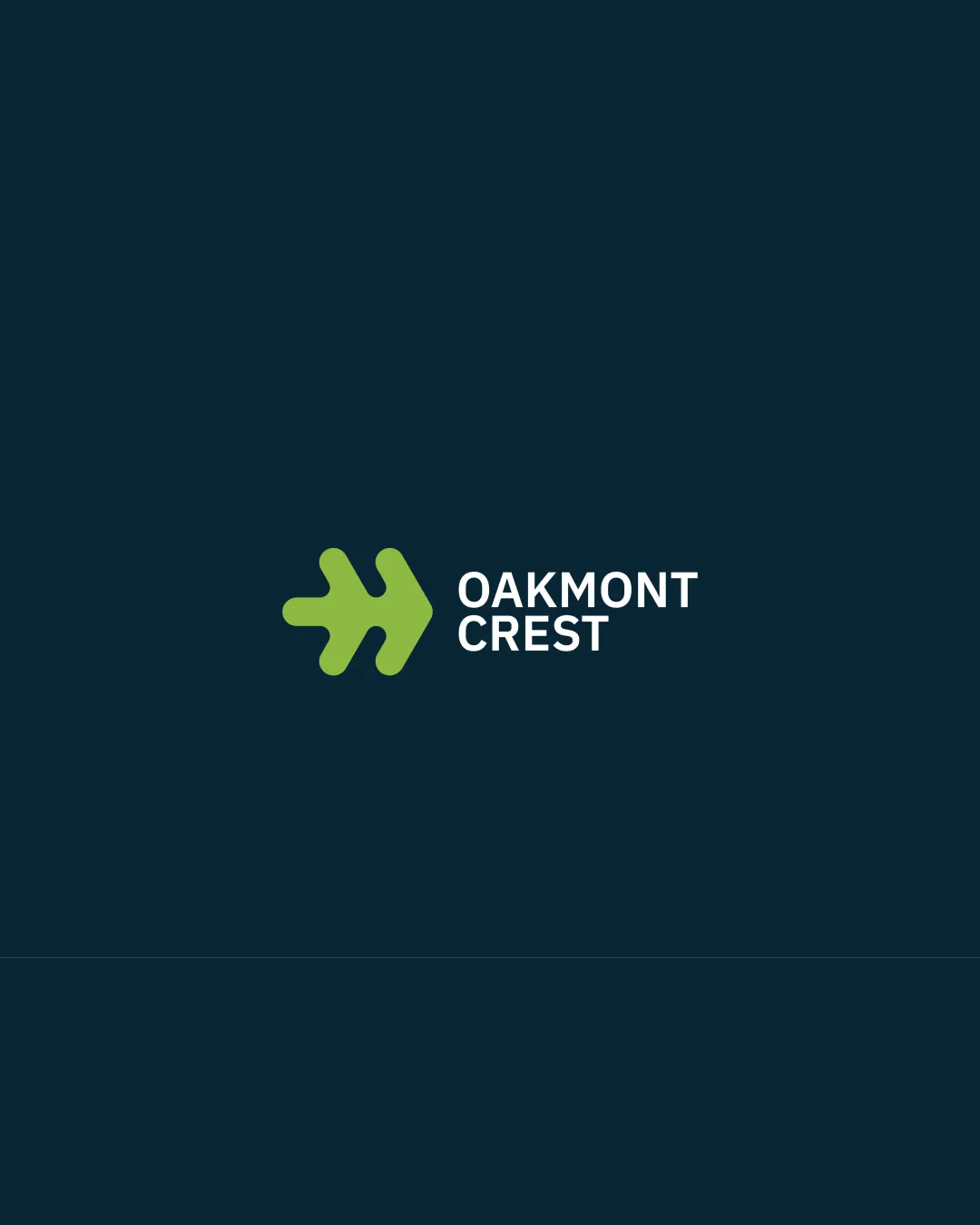
Try it Now!Logo review of OAKMONT CREST
 Logo analysis by AI
Logo type:
Style:
Detected symbol:
Detected text:
Business industry:
Review requested by Thinkevo
**If AI can recognize or misinterpret it, so can people.
Structured logo review
Legibility
![]() Typography is clear and highly readable.
Typography is clear and highly readable.![]() High contrast between white text and dark background.
High contrast between white text and dark background.
Scalability versatility
![]() Simple shape is highly scalable.
Simple shape is highly scalable.![]() Would reproduce well on billboards, signage, and business cards.
Would reproduce well on billboards, signage, and business cards.
![]() The relatively thin lines and small cutouts in the icon may lose clarity at extremely small sizes like favicons or embroidery.
The relatively thin lines and small cutouts in the icon may lose clarity at extremely small sizes like favicons or embroidery.
200x250 px
100×125 px
50×62 px
Balance alignment
![]() Well-aligned logomark and wordmark.
Well-aligned logomark and wordmark.![]() Good spatial relationship between the icon and text.
Good spatial relationship between the icon and text.
![]() The logomark is slightly larger and heavier than the text, drawing more attention than the wordmark.
The logomark is slightly larger and heavier than the text, drawing more attention than the wordmark.

Originality
![]() Abstract modern take on an oak leaf, which is less common than literal or traditional versions.
Abstract modern take on an oak leaf, which is less common than literal or traditional versions.![]() Combination of familiar symbol with unique geometric execution.
Combination of familiar symbol with unique geometric execution.
![]() The oak leaf, while stylized, is still a somewhat common symbol in industries linked to property, nature, or prestige.
The oak leaf, while stylized, is still a somewhat common symbol in industries linked to property, nature, or prestige.
Logomark wordmark fit
![]() Consistent weight and style between symbol and wordmark.
Consistent weight and style between symbol and wordmark.![]() Modern and professional pairing.
Modern and professional pairing.
Aesthetic look
![]() Minimalist style supports versatile usage.
Minimalist style supports versatile usage.![]() Attractive color palette and form.
Attractive color palette and form.
![]() Aesthetic is slightly generic for nature/real estate, lacking a distinctive or premium look.
Aesthetic is slightly generic for nature/real estate, lacking a distinctive or premium look.
Dual meaning and misinterpretations
![]() Symbol is clear and unlikely to be misinterpreted.
Symbol is clear and unlikely to be misinterpreted.![]() No inappropriate or ambiguous imagery detected.
No inappropriate or ambiguous imagery detected.
Color harmony
![]() Strong contrast and well-coordinated palette.
Strong contrast and well-coordinated palette.![]() Limited to two dominant brand colors plus white for optimal brand consistency.
Limited to two dominant brand colors plus white for optimal brand consistency.
Pasture Green
#70B657
Deep Teal
#122D34
White
#FFFFFF