Wondering how your logo performs? 🧐
Get professional logo reviews in seconds and catch design issues in time.
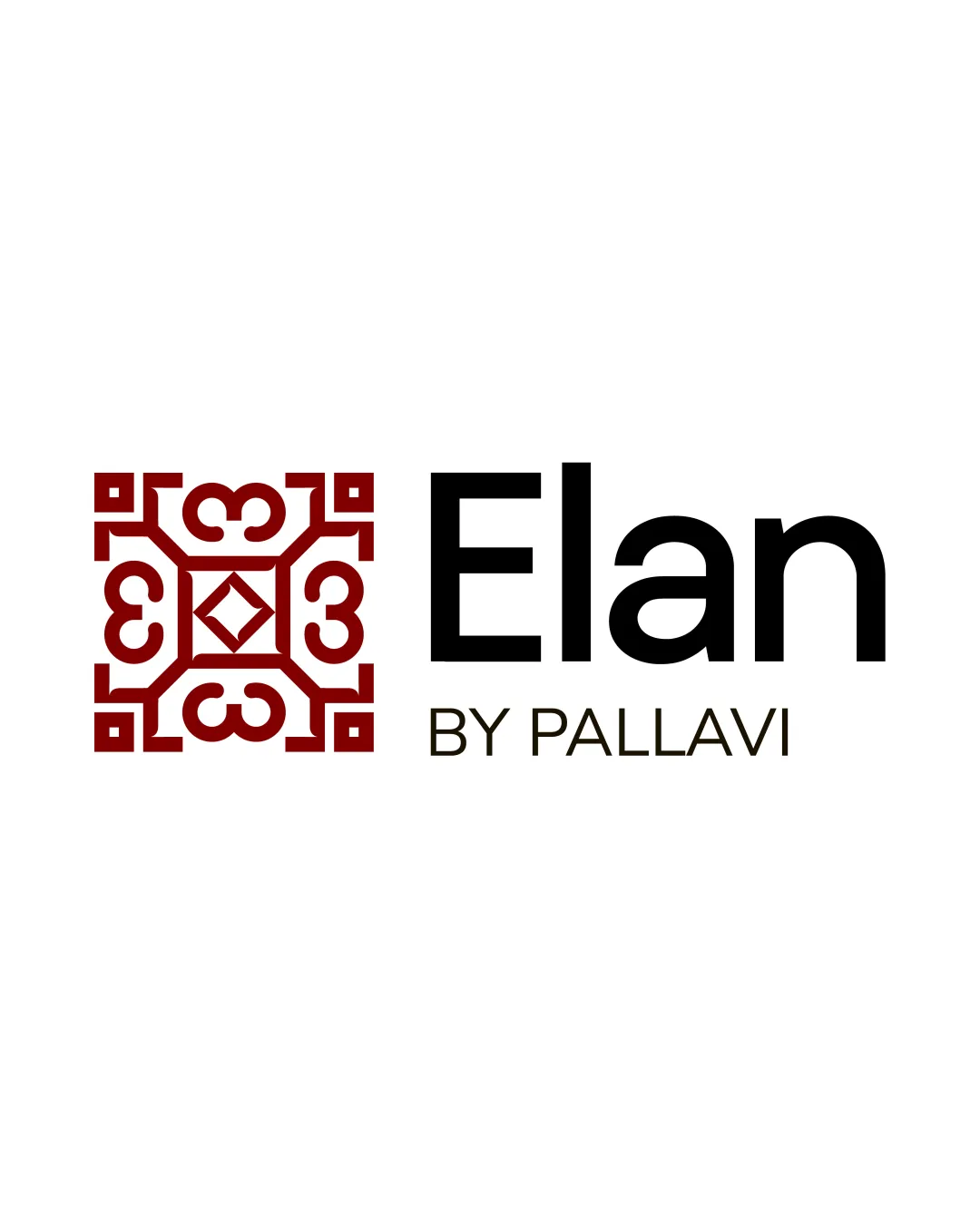
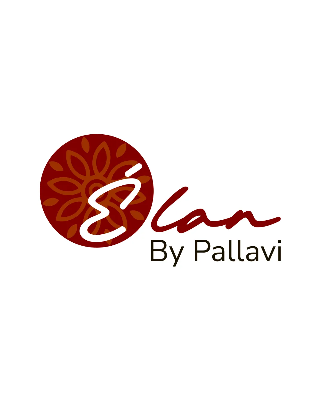
Try it Now!Logo review of Élan By Pallavi
 Logo analysis by AI
Logo type:
Style:
Detected symbol:
Detected text:
Business industry:
Review requested by Rohan_Mangalarap
**If AI can recognize or misinterpret it, so can people.
Structured logo review
Legibility
![]() The serif font 'By Pallavi' is clean and easy to read.
The serif font 'By Pallavi' is clean and easy to read.![]() The script 'Élan' is mostly legible and fluid.
The script 'Élan' is mostly legible and fluid.
![]() Stylized 'É' could be misread, especially in smaller sizes or for those unfamiliar with accents.
Stylized 'É' could be misread, especially in smaller sizes or for those unfamiliar with accents.![]() Contrast between the script and the symbol causes a slight distraction.
Contrast between the script and the symbol causes a slight distraction.
Scalability versatility
![]() Works at medium sizes for print and web use.
Works at medium sizes for print and web use.![]() Ornamental circular mark is distinctive at larger sizes (e.g., signage, packaging).
Ornamental circular mark is distinctive at larger sizes (e.g., signage, packaging).
![]() Ornamental details in the circle may get lost in small formats like icons or embroidery.
Ornamental details in the circle may get lost in small formats like icons or embroidery.![]() Stylized script and detail-heavy symbol may blur in small-scale applications (e.g., pens, favicons).
Stylized script and detail-heavy symbol may blur in small-scale applications (e.g., pens, favicons).
200x250 px
100×125 px
50×62 px
Balance alignment
![]() Visually balanced left-to-right with the circular emblem to the left and script to the right.
Visually balanced left-to-right with the circular emblem to the left and script to the right.![]() Wordmark and icon are visually connected.
Wordmark and icon are visually connected.
![]() The heavy motif and bold 'É' pull weight to the left, creating slight imbalance with the lighter 'By Pallavi' text.
The heavy motif and bold 'É' pull weight to the left, creating slight imbalance with the lighter 'By Pallavi' text.

Originality
![]() Custom drawn floral motif is distinctive and less generic.
Custom drawn floral motif is distinctive and less generic.![]() Combination of a stylized letter inside the icon shows creative effort.
Combination of a stylized letter inside the icon shows creative effort.
![]() Floral motifs are common in fashion/creative industries, reducing uniqueness slightly.
Floral motifs are common in fashion/creative industries, reducing uniqueness slightly.![]() Script font is stylish but not entirely unique.
Script font is stylish but not entirely unique.
Logomark wordmark fit
![]() The motif and script share a similar organic, flowing character.
The motif and script share a similar organic, flowing character.![]() Good color-light pairing between the symbol and typography.
Good color-light pairing between the symbol and typography.
![]() The weight difference between the bold motif/'É' and the thinner 'By Pallavi' subtext weakens cohesion.
The weight difference between the bold motif/'É' and the thinner 'By Pallavi' subtext weakens cohesion.
Aesthetic look
![]() Color scheme is elegant and fitting for high-end or artisanal brands.
Color scheme is elegant and fitting for high-end or artisanal brands.![]() Composition feels airy and modern.
Composition feels airy and modern.
![]() Overall design strength is reduced by minor clutter within the emblem.
Overall design strength is reduced by minor clutter within the emblem.
Dual meaning and misinterpretations
![]() No inappropriate shapes or unintended interpretations detected.
No inappropriate shapes or unintended interpretations detected.
Color harmony
![]() Color palette is limited and complementary, yielding a refined effect.
Color palette is limited and complementary, yielding a refined effect.![]() Good contrast between text and background.
Good contrast between text and background.
Tosca Red
#88171B
Rust
#D0752D
White
#FFFFFF
Espresso
#2B2115