Wondering how your logo performs? 🧐
Get professional logo reviews in seconds and catch design issues in time.
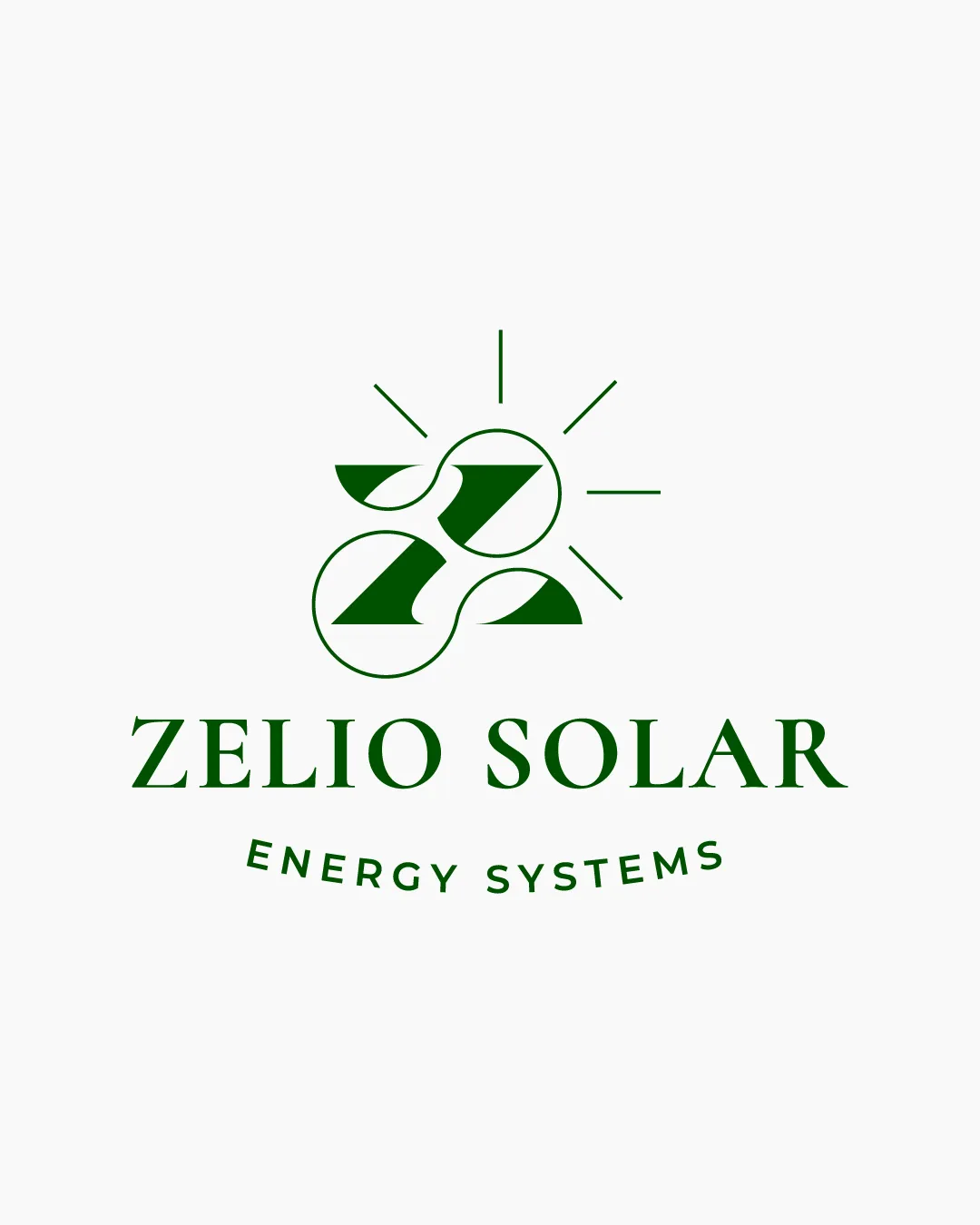
Try it Now!Logo review of ZELIO SOLAR ENERGY SYSTEMS
 Logo analysis by AI
Logo type:
Style:
Detected symbol:
Negative space:
Detected text:
Business industry:
Review requested by Graphstorm
**If AI can recognize or misinterpret it, so can people.
Structured logo review
Legibility
![]() Text is highly legible with excellent spacing and a clear, bold serif typeface.
Text is highly legible with excellent spacing and a clear, bold serif typeface.![]() Consistent capitalization enhances clarity.
Consistent capitalization enhances clarity.
Scalability versatility
![]() Simple, bold shapes and single-color design optimize scalability.
Simple, bold shapes and single-color design optimize scalability.![]() Works for print, web, and physical media such as signage and packaging.
Works for print, web, and physical media such as signage and packaging.
![]() Sun rays detail may become less visible in very small sizes such as favicons.
Sun rays detail may become less visible in very small sizes such as favicons.![]() The 'Energy Systems' subtext could lose clarity at small scales or in complex backgrounds.
The 'Energy Systems' subtext could lose clarity at small scales or in complex backgrounds.
200x250 px
100×125 px
50×62 px
Balance alignment
![]() Both the symbol and wordmark are well centered.
Both the symbol and wordmark are well centered.![]() Symmetrical design and balanced arrangement between icon, main text, and subheading.
Symmetrical design and balanced arrangement between icon, main text, and subheading.

Originality
![]() Creative integration of 'Z' within circular forms to communicate brand initial and suggest energy flow.
Creative integration of 'Z' within circular forms to communicate brand initial and suggest energy flow.![]() Sun rays reference solar energy conceptually.
Sun rays reference solar energy conceptually.
![]() Interlocking circular motif is somewhat common in energy/renewable sector logos.
Interlocking circular motif is somewhat common in energy/renewable sector logos.![]() Could further elevate distinctiveness by exploring more unique geometric interpretations.
Could further elevate distinctiveness by exploring more unique geometric interpretations.
Logomark wordmark fit
![]() Logomark and wordmark complement each other in style, weight, and alignment.
Logomark and wordmark complement each other in style, weight, and alignment.![]() Both elements feel cohesive and visually harmonious.
Both elements feel cohesive and visually harmonious.
Aesthetic look
![]() Clean, contemporary look with a minimal and purposeful layout.
Clean, contemporary look with a minimal and purposeful layout.![]() Effective use of white space and no distracting elements.
Effective use of white space and no distracting elements.
![]() Aesthetic could be improved by softening sharp edges or introducing subtler line work for added sophistication.
Aesthetic could be improved by softening sharp edges or introducing subtler line work for added sophistication.
Dual meaning and misinterpretations
![]() No inappropriate or confusing symbols detected; visual metaphor is clear.
No inappropriate or confusing symbols detected; visual metaphor is clear.
Color harmony
![]() Monotone green color creates strong environmental/renewable cues and is harmonious.
Monotone green color creates strong environmental/renewable cues and is harmonious.![]() High contrast with white background maximizes clarity.
High contrast with white background maximizes clarity.
Forest Green
#09540F
White
#FFFFFF