Wondering how your logo performs? 🧐
Get professional logo reviews in seconds and catch design issues in time.
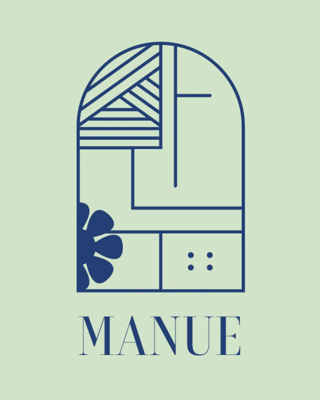
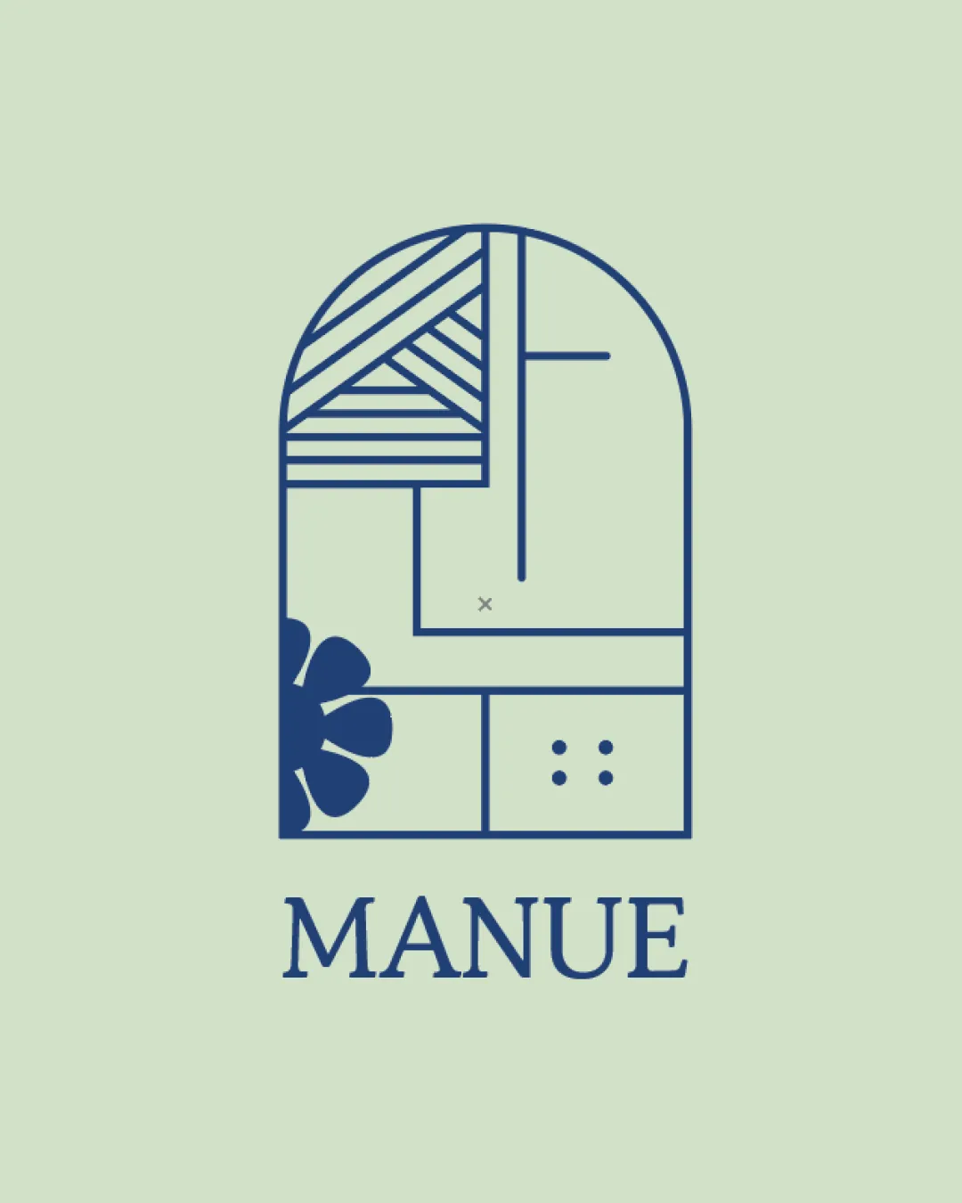
Try it Now!Logo review of MANUE
 Logo analysis by AI
Logo type:
Style:
Detected symbol:
Detected text:
Business industry:
Review requested by Wena
**If AI can recognize or misinterpret it, so can people.
Structured logo review
Legibility
![]() Text is clear, uppercase serif typeface provides sophistication.
Text is clear, uppercase serif typeface provides sophistication.![]() Good contrast between text and background color.
Good contrast between text and background color.
![]() The spacing between characters looks slightly wide, making it less compact and possibly reducing cohesion with the symbol.
The spacing between characters looks slightly wide, making it less compact and possibly reducing cohesion with the symbol.
Scalability versatility
![]() Simple color palette enhances reproduction in various mediums.
Simple color palette enhances reproduction in various mediums.![]() Line-based design allows for easy application on packaging, tags, and digital interfaces.
Line-based design allows for easy application on packaging, tags, and digital interfaces.
![]() Thin lines in the symbol risk losing clarity at small sizes or when embroidered.
Thin lines in the symbol risk losing clarity at small sizes or when embroidered.![]() Complex internal details could become indistinct on small-scale uses like favicons or small product labels.
Complex internal details could become indistinct on small-scale uses like favicons or small product labels.
200x250 px
100×125 px
50×62 px
Balance alignment
![]() Icon is centered above the wordmark with well-proportioned spacing.
Icon is centered above the wordmark with well-proportioned spacing.![]() Geometric symmetry in symbol creates visual harmony.
Geometric symmetry in symbol creates visual harmony.
![]() The denser line pattern at the top left makes the overall weight feel a bit top-heavy relative to the lighter lower section—slight imbalance.
The denser line pattern at the top left makes the overall weight feel a bit top-heavy relative to the lighter lower section—slight imbalance.

Originality
![]() Combination of geometric and organic elements is unique.
Combination of geometric and organic elements is unique.![]() Elements like buttons and abstract flower give a tactile, craft-related nod.
Elements like buttons and abstract flower give a tactile, craft-related nod.
![]() Arched window and geometric subdivisions are trending motifs; creative but not highly original.
Arched window and geometric subdivisions are trending motifs; creative but not highly original.
Logomark wordmark fit
![]() Serif typeface mirrors the crafted, artisan mood of the symbol.
Serif typeface mirrors the crafted, artisan mood of the symbol.![]() Symbol and wordmark weight and style feel consistent.
Symbol and wordmark weight and style feel consistent.
Aesthetic look
![]() Modern, clean aesthetic feels intentional and refined.
Modern, clean aesthetic feels intentional and refined.![]() Color usage is elegant and not overwhelming.
Color usage is elegant and not overwhelming.
![]() Multiple motifs (flower, lines, buttons) risk appearing slightly busy together; visual focus could be tighter.
Multiple motifs (flower, lines, buttons) risk appearing slightly busy together; visual focus could be tighter.
Dual meaning and misinterpretations
![]() No inappropriate or unintended imagery detected. Symbolic elements are neutral and abstract.
No inappropriate or unintended imagery detected. Symbolic elements are neutral and abstract.
Color harmony
![]() Excellent harmony between two colors, sophisticated palette.
Excellent harmony between two colors, sophisticated palette.![]() High contrast ensures readability and elegance.
High contrast ensures readability and elegance.
Snowy Mint
#EAF8E2
Dark Blue
#233A53