Wondering how your logo performs? 🧐
Get professional logo reviews in seconds and catch design issues in time.
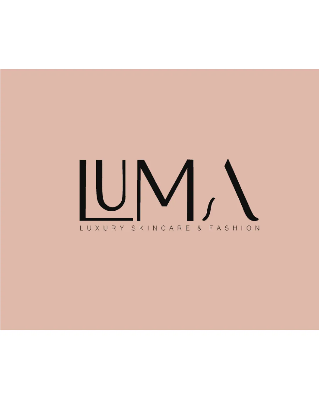
Try it Now!Logo review of LUMA
 Logo analysis by AI
Logo type:
Style:
Detected text:
Business industry:
Review requested by Sejwalshikha
**If AI can recognize or misinterpret it, so can people.
Structured logo review
Legibility
![]() Main text is generally clear and uses well-spaced typography.
Main text is generally clear and uses well-spaced typography.![]() Contrasting color makes the name readable.
Contrasting color makes the name readable.
![]() The highly stylized 'A' can be misread as an abstract symbol or a backward 'V', causing some confusion.
The highly stylized 'A' can be misread as an abstract symbol or a backward 'V', causing some confusion.![]() Thin strokes on the 'M' and unconventional baseline placement could hinder quick legibility, especially at small sizes.
Thin strokes on the 'M' and unconventional baseline placement could hinder quick legibility, especially at small sizes.
Scalability versatility
![]() Minimalist wordmark adapts reasonably well to various applications like packaging or print.
Minimalist wordmark adapts reasonably well to various applications like packaging or print.![]() Simple color palette aids reproduction.
Simple color palette aids reproduction.
![]() Thin letterforms and stylized 'A' risk losing clarity and recognition at smaller sizes, particularly in digital icons or embroidery.
Thin letterforms and stylized 'A' risk losing clarity and recognition at smaller sizes, particularly in digital icons or embroidery.![]() Subtext 'Luxury Skincare & Fashion' may become illegible in small formats such as business cards or website favicons.
Subtext 'Luxury Skincare & Fashion' may become illegible in small formats such as business cards or website favicons.
200x250 px
100×125 px
50×62 px
Balance alignment
![]() Overall composition is visually centered with decent spacing between letterforms.
Overall composition is visually centered with decent spacing between letterforms.![]() Horizontal layout provides a stable appearance.
Horizontal layout provides a stable appearance.
![]() The leaning/italicized effect of the 'A' creates a visual imbalance compared to the mostly upright forms.
The leaning/italicized effect of the 'A' creates a visual imbalance compared to the mostly upright forms.

Originality
![]() The 'A' is given a unique, stylized treatment, differentiating the wordmark from generic sans-serif solutions.
The 'A' is given a unique, stylized treatment, differentiating the wordmark from generic sans-serif solutions.![]() Modern luxury feel is well conveyed.
Modern luxury feel is well conveyed.
![]() Apart from the 'A', the other letterforms do not depart far from standard geometric sans-serif fonts and lack distinctive flourish.
Apart from the 'A', the other letterforms do not depart far from standard geometric sans-serif fonts and lack distinctive flourish.
Aesthetic look
![]() Clean, elegant, and fashionable aesthetic appropriate for a luxury brand.
Clean, elegant, and fashionable aesthetic appropriate for a luxury brand.![]() Good contrast between text and background.
Good contrast between text and background.![]() On-trend color palette.
On-trend color palette.
![]() Visual flow is slightly disrupted by the extreme stylization of the final 'A'.
Visual flow is slightly disrupted by the extreme stylization of the final 'A'.
Dual meaning and misinterpretations
![]() No inappropriate or accidental imagery detected.
No inappropriate or accidental imagery detected.
![]() The stylized 'A' could be misinterpreted as a backslash or an unrelated abstract mark, leading to minor confusion.
The stylized 'A' could be misinterpreted as a backslash or an unrelated abstract mark, leading to minor confusion.
Color harmony
![]() Sophisticated, limited palette enhances luxurious feel.
Sophisticated, limited palette enhances luxurious feel.![]() Colors are harmonious and support brand image.
Colors are harmonious and support brand image.
Cashmere
#DEC0B0
Cod Gray
#141414