Wondering how your logo performs? 🧐
Get professional logo reviews in seconds and catch design issues in time.
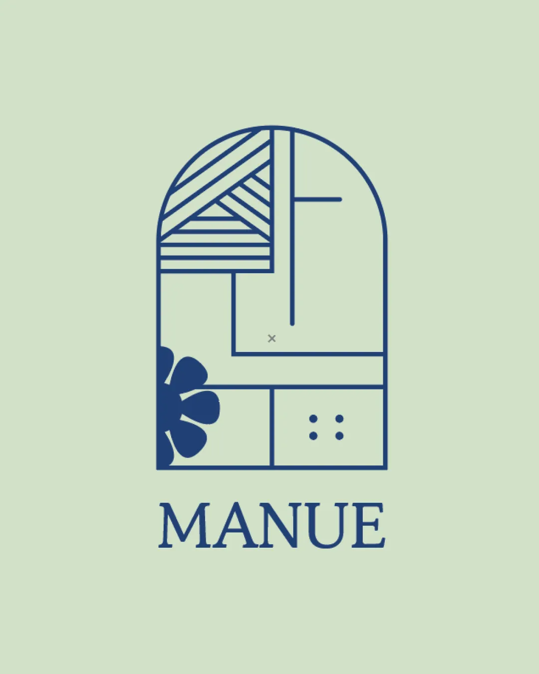
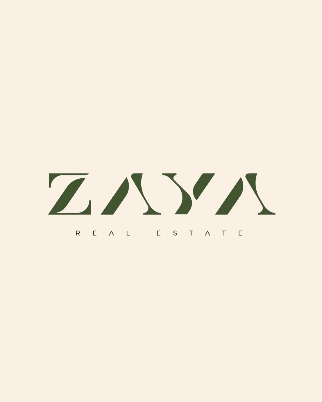
Try it Now!Logo review of ZAYA REAL ESTATE
 Logo analysis by AI
Recognized style:
Logo type:
Detected symbol:
Detected text:
Business industry:
Review requested by Graphstorm
**If AI can recognize or misinterpret it, so can people.
Structured logo review
Legibility
![]() The business name is clearly stated as ZAYA Real Estate.
The business name is clearly stated as ZAYA Real Estate.
![]() The stylized letters may slightly hinder readability, especially from a distance.
The stylized letters may slightly hinder readability, especially from a distance.
Scalability versatility
![]() The simple wordmark design ensures good scalability and versatility.
The simple wordmark design ensures good scalability and versatility.
![]() The intricate letter styling might lose detail at smaller sizes.
The intricate letter styling might lose detail at smaller sizes.
200x250 px
100×125 px
50×62 px
Balance alignment
![]() The alignment of the text is balanced and well-proportioned.
The alignment of the text is balanced and well-proportioned.
![]() The spacing between letters may require slight adjustment for better balance.
The spacing between letters may require slight adjustment for better balance.

Originality
![]() The unique styling of the letters adds originality.
The unique styling of the letters adds originality.
![]() The stylization could be seen as slightly similar to existing luxury brands.
The stylization could be seen as slightly similar to existing luxury brands.
Aesthetic look
![]() The logo looks sophisticated and aligns with a high-end real estate vibe.
The logo looks sophisticated and aligns with a high-end real estate vibe.
Cultural sensitivity dual meaning
![]() No cultural sensitivity issues detected.
No cultural sensitivity issues detected.
Color harmony
![]() The green creates a perfect balance, evoking trust and sophistication.
The green creates a perfect balance, evoking trust and sophistication.