Wondering how your logo performs? 🧐
Get professional logo reviews in seconds and catch design issues in time.
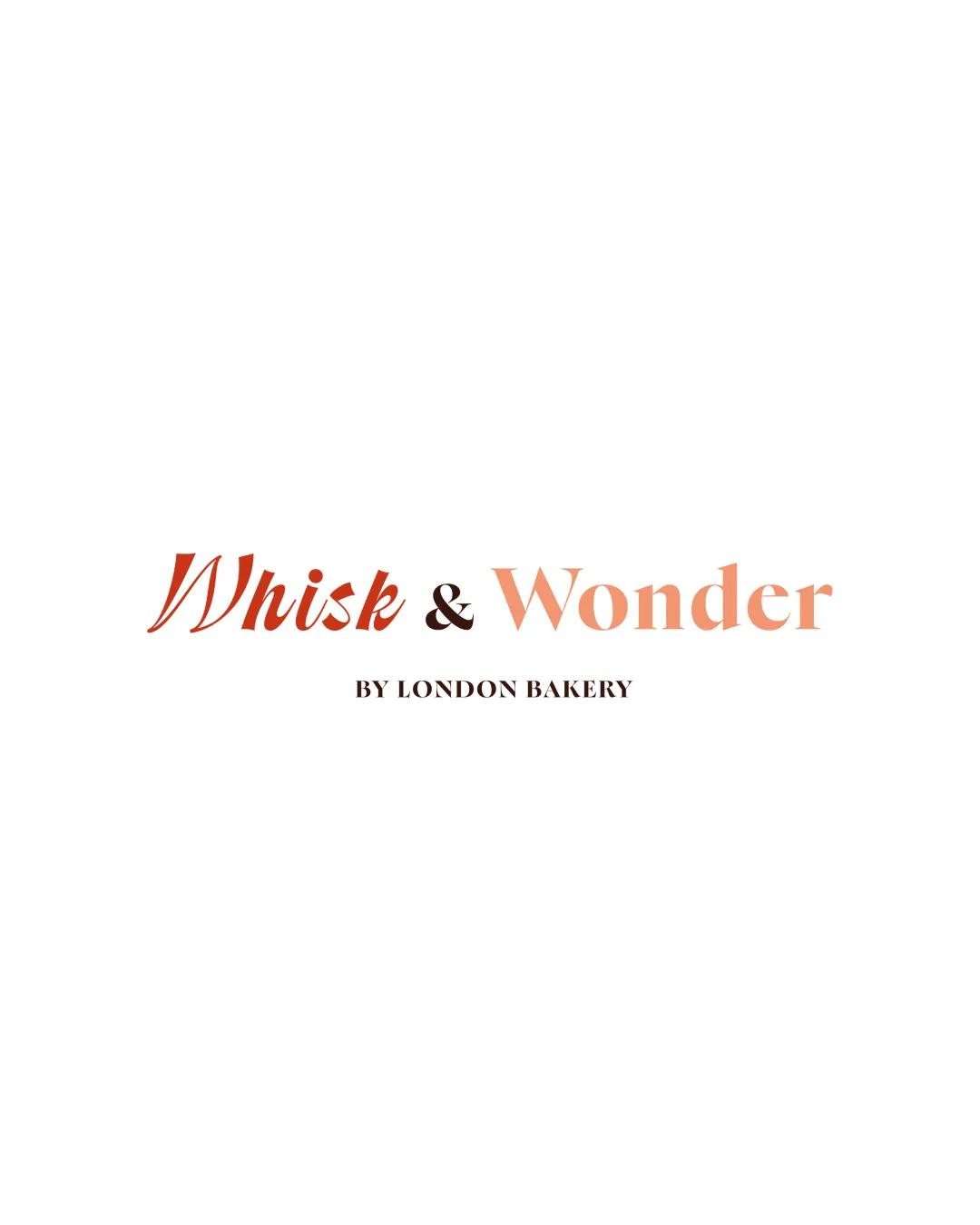
Try it Now!Logo review of Whisk & Wonder BY LONDON BAKERY
 Logo analysis by AI
Logo type:
Style:
Detected text:
Business industry:
Review requested by SophieOlexiv
**If AI can recognize or misinterpret it, so can people.
Structured logo review
Legibility
![]() Text is mostly clear and readable.
Text is mostly clear and readable.![]() Contrast with white background is good.
Contrast with white background is good.![]() Font weights help differentiate words.
Font weights help differentiate words.
![]() The script 'Whisk' is less legible at smaller sizes due to thin strokes and flourishes.
The script 'Whisk' is less legible at smaller sizes due to thin strokes and flourishes.![]() 'BY LONDON BAKERY' text may become difficult to read when scaled down, as it is quite small and thin.
'BY LONDON BAKERY' text may become difficult to read when scaled down, as it is quite small and thin.
Scalability versatility
![]() The design is uncluttered and works well in larger applications, such as signage or packaging.
The design is uncluttered and works well in larger applications, such as signage or packaging.![]() Simple composition is versatile for print and web use.
Simple composition is versatile for print and web use.
![]() Tagline text will be illegible on business cards or small applications.
Tagline text will be illegible on business cards or small applications.![]() Delicate script may lose clarity on embroidery or very small digital surfaces.
Delicate script may lose clarity on embroidery or very small digital surfaces.![]() Color gradient could be problematic in some reproduction methods (e.g., single-color or black-and-white printing).
Color gradient could be problematic in some reproduction methods (e.g., single-color or black-and-white printing).
200x250 px
100×125 px
50×62 px
Balance alignment
![]() The main words are well-balanced horizontally.
The main words are well-balanced horizontally.![]() Weight contrast between 'Whisk' and 'Wonder' adds visual interest.
Weight contrast between 'Whisk' and 'Wonder' adds visual interest.
![]() 'BY LONDON BAKERY' tagline is slightly off-balance due to its small size and lack of anchoring graphic elements.
'BY LONDON BAKERY' tagline is slightly off-balance due to its small size and lack of anchoring graphic elements.![]() The ampersand’s small, dark presence visually disconnects the two main words.
The ampersand’s small, dark presence visually disconnects the two main words.

Originality
![]() Combination of script and serif is contemporary and appealing.
Combination of script and serif is contemporary and appealing.![]() Soft gradient adds a modern twist.
Soft gradient adds a modern twist.
![]() No unique or memorable logomark present.
No unique or memorable logomark present.![]() Wordmark approach is fairly conventional for bakeries and lacks a signature element.
Wordmark approach is fairly conventional for bakeries and lacks a signature element.
Aesthetic look
![]() Pleasant, clean, and upscale aesthetic.
Pleasant, clean, and upscale aesthetic.![]() Warm, appetizing color selection fits the bakery theme.
Warm, appetizing color selection fits the bakery theme.
![]() Gradient between colors, while attractive, can appear inconsistent across different media.
Gradient between colors, while attractive, can appear inconsistent across different media.![]() Minor disconnect between the traditional elegance of the script and the bold serif.
Minor disconnect between the traditional elegance of the script and the bold serif.
Dual meaning and misinterpretations
![]() No inappropriate or confusing secondary imagery.
No inappropriate or confusing secondary imagery.![]() Logo communicates sophistication and warmth.
Logo communicates sophistication and warmth.
Color harmony
![]() Coherent and appetizing palette of browns and peaches.
Coherent and appetizing palette of browns and peaches.![]() Color progression supports a soft, artisanal vibe.
Color progression supports a soft, artisanal vibe.
![]() Gradient use could cause color reproduction issues in monochrome or low-fidelity print situations.
Gradient use could cause color reproduction issues in monochrome or low-fidelity print situations.
Rust
#B84823
Light Peach
#F3B48C
Rich Brown
#1B0904
White
#FFFFFF