Wondering how your logo performs? 🧐
Get professional logo reviews in seconds and catch design issues in time.
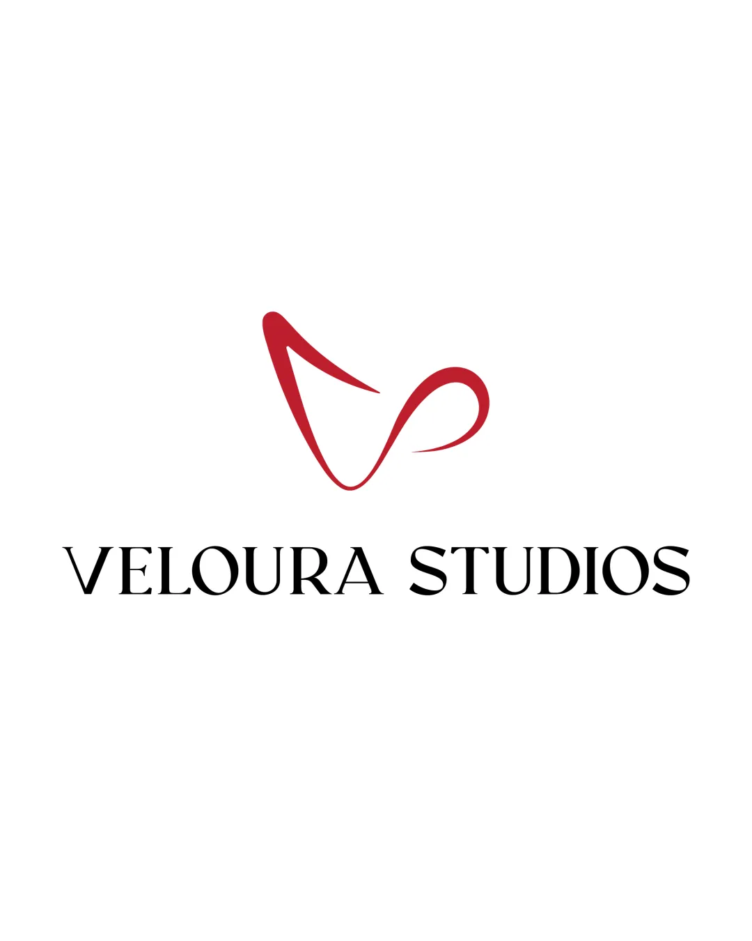
Try it Now!Logo review of VELOURA STUDIOS
 Logo analysis by AI
Logo type:
Style:
Detected symbol:
Detected text:
Business industry:
Review requested by Ronitkhanna
**If AI can recognize or misinterpret it, so can people.
Structured logo review
Legibility
![]() Text is clear and uses a distinctive serif font.
Text is clear and uses a distinctive serif font.![]() High contrast between black text and a white background enhances readability.
High contrast between black text and a white background enhances readability.
![]() Letterspacing could be increased slightly for better readability, especially for the word 'STUDIOS'.
Letterspacing could be increased slightly for better readability, especially for the word 'STUDIOS'.
Scalability versatility
![]() Logo mark can scale relatively well due to its simplicity.
Logo mark can scale relatively well due to its simplicity.![]() The combination mark allows for vertical and horizontal layouts.
The combination mark allows for vertical and horizontal layouts.
![]() The thin curves of the symbol may lose definition when scaled very small, such as on a favicon or embroidery.
The thin curves of the symbol may lose definition when scaled very small, such as on a favicon or embroidery.![]() Wordmark may appear crowded in small formats.
Wordmark may appear crowded in small formats.
200x250 px
100×125 px
50×62 px
Balance alignment
![]() Symbol is placed above the text in a visually central position.
Symbol is placed above the text in a visually central position.![]() Logo has a clean vertical alignment.
Logo has a clean vertical alignment.
![]() Symbol feels slightly light compared to the heavy serif wordmark, creating visual imbalance.
Symbol feels slightly light compared to the heavy serif wordmark, creating visual imbalance.![]() Distance between the symbol and the text might need slight adjustment for proportional harmony.
Distance between the symbol and the text might need slight adjustment for proportional harmony.

Originality
![]() Custom, abstract take on the letter 'V' adds uniqueness.
Custom, abstract take on the letter 'V' adds uniqueness.![]() Avoids generic film or media clichés.
Avoids generic film or media clichés.
![]() The abstract V, while distinctive, is somewhat reminiscent of generic swoosh/ribbon marks seen in other modern brands—could be pushed further for uniqueness.
The abstract V, while distinctive, is somewhat reminiscent of generic swoosh/ribbon marks seen in other modern brands—could be pushed further for uniqueness.
Logomark wordmark fit
![]() Modern abstract mark contrasts with the classical serif, lending a nuanced look to the branding.
Modern abstract mark contrasts with the classical serif, lending a nuanced look to the branding.
![]() The ultra-modern fluidity of the symbol and sharp serif wordmark do not fully harmonize stylistically, leading to a disjointed feel.
The ultra-modern fluidity of the symbol and sharp serif wordmark do not fully harmonize stylistically, leading to a disjointed feel.
Aesthetic look
![]() Clean, minimal, and professional appearance.
Clean, minimal, and professional appearance.![]() Color palette is sophisticated and limited.
Color palette is sophisticated and limited.
![]() Visual tension between the modern symbol and old-style serif can trip up the overall aesthetic flow.
Visual tension between the modern symbol and old-style serif can trip up the overall aesthetic flow.
Dual meaning and misinterpretations
![]() No inappropriate or misleading symbols detected in the composition.
No inappropriate or misleading symbols detected in the composition.
Color harmony
![]() Strong primary use of crimson and black is visually striking and balanced.
Strong primary use of crimson and black is visually striking and balanced.![]() Background color supports logo clarity.
Background color supports logo clarity.
Crimson
#B01628
Black
#000000
White
#FFFFFF