Wondering how your logo performs? 🧐
Get professional logo reviews in seconds and catch design issues in time.
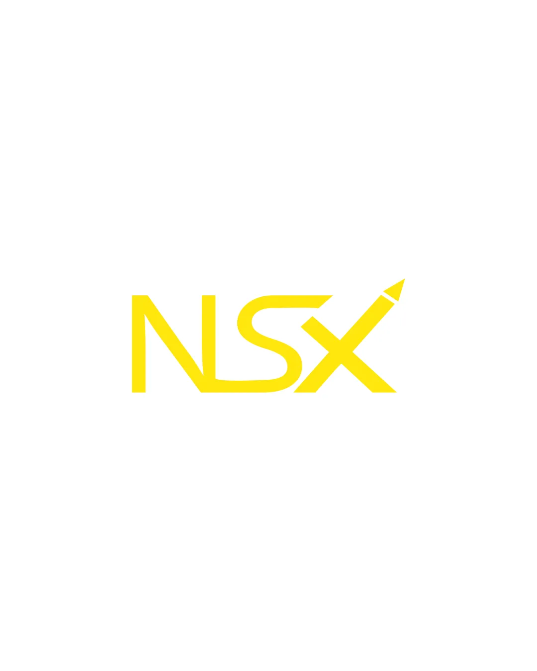
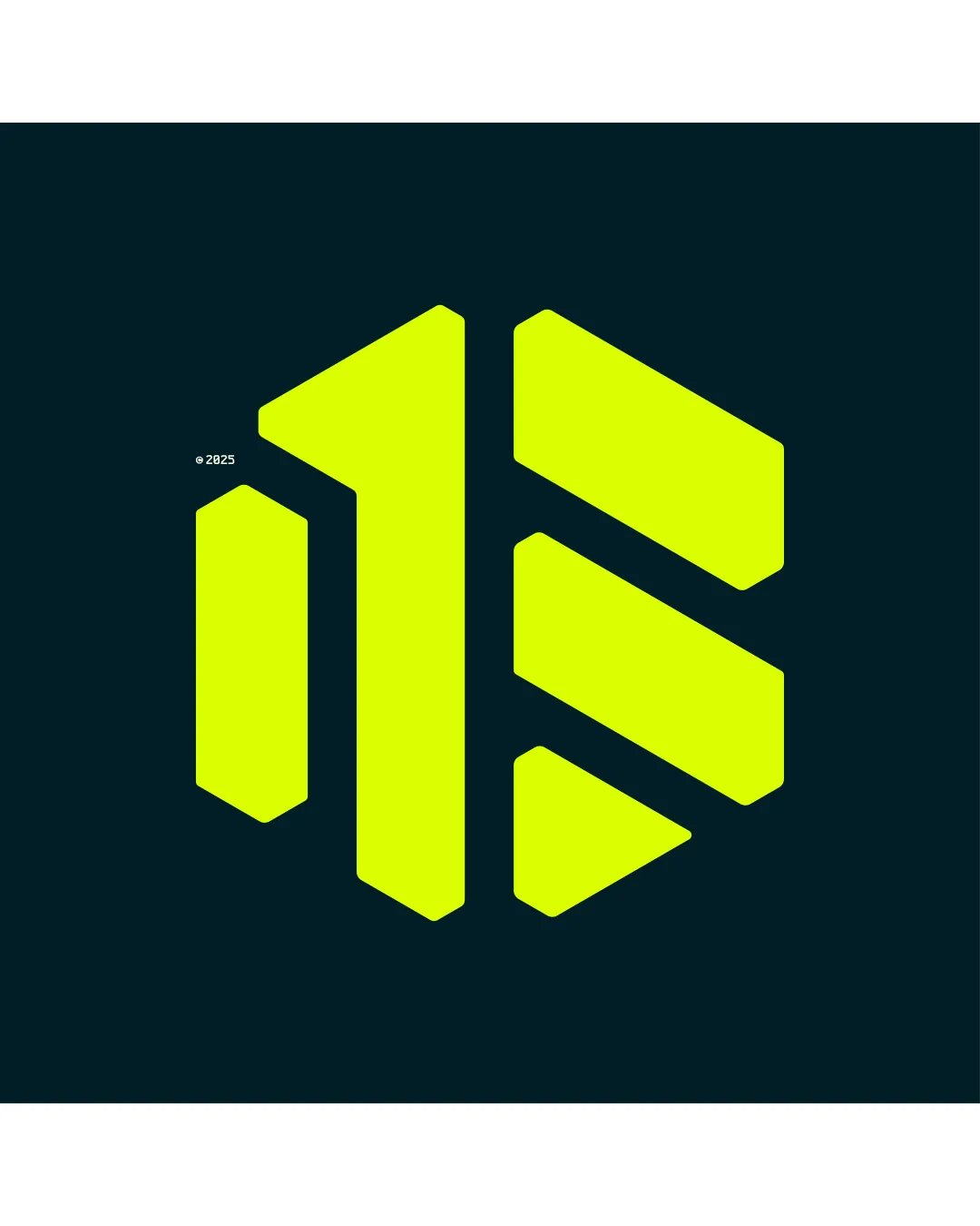
Try it Now!Logo review of Abstract geometric monogram, hexagonal shape, rese..
 Logo analysis by AI
Logo type:
Style:
Detected symbol:
Business industry:
Review requested by Halima9
**If AI can recognize or misinterpret it, so can people.
Structured logo review
Scalability versatility
![]() Bold, simple geometric shapes ensure strong visibility at large format scales such as billboards or digital banners.
Bold, simple geometric shapes ensure strong visibility at large format scales such as billboards or digital banners.![]() Works well as an app icon or favicon due to its distinct form.
Works well as an app icon or favicon due to its distinct form.
![]() Middle vertical element is slightly thinner than others, which might reduce clarity when reduced to very small sizes (e.g., embroidery, stamp applications).
Middle vertical element is slightly thinner than others, which might reduce clarity when reduced to very small sizes (e.g., embroidery, stamp applications).
200x250 px
100×125 px
50×62 px
Balance alignment
![]() Overall symmetrical composition with consistent spacing between geometric forms.
Overall symmetrical composition with consistent spacing between geometric forms.![]() Dynamic yet stable layout within a hexagonal footprint.
Dynamic yet stable layout within a hexagonal footprint.
![]() Minor imbalance due to the weight difference between the left and right components; left side appears slightly heavier.
Minor imbalance due to the weight difference between the left and right components; left side appears slightly heavier.

Originality
![]() Monogram formation is visually distinct and has a slight custom feel.
Monogram formation is visually distinct and has a slight custom feel.![]() Geometric approach provides a modern, technical vibe.
Geometric approach provides a modern, technical vibe.
![]() Abstract monogram logos using hexagonal/angled bars are fairly common in tech and finance industries; lacks a strikingly unique element.
Abstract monogram logos using hexagonal/angled bars are fairly common in tech and finance industries; lacks a strikingly unique element.![]() No innovative use of negative space or clever integration beyond letter shapes.
No innovative use of negative space or clever integration beyond letter shapes.
Aesthetic look
![]() Strong visual impact with high contrast and bold color choice.
Strong visual impact with high contrast and bold color choice.![]() Clean, uncluttered presentation for a contemporary look.
Clean, uncluttered presentation for a contemporary look.
![]() Neon yellow can feel harsh and is not universally appealing across different brand tones.
Neon yellow can feel harsh and is not universally appealing across different brand tones.![]() Overall form verges on being visually generic for tech industries.
Overall form verges on being visually generic for tech industries.
Dual meaning and misinterpretations
![]() No inappropriate shapes or unintended negative meanings detected.
No inappropriate shapes or unintended negative meanings detected.
Color harmony
![]() Uses a clear, limited palette with strong contrast for maximum visibility.
Uses a clear, limited palette with strong contrast for maximum visibility.![]() Neon yellow stands out well against dark background.
Neon yellow stands out well against dark background.
![]() The extremely bright yellow can be overbearing in sensitive applications and may not reproduce well in print without careful color management.
The extremely bright yellow can be overbearing in sensitive applications and may not reproduce well in print without careful color management.
Laser Lemon
#E3FF00
Blue Black
#04171A