Wondering how your logo performs? 🧐
Get professional logo reviews in seconds and catch design issues in time.
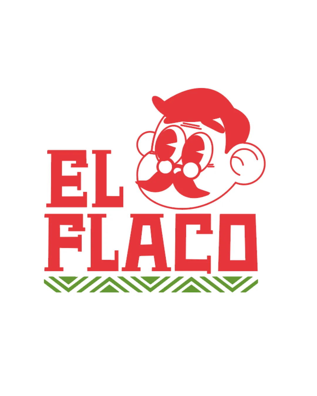
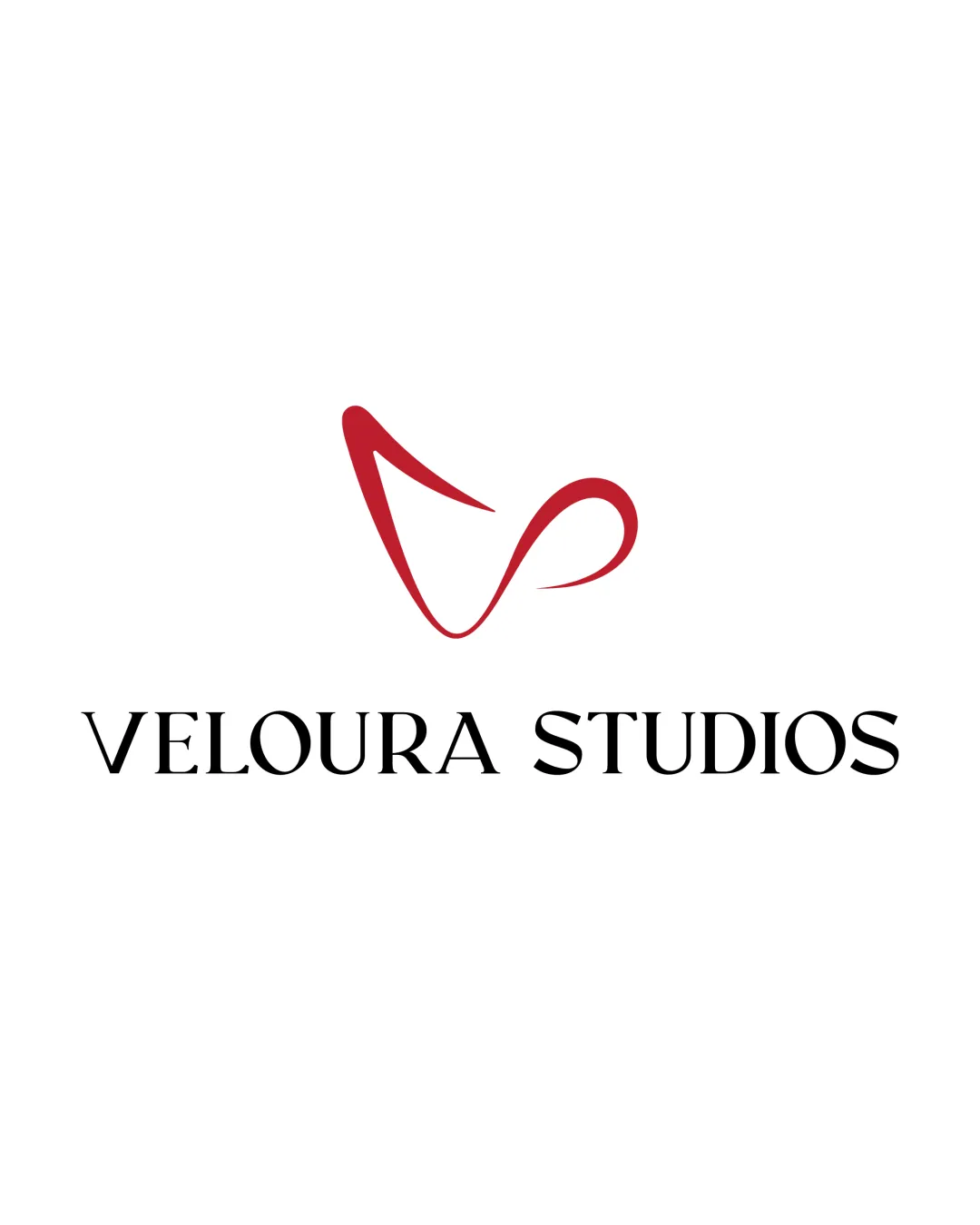
Try it Now!Logo review of Abstract swoosh forming a dynamic checkmark or win..

 Logo analysis by AI
Logo type:
Style:
Detected symbol:
Business industry:
Review requested by Ronitkhanna
**If AI can recognize or misinterpret it, so can people.
Structured logo review
Scalability versatility
![]() Simple, bold form makes it suitable for large-scale applications like signage, billboards, and digital use.
Simple, bold form makes it suitable for large-scale applications like signage, billboards, and digital use.![]() Minimal detail ensures clarity at smaller sizes and in monochrome.
Minimal detail ensures clarity at smaller sizes and in monochrome.
![]() Thin points may lose clarity or become less distinct when resized to extremely small formats such as favicons or embroidery.
Thin points may lose clarity or become less distinct when resized to extremely small formats such as favicons or embroidery.
200x250 px
100×125 px
50×62 px
Balance alignment
![]() Overall form is dynamic and well-composed, conveying movement.
Overall form is dynamic and well-composed, conveying movement.![]() Visual weight is mostly balanced due to the consistent line thickness along the curves.
Visual weight is mostly balanced due to the consistent line thickness along the curves.
![]() The elongated left side creates a mild sense of imbalance, as it visually outweighs the right curve.
The elongated left side creates a mild sense of imbalance, as it visually outweighs the right curve.

Originality
![]() Dynamic sweep gives a strong identity and movement.
Dynamic sweep gives a strong identity and movement.![]() Minimalist style avoids overused generic iconography like circles or squares.
Minimalist style avoids overused generic iconography like circles or squares.
![]() Abstract swooshes and checkmark motifs are commonly seen in tech and service logos, diminishing uniqueness.
Abstract swooshes and checkmark motifs are commonly seen in tech and service logos, diminishing uniqueness.
Aesthetic look
![]() Clean and modern aesthetic.
Clean and modern aesthetic.![]() Red color adds vibrancy without overwhelming the design.
Red color adds vibrancy without overwhelming the design.
![]() Due to common swoosh styles, it struggles to stand out visually among similar logos.
Due to common swoosh styles, it struggles to stand out visually among similar logos.
Dual meaning and misinterpretations
![]() No inappropriate accidental shapes or unintended connotations detected.
No inappropriate accidental shapes or unintended connotations detected.
Color harmony
![]() Single bold red color provides strong brand recognition and works well against the white background.
Single bold red color provides strong brand recognition and works well against the white background.![]() No color discordance.
No color discordance.
Red
#C1272D
White
#FFFFFF