Wondering how your logo performs? 🧐
Get professional logo reviews in seconds and catch design issues in time.
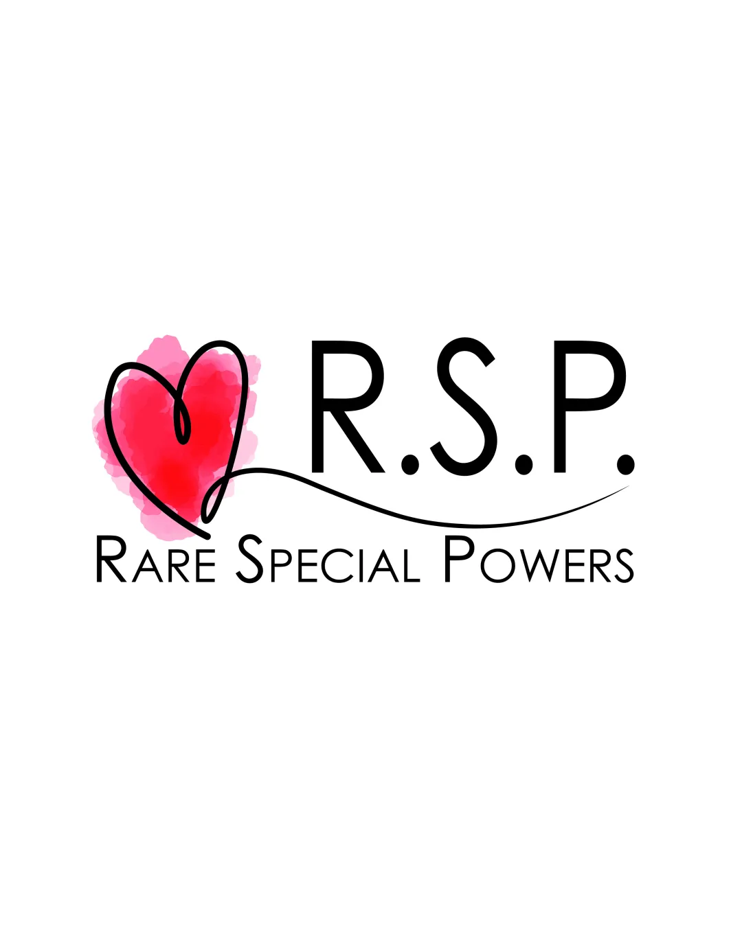
Try it Now!Logo review of R.S.P. Rare Special Powers
 Logo analysis by AI
Logo type:
Style:
Detected symbol:
Detected text:
Business industry:
Review requested by Motheroftypos
**If AI can recognize or misinterpret it, so can people.
Structured logo review
Legibility
![]() All text elements are easy to read due to high contrast with background.
All text elements are easy to read due to high contrast with background.![]() Font style is clean, modern, and sized well relative to the symbol.
Font style is clean, modern, and sized well relative to the symbol.
Scalability versatility
![]() Works well for digital usage and large prints.
Works well for digital usage and large prints.![]() Bold and simple enough for banners and signage.
Bold and simple enough for banners and signage.
![]() Watercolor background may lose detail when scaled small or reproduced in single color.
Watercolor background may lose detail when scaled small or reproduced in single color.![]() Hand-drawn elements may become unclear at tiny sizes (e.g., favicons or embroidery).
Hand-drawn elements may become unclear at tiny sizes (e.g., favicons or embroidery).
200x250 px
100×125 px
50×62 px
Balance alignment
![]() Horizontal alignment is consistent.
Horizontal alignment is consistent.![]() Heart flows smoothly into the lettering.
Heart flows smoothly into the lettering.
![]() Heart’s fluid line creates a visual imbalance, drawing more weight to the left.
Heart’s fluid line creates a visual imbalance, drawing more weight to the left.![]() Lower text 'Rare Special Powers' feels disconnected due to the lengthy swoosh.
Lower text 'Rare Special Powers' feels disconnected due to the lengthy swoosh.

Originality
![]() Watercolor heart adds a personalized touch.
Watercolor heart adds a personalized touch.![]() Handwritten flourish enhances uniqueness.
Handwritten flourish enhances uniqueness.
![]() Heart symbol is very common and lacks distinctiveness.
Heart symbol is very common and lacks distinctiveness.![]() No notable use of negative space or novel symbolism.
No notable use of negative space or novel symbolism.
Logomark wordmark fit
![]() The handwritten heart and swoosh harmonize with friendly text below.
The handwritten heart and swoosh harmonize with friendly text below.![]() Color palette is coherent between logomark and wordmark.
Color palette is coherent between logomark and wordmark.
![]() Visual style mismatch between informal heart and formal sans-serif creates mild contrast.
Visual style mismatch between informal heart and formal sans-serif creates mild contrast.
Aesthetic look
![]() Clean execution and pleasing color palette.
Clean execution and pleasing color palette.![]() Balances playful and professional qualities.
Balances playful and professional qualities.
![]() Lengthy swoosh introduces mild visual clutter.
Lengthy swoosh introduces mild visual clutter.![]() Watercolor effect could appear messy in some contexts.
Watercolor effect could appear messy in some contexts.
Dual meaning and misinterpretations
![]() No inappropriate or misleading imagery detected.
No inappropriate or misleading imagery detected.
Color harmony
![]() Color palette is restrained and visually pleasing.
Color palette is restrained and visually pleasing.![]() Good contrast between dark type and vibrant mark.
Good contrast between dark type and vibrant mark.
Cerise
#EA4A6A
Pink
#F6B7C3
Black
#000000