Wondering how your logo performs? 🧐
Get professional logo reviews in seconds and catch design issues in time.
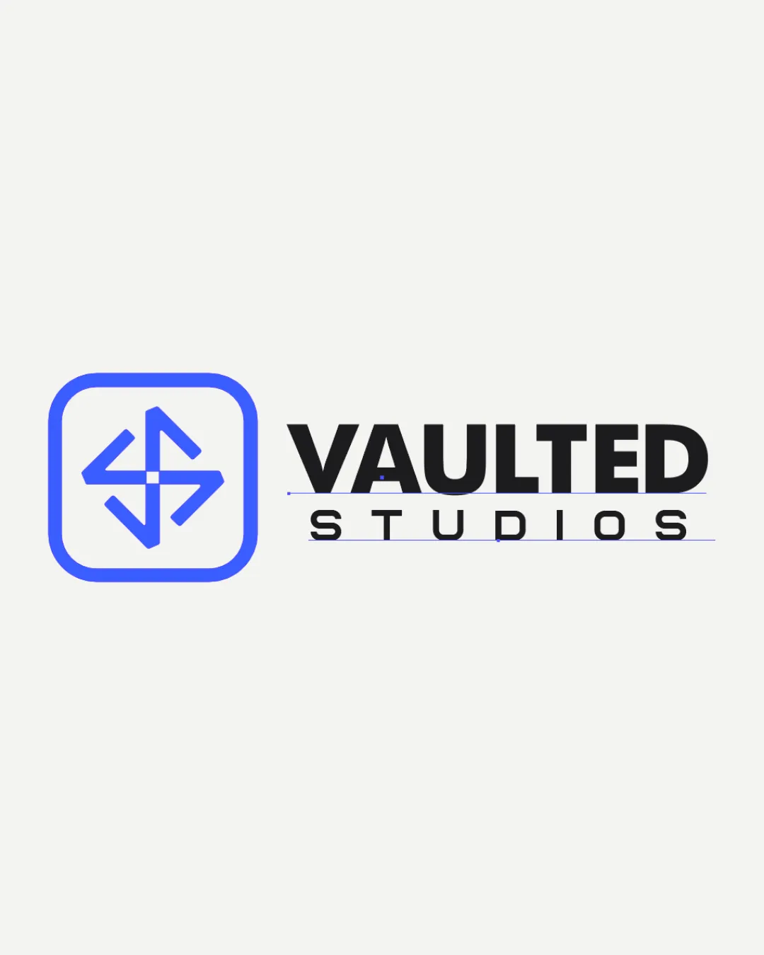
Try it Now!Logo review of VAULTED STUDIOS
 Logo analysis by AI
Logo type:
Style:
Detected symbol:
Negative space:
Detected text:
Business industry:
Review requested by Olamilekan
**If AI can recognize or misinterpret it, so can people.
Structured logo review
Legibility
![]() Both 'VAULTED' and 'STUDIOS' are highly legible with clear font choices.
Both 'VAULTED' and 'STUDIOS' are highly legible with clear font choices.![]() Good contrast between text and background.
Good contrast between text and background.![]() Hierarchy between the bold and light fonts is well established.
Hierarchy between the bold and light fonts is well established.
Scalability versatility
![]() The geometric symbol is simple enough for small-scale reproduction.
The geometric symbol is simple enough for small-scale reproduction.![]() Logo will be effective on business cards and digital interfaces.
Logo will be effective on business cards and digital interfaces.
![]() Thin lines in the 'STUDIOS' wordmark and symbol may disappear at very small sizes or when embroidered.
Thin lines in the 'STUDIOS' wordmark and symbol may disappear at very small sizes or when embroidered.![]() The outlined symbol might lose clarity if scaled down too much, especially in favicon or app icon applications.
The outlined symbol might lose clarity if scaled down too much, especially in favicon or app icon applications.
200x250 px
100×125 px
50×62 px
Balance alignment
![]() Strong alignment between logomark and wordmark.
Strong alignment between logomark and wordmark.![]() Overall composition feels visually grounded.
Overall composition feels visually grounded.
![]() Minor misalignment: The height of the logomark doesn't quite match the text block, making them feel slightly disconnected.
Minor misalignment: The height of the logomark doesn't quite match the text block, making them feel slightly disconnected.![]() Spacing between 'STUDIOS' and the line beneath it could be reduced for tighter cohesion.
Spacing between 'STUDIOS' and the line beneath it could be reduced for tighter cohesion.

Originality
![]() Abstract arrows and use of negative space inside a rounded square add some uniqueness.
Abstract arrows and use of negative space inside a rounded square add some uniqueness.
![]() Arrow motifs in logos are very common, reducing overall originality.
Arrow motifs in logos are very common, reducing overall originality.![]() No unique twist or strong visual metaphor specific to 'vault' or 'studio' is present in the symbol.
No unique twist or strong visual metaphor specific to 'vault' or 'studio' is present in the symbol.
Logomark wordmark fit
![]() Modern styles of logomark and wordmark align well aesthetically.
Modern styles of logomark and wordmark align well aesthetically.![]() Typeface choice complements the geometric theme.
Typeface choice complements the geometric theme.
![]() The visual weight of the logomark could be slightly better matched to the boldness of 'VAULTED' for more seamless integration.
The visual weight of the logomark could be slightly better matched to the boldness of 'VAULTED' for more seamless integration.
Aesthetic look
![]() Clean, modern aesthetic with appropriate white space.
Clean, modern aesthetic with appropriate white space.![]() Professional appearance suits industry standards.
Professional appearance suits industry standards.
![]() Could be perceived as a bit generic due to heavy reliance on geometric arrow motif.
Could be perceived as a bit generic due to heavy reliance on geometric arrow motif.![]() Lacks a memorable visual element that sets it apart.
Lacks a memorable visual element that sets it apart.
Dual meaning and misinterpretations
![]() No inappropriate or misleading shapes detected.
No inappropriate or misleading shapes detected.
Color harmony
![]() Excellent color harmony with restrained palette.
Excellent color harmony with restrained palette.![]() High contrast ensures strong visibility and impact.
High contrast ensures strong visibility and impact.
Blue
#4063FD
Black
#181818
White
#F7F7F7