Wondering how your logo performs? 🧐
Get professional logo reviews in seconds and catch design issues in time.
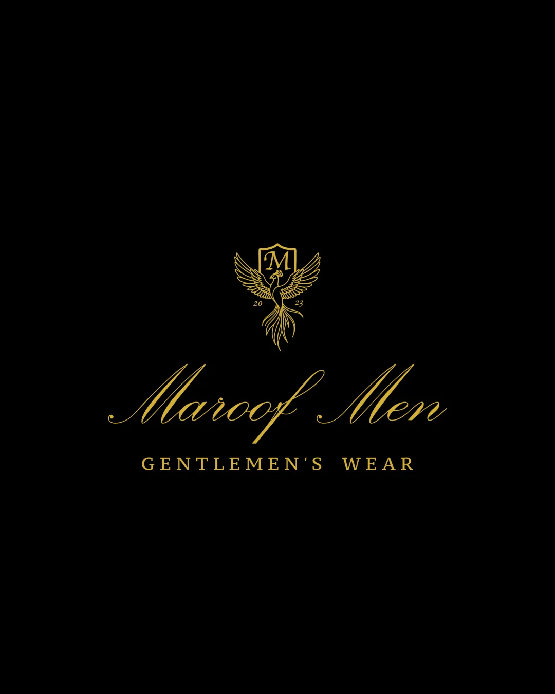
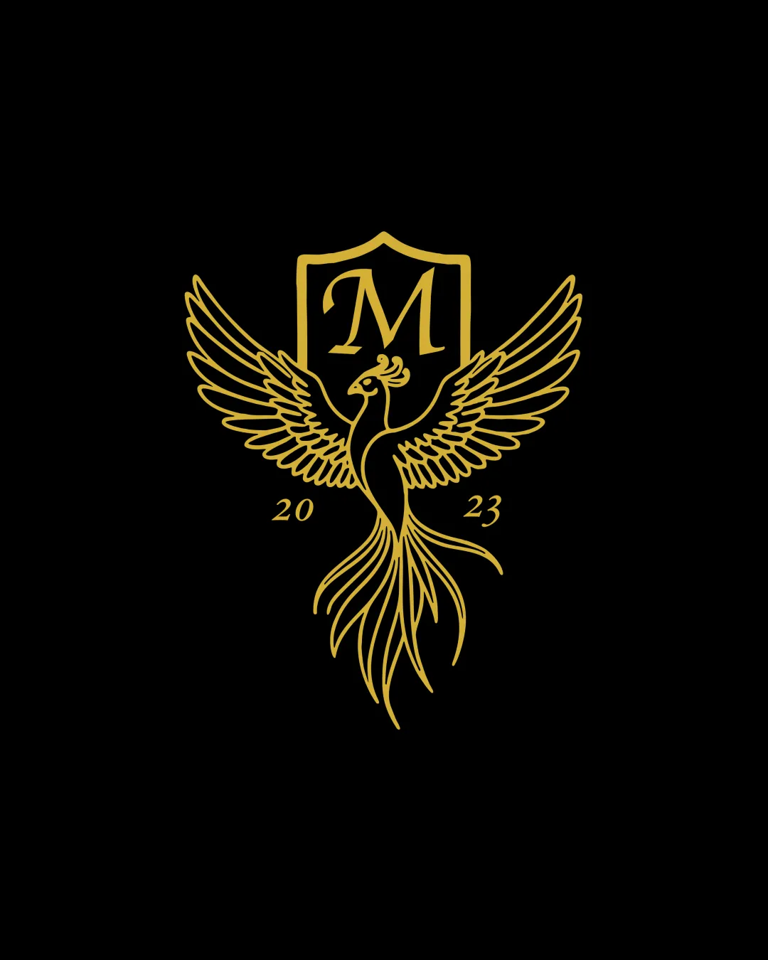
Try it Now!Logo review of M, 2023
 Logo analysis by AI
Logo type:
Style:
Detected symbol:
Detected text:
Business industry:
Review requested by AbuAlqaasem
**If AI can recognize or misinterpret it, so can people.
Structured logo review
Legibility
![]() Letter M is prominently displayed and highly readable.
Letter M is prominently displayed and highly readable.![]() Year '2023' is legible and well spaced.
Year '2023' is legible and well spaced.
Scalability versatility
![]() Line art style can work well in large formats such as signage or luxury branding.
Line art style can work well in large formats such as signage or luxury branding.
![]() Highly detailed bird illustration will lose clarity at small sizes like business cards or favicons.
Highly detailed bird illustration will lose clarity at small sizes like business cards or favicons.![]() Thin lines may disappear in embroidery or small print applications.
Thin lines may disappear in embroidery or small print applications.
200x250 px
100×125 px
50×62 px
Balance alignment
![]() Symmetrical bird and central shield ensure good vertical balance.
Symmetrical bird and central shield ensure good vertical balance.![]() Wingspan is evenly distributed.
Wingspan is evenly distributed.
![]() Text '2023' feels slightly disconnected from the main shield and bird form, breaking some visual cohesion.
Text '2023' feels slightly disconnected from the main shield and bird form, breaking some visual cohesion.

Originality
![]() Phoenix/bird theme with shield adds a unique touch of heritage and luxury.
Phoenix/bird theme with shield adds a unique touch of heritage and luxury.
![]() Use of phoenix/shield is a relatively common luxury or hospitality motif.
Use of phoenix/shield is a relatively common luxury or hospitality motif.![]() Letter-in-shield execution is standard and lacks significant creative twist.
Letter-in-shield execution is standard and lacks significant creative twist.
Logomark wordmark fit
![]() Shield, phoenix, and letter 'M' all tie together well for a unified vintage look.
Shield, phoenix, and letter 'M' all tie together well for a unified vintage look.![]() Serif M complements the traditional aesthetic.
Serif M complements the traditional aesthetic.
![]() Year '2023' feels stylistically less integrated compared to the main symbol and wordmark.
Year '2023' feels stylistically less integrated compared to the main symbol and wordmark.
Aesthetic look
![]() Clean line work and gold-on-black palette deliver a strong luxury feel.
Clean line work and gold-on-black palette deliver a strong luxury feel.![]() Ornate details evoke a premium, high-end brand identity.
Ornate details evoke a premium, high-end brand identity.
![]() Detail may verge on excessive for some applications, risking a slightly busy appearance.
Detail may verge on excessive for some applications, risking a slightly busy appearance.
Dual meaning and misinterpretations
![]() No unintended inappropriate imagery detected.
No unintended inappropriate imagery detected.![]() Symbolism of phoenix conveys positive rebirth/renewal.
Symbolism of phoenix conveys positive rebirth/renewal.
Color harmony
![]() Sophisticated gold and black pairing is classic for luxury sectors.
Sophisticated gold and black pairing is classic for luxury sectors.![]() Monochrome approach aids in maintaining a unified aesthetic.
Monochrome approach aids in maintaining a unified aesthetic.
Gold
#FFD700
Black
#000000