Wondering how your logo performs? 🧐
Get professional logo reviews in seconds and catch design issues in time.
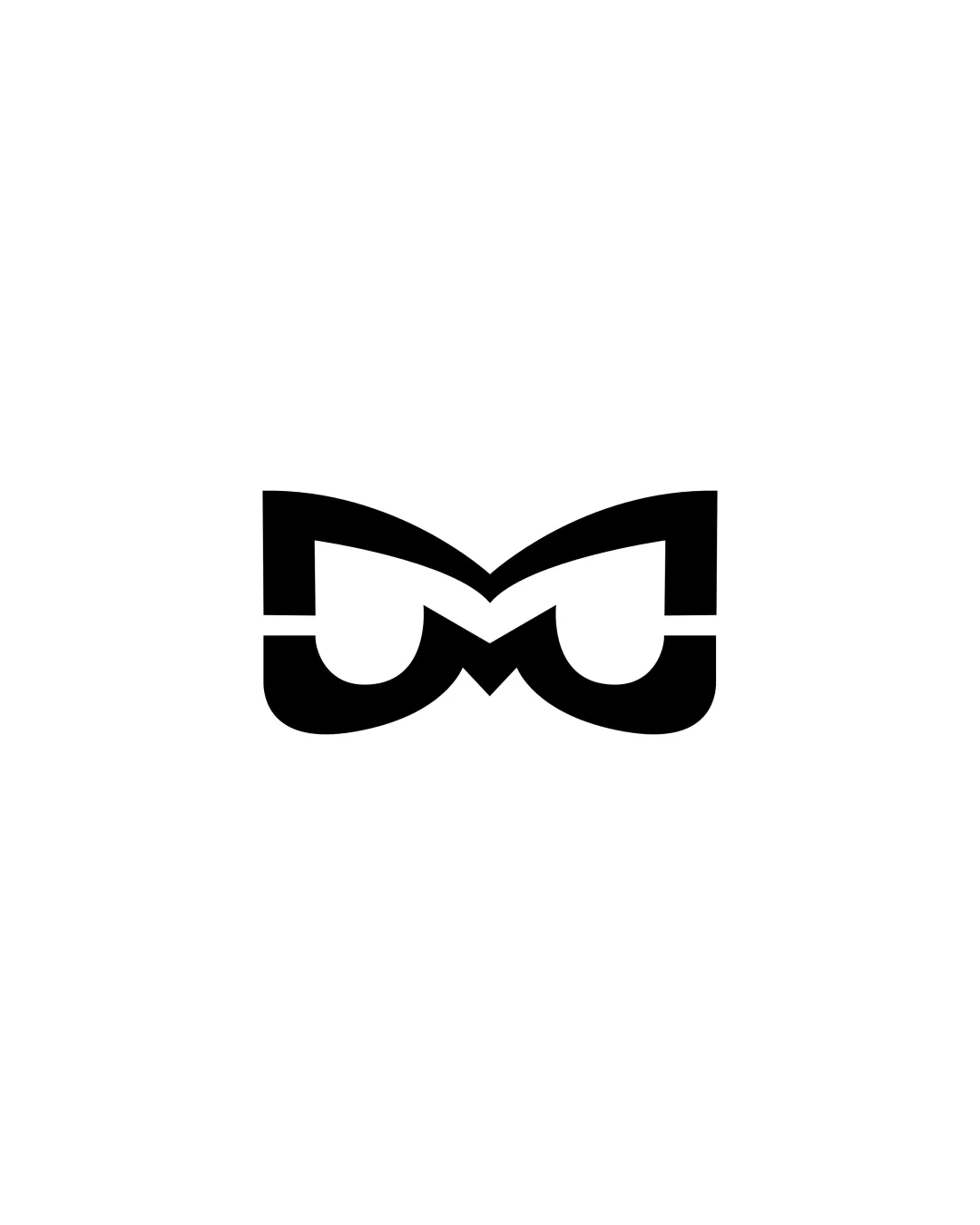
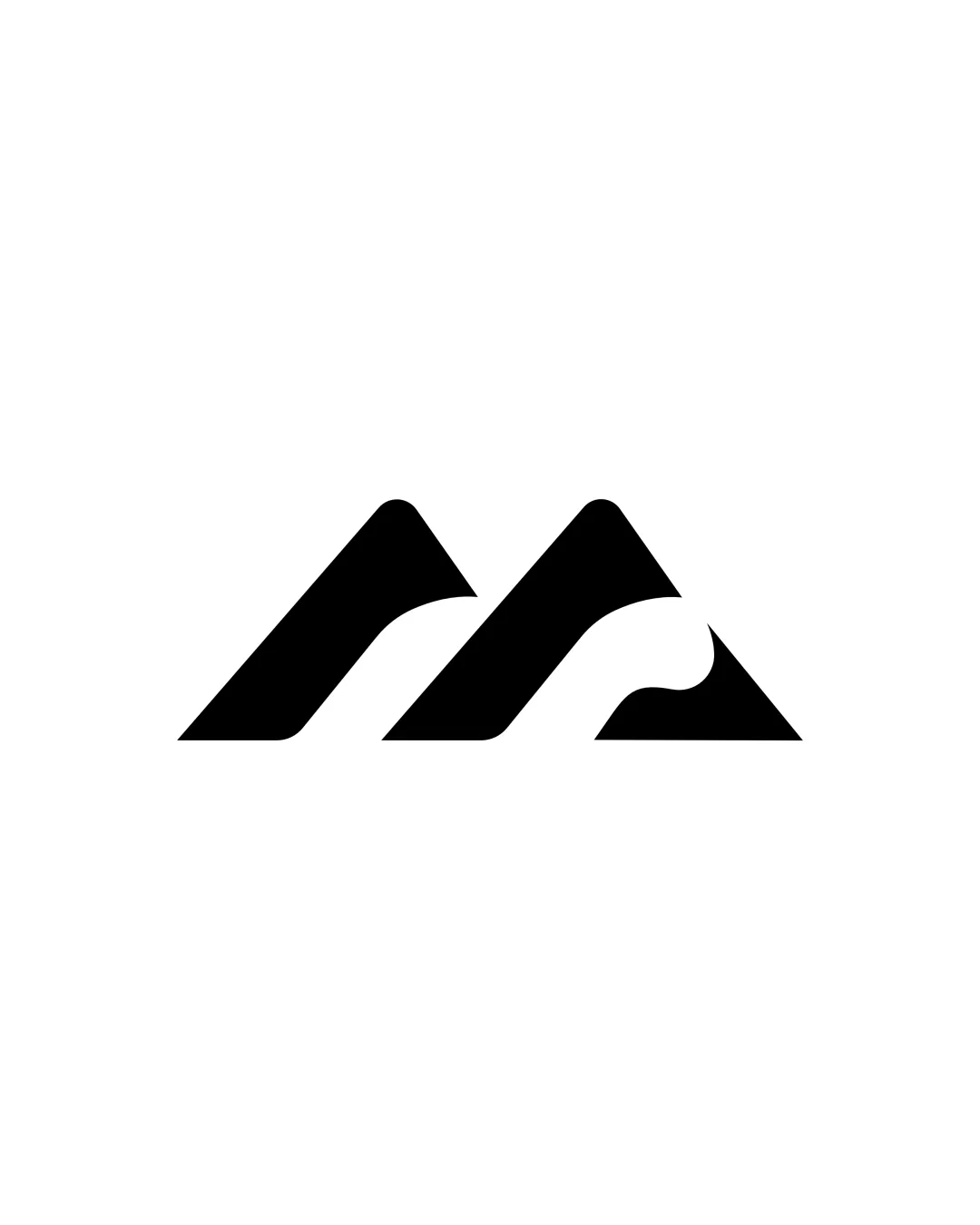
Try it Now!Logo review of two stylized mountain peaks, abstract wave shape
 Logo analysis by AI
Logo type:
Style:
Detected symbol:
Negative space:
Business industry:
Review requested by AbuAlqaasem
**If AI can recognize or misinterpret it, so can people.
Structured logo review
Scalability versatility
![]() Extremely simple geometric form ensures good reproduction at all sizes.
Extremely simple geometric form ensures good reproduction at all sizes.![]() No fine details or gradients—adapts well to embroidery, signage, favicons, and print.
No fine details or gradients—adapts well to embroidery, signage, favicons, and print.
200x250 px
100×125 px
50×62 px
Balance alignment
![]() Both peaks are visually balanced symmetrically.
Both peaks are visually balanced symmetrically.![]() Consistent stroke width and spacing between elements.
Consistent stroke width and spacing between elements.

Originality
![]() Wave-like negative space subtly adds a second layer of meaning.
Wave-like negative space subtly adds a second layer of meaning.![]() Minimalist abstraction avoids overused realism.
Minimalist abstraction avoids overused realism.
![]() Mountain peaks are an extremely common motif in outdoor/adventure branding.
Mountain peaks are an extremely common motif in outdoor/adventure branding.![]() Overall symbol feels familiar, lacking strong distinguishing features.
Overall symbol feels familiar, lacking strong distinguishing features.
Aesthetic look
![]() Clean and modern with strong visual appeal.
Clean and modern with strong visual appeal.![]() No unnecessary elements or distractions.
No unnecessary elements or distractions.
![]() Very minimal, risks being forgettable among many similar logos.
Very minimal, risks being forgettable among many similar logos.
Dual meaning and misinterpretations
![]() No risk of inappropriate or ambiguous forms.
No risk of inappropriate or ambiguous forms.![]() Abstract wave is clear and harmless.
Abstract wave is clear and harmless.
Color harmony
![]() Single black color on white background creates maximum contrast.
Single black color on white background creates maximum contrast.![]() Monochrome works universally for all applications.
Monochrome works universally for all applications.
Black
#000000
White
#FFFFFF