Wondering how your logo performs? 🧐
Get professional logo reviews in seconds and catch design issues in time.
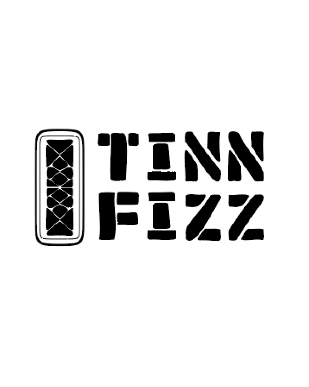
Try it Now!Logo review of TINN FIZZ
 Logo analysis by AI
Logo type:
Style:
Detected symbol:
Detected text:
Business industry:
Review requested by Asadkhan12
**If AI can recognize or misinterpret it, so can people.
Structured logo review
Legibility
![]() Bold stencil lettering creates strong visibility at multiple sizes.
Bold stencil lettering creates strong visibility at multiple sizes.![]() Text is mostly easy to read and distinctive in style.
Text is mostly easy to read and distinctive in style.
![]() The stencil effect, especially on letters like 'I' and 'N', slightly decreases instant readability.
The stencil effect, especially on letters like 'I' and 'N', slightly decreases instant readability.![]() Spacing between characters in 'TINN' is somewhat uneven, causing minor legibility challenges.
Spacing between characters in 'TINN' is somewhat uneven, causing minor legibility challenges.
Scalability versatility
![]() Simple, high-contrast composition will reproduce well in large and small formats.
Simple, high-contrast composition will reproduce well in large and small formats.![]() Strong shapes are suitable for use on packaging, drink labels, and apparel.
Strong shapes are suitable for use on packaging, drink labels, and apparel.
![]() Fine details in the crisscross pattern of the symbol may get lost at extremely small sizes (e.g., favicon, small embroidery).
Fine details in the crisscross pattern of the symbol may get lost at extremely small sizes (e.g., favicon, small embroidery).
200x250 px
100×125 px
50×62 px
Balance alignment
![]() Overall left-to-right alignment feels intentional and grounded.
Overall left-to-right alignment feels intentional and grounded.![]() Wordmark is weighted to balance the symbol visually.
Wordmark is weighted to balance the symbol visually.
![]() The symbol's tall rectangle appears heavy and slightly disproportionate to the type, dominating the left side.
The symbol's tall rectangle appears heavy and slightly disproportionate to the type, dominating the left side.![]() The negative space between the symbol and wordmark is less than optimal, causing some visual tension.
The negative space between the symbol and wordmark is less than optimal, causing some visual tension.

Originality
![]() Stencil effect adds some uniqueness and ties to a fun, casual vibe.
Stencil effect adds some uniqueness and ties to a fun, casual vibe.![]() The crisscross pattern inside the rectangle is an interesting touch and may hint at design inspiration (cocktail shaker, glass).
The crisscross pattern inside the rectangle is an interesting touch and may hint at design inspiration (cocktail shaker, glass).
![]() The rectangular symbol is somewhat generic and lacks a distinctive, iconic feature that instantly relates to the brand.
The rectangular symbol is somewhat generic and lacks a distinctive, iconic feature that instantly relates to the brand.![]() Stencil letterforms are widely used and not highly original on their own.
Stencil letterforms are widely used and not highly original on their own.
Logomark wordmark fit
![]() Both elements share similar boldness and weight.
Both elements share similar boldness and weight.![]() Design elements attempt to feel cohesive through geometry and black fill.
Design elements attempt to feel cohesive through geometry and black fill.
![]() The logomark's fine interior lines contrast with the strong solid fills of the wordmark, causing a slight mismatch in style.
The logomark's fine interior lines contrast with the strong solid fills of the wordmark, causing a slight mismatch in style.![]() Symbol to wordmark scale could be adjusted for better cohesion.
Symbol to wordmark scale could be adjusted for better cohesion.
Aesthetic look
![]() Clean and visually striking.
Clean and visually striking.![]() Monochrome palette enhances sophistication and flexibility.
Monochrome palette enhances sophistication and flexibility.![]() Playful stencil pattern adds a craft feel suitable to the beverage space.
Playful stencil pattern adds a craft feel suitable to the beverage space.
![]() Rectangular logomark itself lacks strong aesthetic impact when isolated.
Rectangular logomark itself lacks strong aesthetic impact when isolated.![]() Slightly busy internal pattern competes with simplicity of wordmark.
Slightly busy internal pattern competes with simplicity of wordmark.
Dual meaning and misinterpretations
![]() No inappropriate or confusing visual associations detected.
No inappropriate or confusing visual associations detected.![]() Composition is professional and brand-safe.
Composition is professional and brand-safe.
Color harmony
![]() Black and white colorway offers timeless contrast and broad application.
Black and white colorway offers timeless contrast and broad application.![]() No clashing or excessive coloring present.
No clashing or excessive coloring present.
Black
#000000
White
#FFFFFF