Wondering how your logo performs? 🧐
Get professional logo reviews in seconds and catch design issues in time.
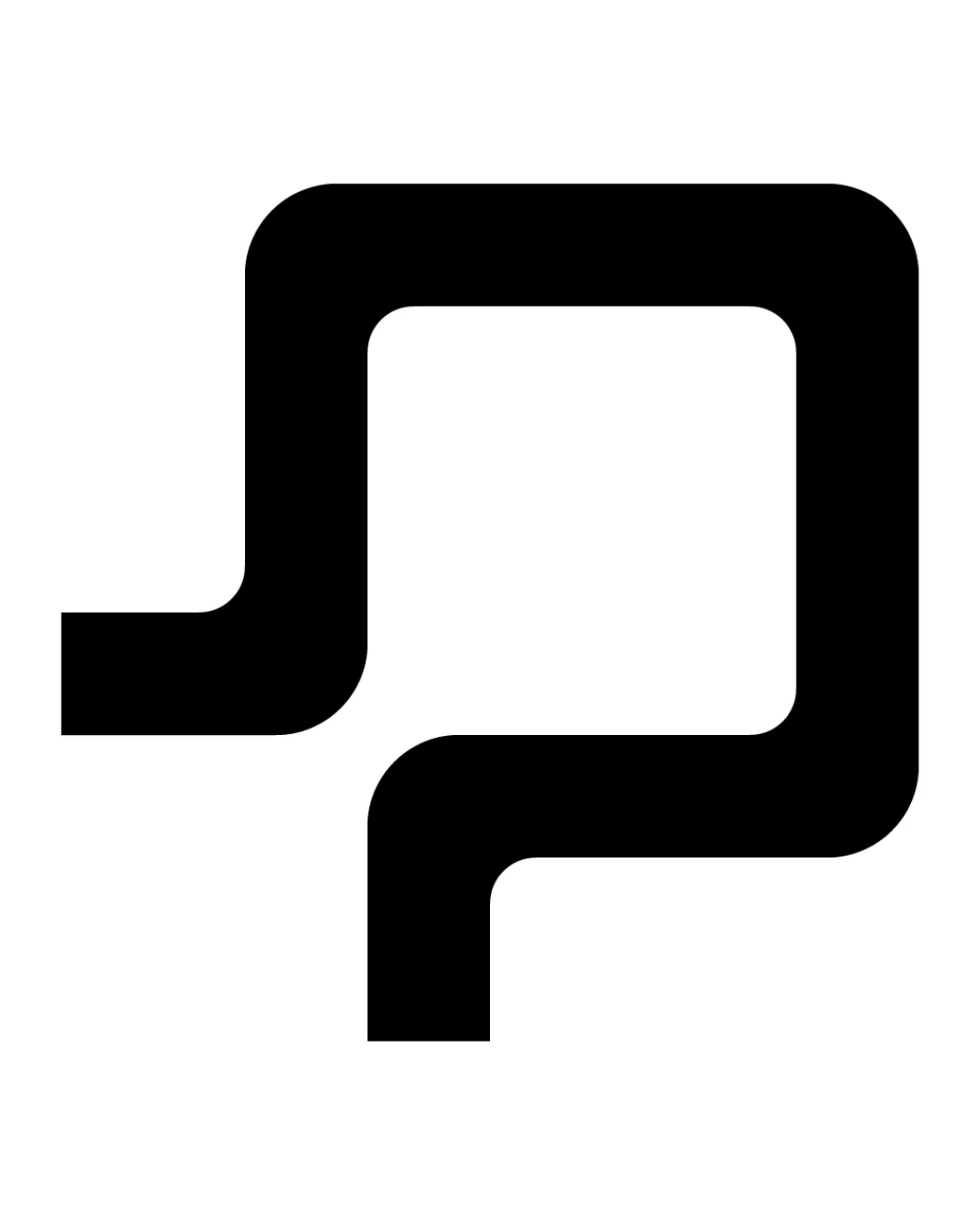
Try it Now!Logo review of abstract geometric monogram, appears as letter P m..
 Logo analysis by AI
Logo type:
Style:
Detected symbol:
Negative space:
Business industry:
Review requested by Shankardesigns
**If AI can recognize or misinterpret it, so can people.
Structured logo review
Scalability versatility
![]() Extremely bold lines ensure visibility at any size.
Extremely bold lines ensure visibility at any size.![]() Minimalist shape will reproduce well on digital and print formats.
Minimalist shape will reproduce well on digital and print formats.![]() Ideal for use as a favicon, app icon, or large signage due to simplicity.
Ideal for use as a favicon, app icon, or large signage due to simplicity.
200x250 px
100×125 px
50×62 px
Balance alignment
![]() Symmetrical and well balanced due to mirrored elements.
Symmetrical and well balanced due to mirrored elements.![]() Central negative space maintains alignment and visual interest.
Central negative space maintains alignment and visual interest.

Originality
![]() Utilizes mirrored monogram concept for a unique, tech-forward appearance.
Utilizes mirrored monogram concept for a unique, tech-forward appearance.
![]() Abstract mirrored forms are becoming more common in tech branding.
Abstract mirrored forms are becoming more common in tech branding.![]() Design lacks distinct proprietary detailing that would make it truly one-of-a-kind.
Design lacks distinct proprietary detailing that would make it truly one-of-a-kind.
Aesthetic look
![]() Clean, modern, and aesthetically pleasing with bold simplicity.
Clean, modern, and aesthetically pleasing with bold simplicity.![]() No unnecessary decorative elements.
No unnecessary decorative elements.
![]() The shape is so abstract that the intended letter(s) may not be immediately clear to viewers.
The shape is so abstract that the intended letter(s) may not be immediately clear to viewers.
Dual meaning and misinterpretations
![]() No inappropriate or offensive shapes detected.
No inappropriate or offensive shapes detected.
![]() The abstraction may cause confusion regarding what the symbol represents, especially in markets unfamiliar with mirrored or monogram concepts.
The abstraction may cause confusion regarding what the symbol represents, especially in markets unfamiliar with mirrored or monogram concepts.
Color harmony
![]() Single color offers maximum versatility.
Single color offers maximum versatility.![]() High contrast ensures visibility on any background.
High contrast ensures visibility on any background.
Black
#000000
White
#FFFFFF