Wondering how your logo performs? 🧐
Get professional logo reviews in seconds and catch design issues in time.
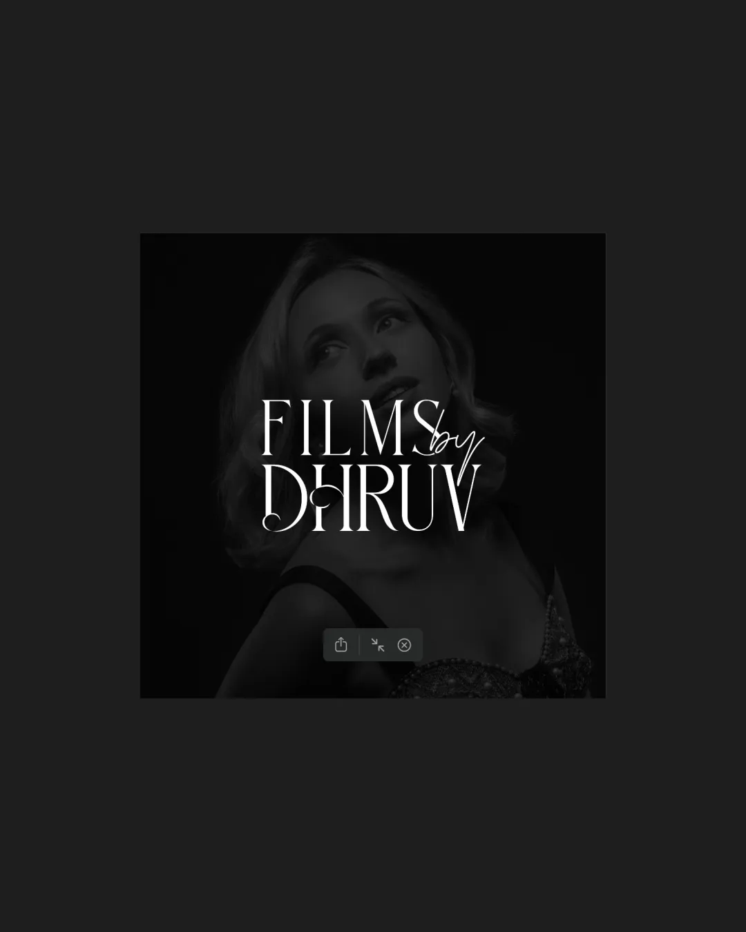
Try it Now!Logo review of FILMS by DHRUV
 Logo analysis by AI
Logo type:
Style:
Detected text:
Business industry:
Review requested by Filmsbydhruv.in
**If AI can recognize or misinterpret it, so can people.
Structured logo review
Legibility
![]() Main serif text is mostly readable with good contrast against the background.
Main serif text is mostly readable with good contrast against the background.![]() Distinct white color ensures visibility over the dark background.
Distinct white color ensures visibility over the dark background.
![]() Handwritten 'by' overlaps with the main serif text, reducing legibility.
Handwritten 'by' overlaps with the main serif text, reducing legibility.![]() Fine strokes in the handwritten script lose clarity at smaller sizes.
Fine strokes in the handwritten script lose clarity at smaller sizes.
Scalability versatility
![]() Simple color palette aids in some scaling scenarios.
Simple color palette aids in some scaling scenarios.![]() Wordmark can be recognizable on medium formats such as posters.
Wordmark can be recognizable on medium formats such as posters.
![]() Fine details in the handwritten 'by' and the thin serifs may be lost on business cards or small web icons.
Fine details in the handwritten 'by' and the thin serifs may be lost on business cards or small web icons.![]() Complexity due to overlapping text makes it hard to scale down cleanly.
Complexity due to overlapping text makes it hard to scale down cleanly.![]() Would not translate well to embroidery or single-color stamping.
Would not translate well to embroidery or single-color stamping.
200x250 px
100×125 px
50×62 px
Balance alignment
![]() The serif type is well-centered and symmetrical.
The serif type is well-centered and symmetrical.![]() Overall arrangement maintains a central focal point.
Overall arrangement maintains a central focal point.
![]() The handwritten 'by' feels awkwardly positioned and disrupts harmony.
The handwritten 'by' feels awkwardly positioned and disrupts harmony.![]() Top section looks slightly crowded due to overlaying elements, making the overall mark less balanced.
Top section looks slightly crowded due to overlaying elements, making the overall mark less balanced.

Originality
![]() Combination of elegant serif with handwritten accent adds personality.
Combination of elegant serif with handwritten accent adds personality.![]() Not a generic sans-serif—stylistically distinct.
Not a generic sans-serif—stylistically distinct.
![]() Pairing script with serif for 'Films by [Name]' is a common trope in creative industries.
Pairing script with serif for 'Films by [Name]' is a common trope in creative industries.![]() No unique mark or logomark that sets it apart distinctly.
No unique mark or logomark that sets it apart distinctly.
Aesthetic look
![]() Elegant serif conveys a premium, creative feel.
Elegant serif conveys a premium, creative feel.![]() Monochromatic approach is visually calm and professional.
Monochromatic approach is visually calm and professional.
![]() Overlapping script and serif make it visually busy.
Overlapping script and serif make it visually busy.![]() The stylistic difference between elements feels forced instead of harmonious.
The stylistic difference between elements feels forced instead of harmonious.![]() Could feel cliché for the film/photography space.
Could feel cliché for the film/photography space.
Dual meaning and misinterpretations
![]() No inappropriate or ambiguous shapes present.
No inappropriate or ambiguous shapes present.![]() The message is clear and straightforward.
The message is clear and straightforward.
Color harmony
![]() Limited to monochrome, ensuring harmonious appearance.
Limited to monochrome, ensuring harmonious appearance.![]() White text stands out effectively on a dark background.
White text stands out effectively on a dark background.
White
#FFFFFF
Very Dark Gray
#151515
Black
#000000