Wondering how your logo performs? 🧐
Get professional logo reviews in seconds and catch design issues in time.
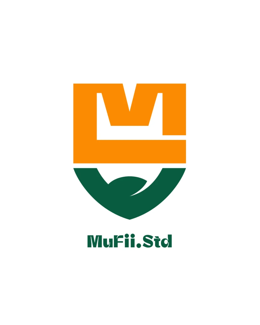
Try it Now!Logo review of MuFii.Std
 Logo analysis by AI
Logo type:
Style:
Detected symbol:
Negative space:
Detected text:
Business industry:
Review requested by Mufii.std
**If AI can recognize or misinterpret it, so can people.
Structured logo review
Legibility
![]() The text 'MuFii.Std' is generally clear and readable.
The text 'MuFii.Std' is generally clear and readable.![]() Typography stands out against the white background.
Typography stands out against the white background.
![]() The dot between 'MuFii' and 'Std' could be misread at small sizes.
The dot between 'MuFii' and 'Std' could be misread at small sizes.![]() Bold, condensed style may suffer from slight tightness in spacing.
Bold, condensed style may suffer from slight tightness in spacing.
Scalability versatility
![]() Bold, simple forms aid legibility at many sizes.
Bold, simple forms aid legibility at many sizes.![]() Distinct shape would look strong on digital screens and signage.
Distinct shape would look strong on digital screens and signage.
![]() The interior negative space and delicate alignment may get lost at very small sizes (e.g., favicon, embroidery).
The interior negative space and delicate alignment may get lost at very small sizes (e.g., favicon, embroidery).![]() Color block separation may not translate well in black-and-white or single-color applications.
Color block separation may not translate well in black-and-white or single-color applications.
200x250 px
100×125 px
50×62 px
Balance alignment
![]() Logo feels visually stable with strong geometric symmetry.
Logo feels visually stable with strong geometric symmetry.![]() Wordmark is centered perfectly beneath the mark.
Wordmark is centered perfectly beneath the mark.
![]() Slight imbalance between the boldness of the orange upper section and the green lower section.
Slight imbalance between the boldness of the orange upper section and the green lower section.![]() The top-heavy structure makes the lower section feel somewhat visually lighter.
The top-heavy structure makes the lower section feel somewhat visually lighter.

Originality
![]() Unique geometric fusion for the letter 'M' and shield motif.
Unique geometric fusion for the letter 'M' and shield motif.![]() Creative negative space integration adds unique flair.
Creative negative space integration adds unique flair.
![]() Shield and 'M' combinations are not entirely novel in creative/educational sectors.
Shield and 'M' combinations are not entirely novel in creative/educational sectors.![]() Color blocking approach is currently trendy but risks becoming dated.
Color blocking approach is currently trendy but risks becoming dated.
Logomark wordmark fit
![]() Typographic style complements the geometric qualities of the icon.
Typographic style complements the geometric qualities of the icon.![]() Proportions between logomark and wordmark are mostly harmonious.
Proportions between logomark and wordmark are mostly harmonious.
![]() Wordmark could feel slightly generic compared to the distinctive symbol.
Wordmark could feel slightly generic compared to the distinctive symbol.![]() A bit more customization in the typography could enhance brand cohesion.
A bit more customization in the typography could enhance brand cohesion.
Aesthetic look
![]() Color contrast is bold and energetic.
Color contrast is bold and energetic.![]() Simple execution yields a modern, professional appearance.
Simple execution yields a modern, professional appearance.
![]() Geometric segments may appear overly rigid and may not appeal to all audiences.
Geometric segments may appear overly rigid and may not appeal to all audiences.![]() The combination of orange and green can feel harsh if not carefully managed across brand materials.
The combination of orange and green can feel harsh if not carefully managed across brand materials.
Dual meaning and misinterpretations
![]() No inappropriate or unintended symbolism detected.
No inappropriate or unintended symbolism detected.![]() Symbol remains abstract but positive.
Symbol remains abstract but positive.
Color harmony
![]() Orange and green are contrasting yet harmonious, making the logo stand out.
Orange and green are contrasting yet harmonious, making the logo stand out.![]() Palette stays within two primary colors with white space balancing the impact.
Palette stays within two primary colors with white space balancing the impact.
![]() The color pairing, while bold, can be polarizing and is difficult to harmonize across all collateral.
The color pairing, while bold, can be polarizing and is difficult to harmonize across all collateral.![]() Loss of effect in monochrome scenarios.
Loss of effect in monochrome scenarios.
Orange
#F7931A
Green
#105D3C
White
#FFFFFF