Wondering how your logo performs? 🧐
Get professional logo reviews in seconds and catch design issues in time.
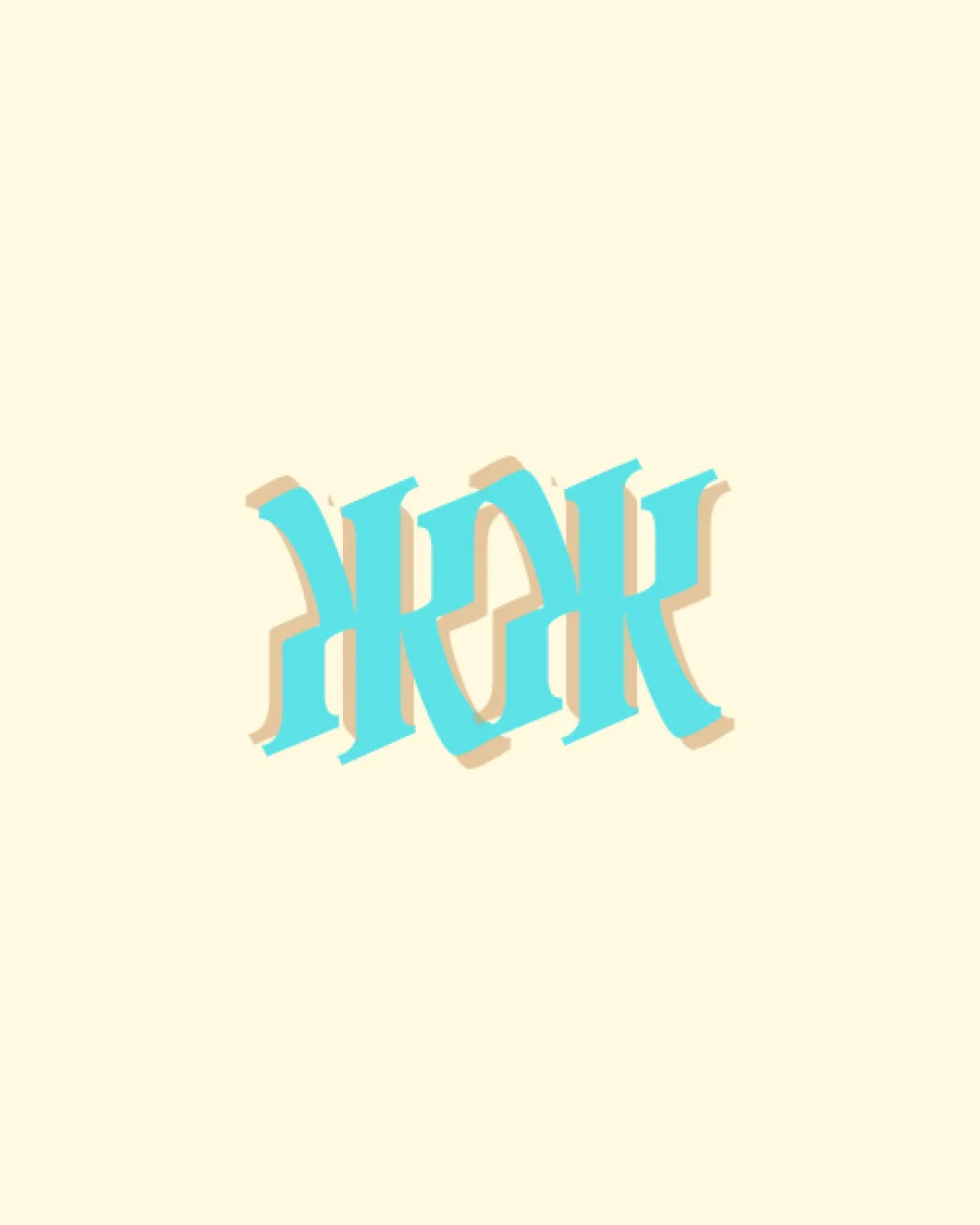
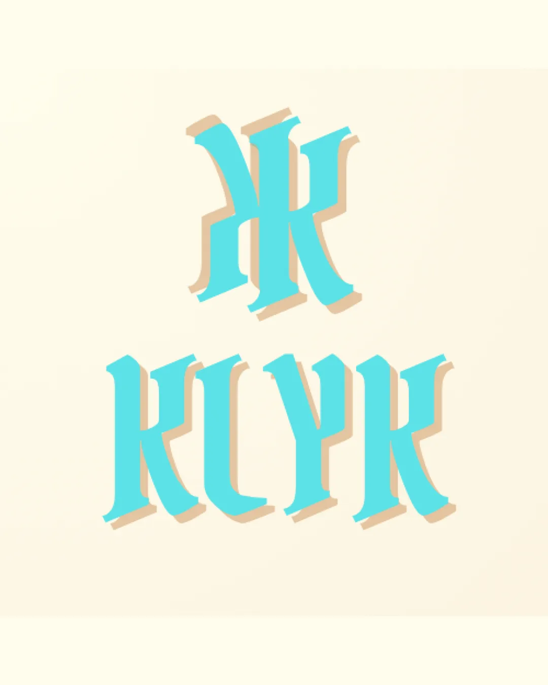
Try it Now!Logo review of KLYK
 Logo analysis by AI
Logo type:
Style:
Detected symbol:
Detected text:
Business industry:
Review requested by XavierShayne35
**If AI can recognize or misinterpret it, so can people.
Structured logo review
Legibility
![]() Large, bold letterforms, visible contrast between foreground and background.
Large, bold letterforms, visible contrast between foreground and background.
![]() Elaborate gothic style makes the wordmark difficult to interpret at a glance.
Elaborate gothic style makes the wordmark difficult to interpret at a glance.![]() Upper monogram is ambiguous and can be misread.
Upper monogram is ambiguous and can be misread.![]() Letter shapes may confuse viewers unfamiliar with gothic script.
Letter shapes may confuse viewers unfamiliar with gothic script.
Scalability versatility
![]() Bold type ensures better visibility in larger formats such as signage or posters.
Bold type ensures better visibility in larger formats such as signage or posters.
![]() Heavy ornamentation and shadowing will lose clarity at small sizes, such as business cards or app icons.
Heavy ornamentation and shadowing will lose clarity at small sizes, such as business cards or app icons.![]() Fine details and 3D effects are not embroidery-friendly.
Fine details and 3D effects are not embroidery-friendly.![]() Does not translate well to minimalist or monochrome mockups.
Does not translate well to minimalist or monochrome mockups.
200x250 px
100×125 px
50×62 px
Balance alignment
![]() Vertical layout structure feels stable.
Vertical layout structure feels stable.![]() Shadows add dimensionality, giving an impression of depth.
Shadows add dimensionality, giving an impression of depth.
![]() The monogram and wordmark feel slightly disconnected by style and proportion.
The monogram and wordmark feel slightly disconnected by style and proportion.![]() Upper symbol may overpower the wordmark depending on use.
Upper symbol may overpower the wordmark depending on use.

Originality
![]() Ornate, decorative approach is uncommon in modern logos.
Ornate, decorative approach is uncommon in modern logos.![]() Shadow and color combination create some distinction.
Shadow and color combination create some distinction.
![]() Gothic letter styling is derivative of classic scripts and not highly innovative.
Gothic letter styling is derivative of classic scripts and not highly innovative.![]() Monogram does not introduce a unique visual twist beyond the script.
Monogram does not introduce a unique visual twist beyond the script.
Logomark wordmark fit
![]() Both logomark and wordmark use similar colors and shadow effects, aiming for cohesion.
Both logomark and wordmark use similar colors and shadow effects, aiming for cohesion.
![]() Difference in style: logomark appears more abstract and exaggerated than the wordmark.
Difference in style: logomark appears more abstract and exaggerated than the wordmark.![]() Scale and visual weight could be more harmonized.
Scale and visual weight could be more harmonized.
Aesthetic look
![]() Carefully executed drop-shadow and color pairing elevate appearance.
Carefully executed drop-shadow and color pairing elevate appearance.![]() Vintage aesthetic appeals to nostalgia or retro themes.
Vintage aesthetic appeals to nostalgia or retro themes.
![]() Aesthetic may not appeal to modern and minimalistic tastes.
Aesthetic may not appeal to modern and minimalistic tastes.![]() Heavy styling can appear dated, risking limited appeal.
Heavy styling can appear dated, risking limited appeal.
Dual meaning and misinterpretations
![]() No overtly inappropriate or confusing shapes identified.
No overtly inappropriate or confusing shapes identified.
Color harmony
![]() Color combination is pleasing and well-balanced.
Color combination is pleasing and well-balanced.![]() High contrast supports visibility.
High contrast supports visibility.
![]() Limitation to mostly two colors may restrict brand flexibility in some contexts.
Limitation to mostly two colors may restrict brand flexibility in some contexts.
Cyan
#57E5F6
Beige
#EED9B6