Wondering how your logo performs? 🧐
Get professional logo reviews in seconds and catch design issues in time.
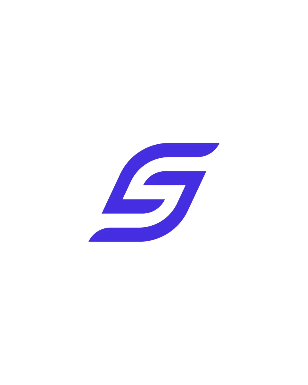
Try it Now!Logo review of S
 Logo analysis by AI
Logo type:
Style:
Detected symbol:
Detected text:
Business industry:
Review requested by Debbiealyw
**If AI can recognize or misinterpret it, so can people.
Structured logo review
Scalability versatility
![]() Clean, bold lines ensure excellent scalability for use on both small and large formats.
Clean, bold lines ensure excellent scalability for use on both small and large formats.![]() Simple structure makes it suitable for a variety of applications including app icons, favicons, and embroidery.
Simple structure makes it suitable for a variety of applications including app icons, favicons, and embroidery.
200x250 px
100×125 px
50×62 px
Balance alignment
![]() Perfectly balanced design with even negative space and symmetry.
Perfectly balanced design with even negative space and symmetry.![]() Curvature and line thickness are consistent throughout.
Curvature and line thickness are consistent throughout.

Originality
![]() The 'S' is clearly constructed with a unique geometric approach.
The 'S' is clearly constructed with a unique geometric approach.![]() Stands out among traditional 'S' monogram logos by using dynamic lines and angles.
Stands out among traditional 'S' monogram logos by using dynamic lines and angles.
![]() The single-letter monogram is a common approach across industries and risks feeling generic unless linked to a strong brand identity.
The single-letter monogram is a common approach across industries and risks feeling generic unless linked to a strong brand identity.
Aesthetic look
![]() Modern minimalism contributes to a crisp and professional appearance.
Modern minimalism contributes to a crisp and professional appearance.![]() No excessive detail or unnecessary decoration enhances visual appeal.
No excessive detail or unnecessary decoration enhances visual appeal.
Dual meaning and misinterpretations
![]() No unintended shapes or misinterpretations detected.
No unintended shapes or misinterpretations detected.
Color harmony
![]() Limited and harmonious color palette with strong contrast for maximum legibility and visual impact.
Limited and harmonious color palette with strong contrast for maximum legibility and visual impact.
BlueViolet
#4939EF
White
#FFFFFF