Wondering how your logo performs? 🧐
Get professional logo reviews in seconds and catch design issues in time.
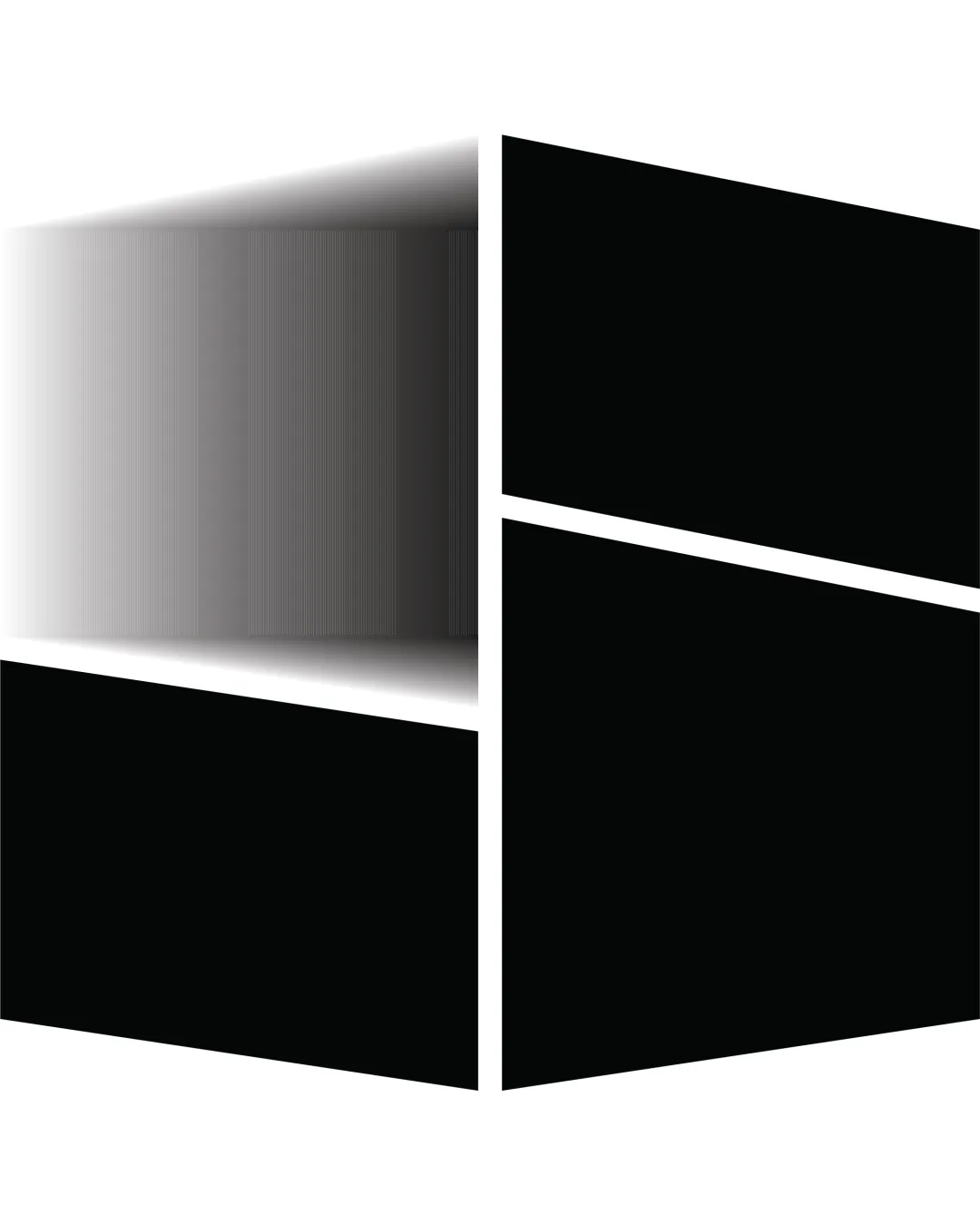
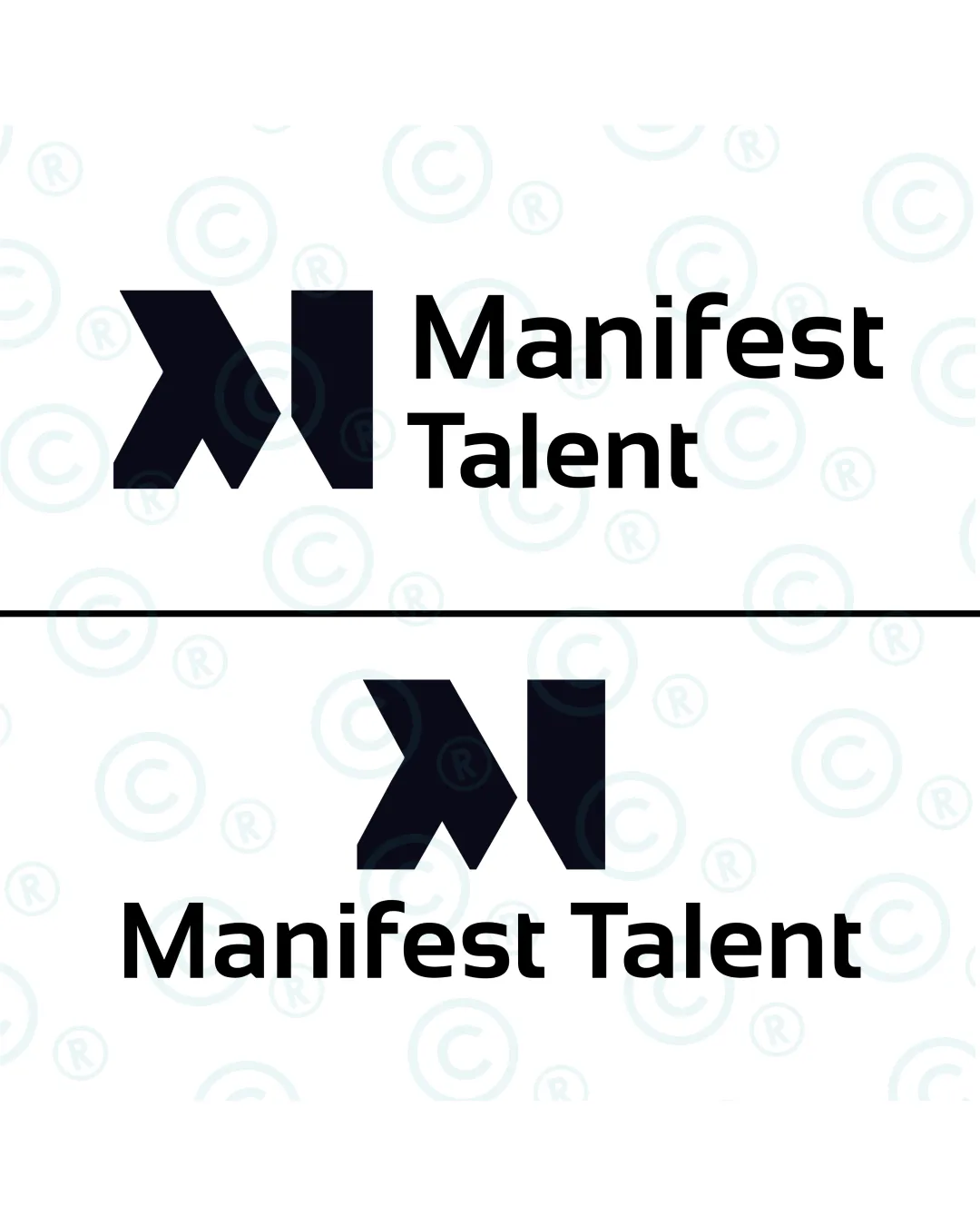
Try it Now!Logo review of Manifest Talent
 Logo analysis by AI
Logo type:
Style:
Detected symbol:
Detected text:
Business industry:
Review requested by Halima9
**If AI can recognize or misinterpret it, so can people.
Structured logo review
Legibility
![]() Clear, sans-serif typography ensures high readability.
Clear, sans-serif typography ensures high readability.![]() Consistent letter spacing with strong contrast against the background.
Consistent letter spacing with strong contrast against the background.
Scalability versatility
![]() Bold shapes and typography retain clarity at small and large sizes.
Bold shapes and typography retain clarity at small and large sizes.![]() Logo will work well on business cards, digital use, and billboards.
Logo will work well on business cards, digital use, and billboards.
![]() The detailed sharp angular cuts in the symbol may lose definition when scaled down significantly (e.g., favicon, embroidery).
The detailed sharp angular cuts in the symbol may lose definition when scaled down significantly (e.g., favicon, embroidery).
200x250 px
100×125 px
50×62 px
Balance alignment
![]() Alignment between the logomark and wordmark is visually balanced.
Alignment between the logomark and wordmark is visually balanced.![]() Both horizontal and stacked versions maintain a consistent relationship between elements.
Both horizontal and stacked versions maintain a consistent relationship between elements.
![]() The solid, heavy logomark marginally outweighs the wordmark, causing a slight imbalance in the overall optical weight.
The solid, heavy logomark marginally outweighs the wordmark, causing a slight imbalance in the overall optical weight.

Originality
![]() Abstract geometric representation of 'M' offers mild uniqueness.
Abstract geometric representation of 'M' offers mild uniqueness.![]() Modern and clean geometric style shows some distinction.
Modern and clean geometric style shows some distinction.
![]() Geometric 'M' marks are relatively common in the talent/recruitment/HR sector.
Geometric 'M' marks are relatively common in the talent/recruitment/HR sector.![]() Concept could be pushed further for a more memorable, ownable mark.
Concept could be pushed further for a more memorable, ownable mark.
Logomark wordmark fit
![]() Styles are consistent and modern, both logomark and wordmark feel designed for each other.
Styles are consistent and modern, both logomark and wordmark feel designed for each other.![]() Proportions between logomark and wordmark are generally appropriate.
Proportions between logomark and wordmark are generally appropriate.
![]() The geometric boldness of the mark slightly overshadows the lighter weight of the wordmark. Tighter integration would further elevate the pairing.
The geometric boldness of the mark slightly overshadows the lighter weight of the wordmark. Tighter integration would further elevate the pairing.
Aesthetic look
![]() Minimalist and bold, with a modern appeal.
Minimalist and bold, with a modern appeal.![]() Clean layout and absence of unnecessary ornamentation strengthen the brand's authority.
Clean layout and absence of unnecessary ornamentation strengthen the brand's authority.
![]() The mark comes off as generic and lacks the refined sophistication expected from top-tier brands.
The mark comes off as generic and lacks the refined sophistication expected from top-tier brands.
Dual meaning and misinterpretations
![]() No inappropriate or accidental imagery detected in the logo composition.
No inappropriate or accidental imagery detected in the logo composition.
Color harmony
![]() Classic black and white palette ensures timelessness and maximal versatility.
Classic black and white palette ensures timelessness and maximal versatility.![]() Strong color contrast enhances legibility and professionalism.
Strong color contrast enhances legibility and professionalism.
Black
#000000
White
#FFFFFF