Wondering how your logo performs? 🧐
Get professional logo reviews in seconds and catch design issues in time.
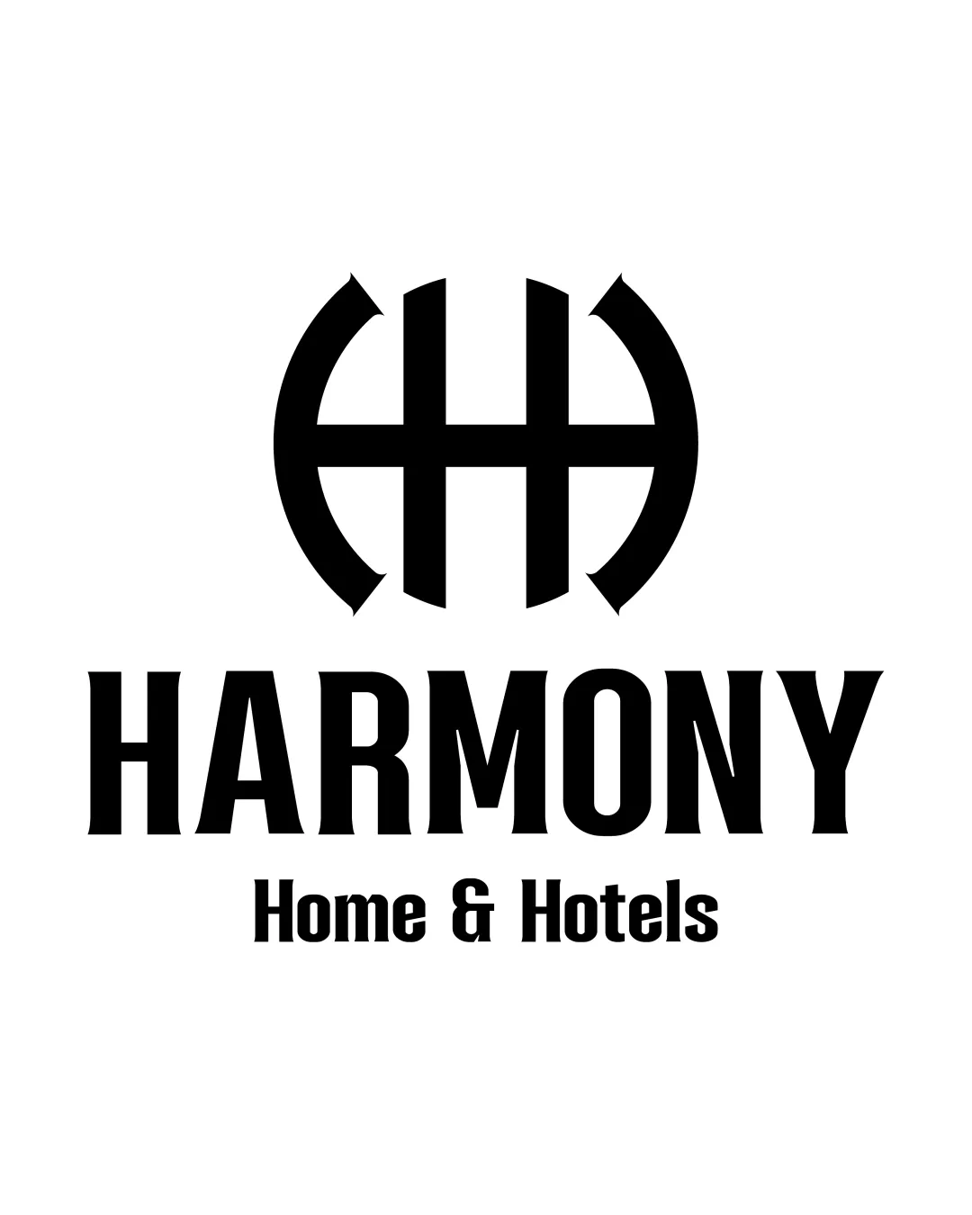
Try it Now!Logo review of HARMONY Home & Hotels
 Logo analysis by AI
Logo type:
Style:
Detected symbol:
Detected text:
Business industry:
Review requested by Nero_news
**If AI can recognize or misinterpret it, so can people.
Structured logo review
Legibility
![]() All text is highly readable due to the strong contrasting black on white and bold typeface.
All text is highly readable due to the strong contrasting black on white and bold typeface.![]() Font size and spacing help reinforce legibility even at a distance.
Font size and spacing help reinforce legibility even at a distance.
Scalability versatility
![]() Bold lines and simple forms are adaptable for large-scale signage and digital platforms.
Bold lines and simple forms are adaptable for large-scale signage and digital platforms.![]() Logo works clearly on business cards, promotional materials, and web icons.
Logo works clearly on business cards, promotional materials, and web icons.
![]() The intricate monogram might lose some clarity at small favicon scale, especially the space within the symbol.
The intricate monogram might lose some clarity at small favicon scale, especially the space within the symbol.![]() Logo should be tested in embroidery and etching applications to ensure the thin spacing does not cause merging or loss of definition.
Logo should be tested in embroidery and etching applications to ensure the thin spacing does not cause merging or loss of definition.
200x250 px
100×125 px
50×62 px
Balance alignment
![]() Monogram is visually centered above the wordmark, creating strong vertical alignment.
Monogram is visually centered above the wordmark, creating strong vertical alignment.![]() Proportionate spacing between the mark and the two lines of text is clear and deliberate.
Proportionate spacing between the mark and the two lines of text is clear and deliberate.
![]() There is slight visual heaviness in the symbol compared to the comparatively thinner 'Home & Hotels' subtext, causing minor imbalance.
There is slight visual heaviness in the symbol compared to the comparatively thinner 'Home & Hotels' subtext, causing minor imbalance.

Originality
![]() Creative use of the 'HH' initials to form a geometric monogram linked to the brand name.
Creative use of the 'HH' initials to form a geometric monogram linked to the brand name.![]() The rounded framing adds unique character beyond a plain monogram.
The rounded framing adds unique character beyond a plain monogram.
![]() Double-arched 'H' forms are not entirely unique in hospitality and may be loosely reminiscent of other hotel or bed & breakfast marks.
Double-arched 'H' forms are not entirely unique in hospitality and may be loosely reminiscent of other hotel or bed & breakfast marks.
Logomark wordmark fit
![]() The strong and bold monogram complements the robust wordmark font, creating coherence.
The strong and bold monogram complements the robust wordmark font, creating coherence.![]() The vertical arrangement communicates hierarchy effectively.
The vertical arrangement communicates hierarchy effectively.
Aesthetic look
![]() Clean, bold, and modern look suits the hospitality sector and conveys stability and reliability.
Clean, bold, and modern look suits the hospitality sector and conveys stability and reliability.![]() Minimalistic black and white scheme enhances timelessness.
Minimalistic black and white scheme enhances timelessness.
![]() Upper monogram may feel a touch generic without additional unique detailing.
Upper monogram may feel a touch generic without additional unique detailing.
Dual meaning and misinterpretations
![]() No inappropriate or accidental dual meanings detected.
No inappropriate or accidental dual meanings detected.![]() Design avoids any visual misinterpretation.
Design avoids any visual misinterpretation.
Color harmony
![]() Monochrome color scheme offers maximum versatility and pairs well with any background.
Monochrome color scheme offers maximum versatility and pairs well with any background.![]() No clutter or overwhelming palettes.
No clutter or overwhelming palettes.
Black
#000000
White
#FFFFFF