Wondering how your logo performs? 🧐
Get professional logo reviews in seconds and catch design issues in time.
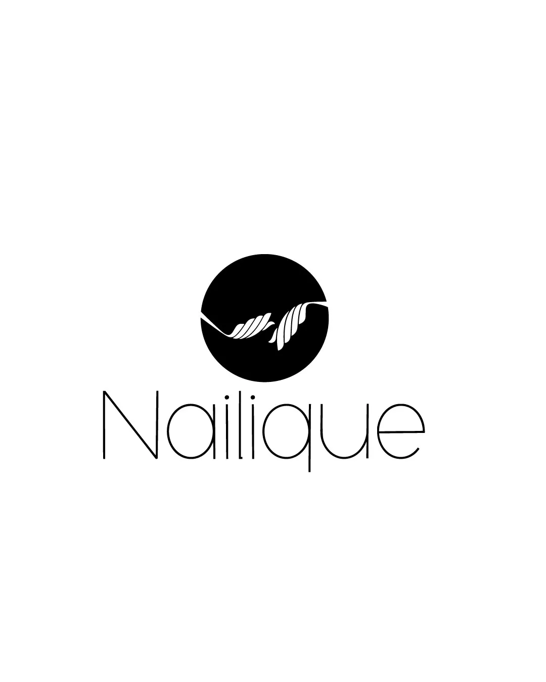
Try it Now!Logo review of Nailique
 Logo analysis by AI
Logo type:
Style:
Detected symbol:
Negative space:
Detected text:
Business industry:
Review requested by Preetigraphic8
**If AI can recognize or misinterpret it, so can people.
Structured logo review
Legibility
![]() Clean and modern typeface is generally easy to read.
Clean and modern typeface is generally easy to read.![]() Sufficient spacing between letters enhances clarity, especially for a beauty brand.
Sufficient spacing between letters enhances clarity, especially for a beauty brand.
![]() Very thin weight of the font can reduce legibility at small sizes or when viewed from a distance.
Very thin weight of the font can reduce legibility at small sizes or when viewed from a distance.
Scalability versatility
![]() Simple, bold symbol works well at larger sizes, such as signage or print formats.
Simple, bold symbol works well at larger sizes, such as signage or print formats.![]() Minimal details in the logomark allow for relatively easy reproduction on packaging.
Minimal details in the logomark allow for relatively easy reproduction on packaging.
![]() Thin font and intricate aspects of the leaves/nail shapes may lose clarity or appear weak at very small sizes, like on business cards, nail polish bottles, embroidery, or digital favicons.
Thin font and intricate aspects of the leaves/nail shapes may lose clarity or appear weak at very small sizes, like on business cards, nail polish bottles, embroidery, or digital favicons.
200x250 px
100×125 px
50×62 px
Balance alignment
![]() Centered alignment feels intentional and professional.
Centered alignment feels intentional and professional.![]() Proportions between the wordmark and the symbol are visually balanced overall.
Proportions between the wordmark and the symbol are visually balanced overall.
![]() Wordmark feels slightly too thin in relation to the solid black circle, creating a mild imbalance between logomark boldness and the typeface's delicacy.
Wordmark feels slightly too thin in relation to the solid black circle, creating a mild imbalance between logomark boldness and the typeface's delicacy.

Originality
![]() Clever adaptation of leaf/nail shapes to create a unique central symbol tailored to the beauty/nail industry.
Clever adaptation of leaf/nail shapes to create a unique central symbol tailored to the beauty/nail industry.![]() Negative space use within the symbol adds a refined touch.
Negative space use within the symbol adds a refined touch.
![]() Leaf motifs are somewhat common in beauty branding; true uniqueness could be pushed further with a subtler or more abstract twist.
Leaf motifs are somewhat common in beauty branding; true uniqueness could be pushed further with a subtler or more abstract twist.
Logomark wordmark fit
![]() Both logomark and wordmark share a minimal, elegant aesthetic.
Both logomark and wordmark share a minimal, elegant aesthetic.![]() The typeface style complements the flowing shapes of the symbol.
The typeface style complements the flowing shapes of the symbol.
![]() Contrast between thick, solid logomark and ultra-thin wordmark creates a slight disconnect, reducing visual cohesion.
Contrast between thick, solid logomark and ultra-thin wordmark creates a slight disconnect, reducing visual cohesion.
Aesthetic look
![]() Overall aesthetics are clean, modern, and fitting for a contemporary beauty brand.
Overall aesthetics are clean, modern, and fitting for a contemporary beauty brand.![]() High contrast gives the logo a bold, professional presence.
High contrast gives the logo a bold, professional presence.
![]() Looks somewhat generic due to safe minimalism and classic beauty motifs.
Looks somewhat generic due to safe minimalism and classic beauty motifs.![]() Ultra-thin font feels fragile next to the substantial solid logomark.
Ultra-thin font feels fragile next to the substantial solid logomark.
Dual meaning and misinterpretations
![]() No inappropriate or confusing visual symbolism detected.
No inappropriate or confusing visual symbolism detected.![]() Imagery clearly fits the sector and is unlikely to be misread.
Imagery clearly fits the sector and is unlikely to be misread.
Color harmony
![]() Strictly black and white ensures timeless contrast and effective readability.
Strictly black and white ensures timeless contrast and effective readability.![]() Monochrome palette improves reproduction versatility.
Monochrome palette improves reproduction versatility.
Black
#000000
White
#FFFFFF