Wondering how your logo performs? 🧐
Get professional logo reviews in seconds and catch design issues in time.
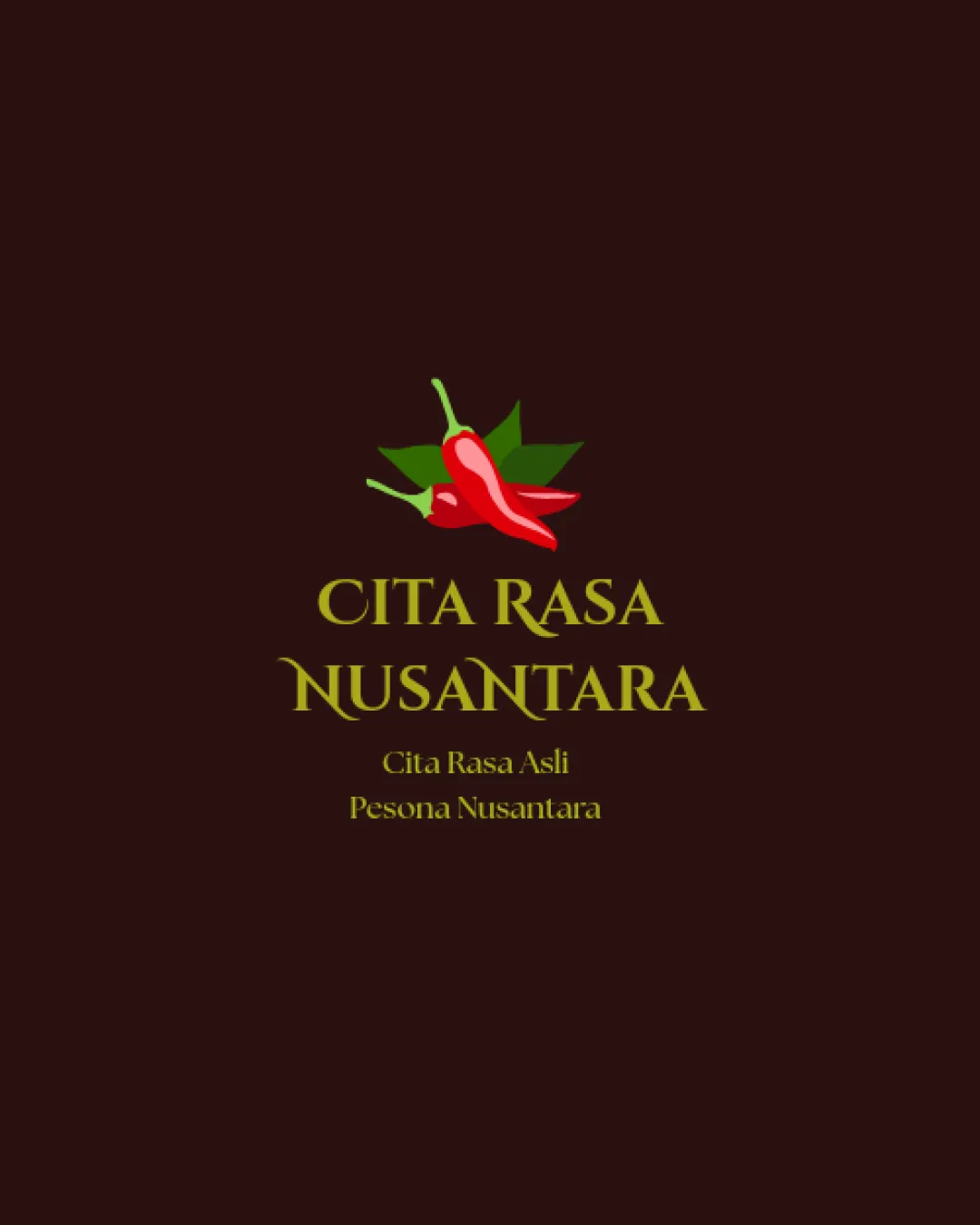
Try it Now!Logo review of CITA RASA NUSANTARA, Cita Rasa Asli, Pesona Nusant..
 Logo analysis by AI
Logo type:
Style:
Detected symbol:
Detected text:
Business industry:
Review requested by Byruss
**If AI can recognize or misinterpret it, so can people.
Structured logo review
Legibility
![]() Main text is relatively large and uses a highly readable serif style.
Main text is relatively large and uses a highly readable serif style.![]() The yellow-green color creates decent contrast against the dark background in larger sizes.
The yellow-green color creates decent contrast against the dark background in larger sizes.
![]() The tagline text is small and may be difficult to read at reduced sizes or from a distance.
The tagline text is small and may be difficult to read at reduced sizes or from a distance.![]() Color contrast for the tagline is lower, compromising legibility, especially for visually impaired audiences.
Color contrast for the tagline is lower, compromising legibility, especially for visually impaired audiences.
Scalability versatility
![]() Symbol and text are separate, allowing for flexible arrangements in different contexts.
Symbol and text are separate, allowing for flexible arrangements in different contexts.![]() Simple enough for use on packaging, menus, and restaurant signage.
Simple enough for use on packaging, menus, and restaurant signage.
![]() Detailed chili illustration with multiple color shades could lose clarity or detail at smaller sizes or when embroidered.
Detailed chili illustration with multiple color shades could lose clarity or detail at smaller sizes or when embroidered.![]() Small taglines would be nearly illegible as favicons or on small merchandise such as business cards or labels.
Small taglines would be nearly illegible as favicons or on small merchandise such as business cards or labels.
200x250 px
100×125 px
50×62 px
Balance alignment
![]() Elements are centered and visually aligned, creating a stable and harmonious composition.
Elements are centered and visually aligned, creating a stable and harmonious composition.
![]() There is an imbalance between the vibrant, illustrative symbol and the classic serif text which can feel stylistically mismatched.
There is an imbalance between the vibrant, illustrative symbol and the classic serif text which can feel stylistically mismatched.

Originality
![]() The chili pepper hints at local flavor and spice, fitting for the industry.
The chili pepper hints at local flavor and spice, fitting for the industry.
![]() Chili peppers are an overused symbol in food industry logos, especially for brands emphasizing spiciness.
Chili peppers are an overused symbol in food industry logos, especially for brands emphasizing spiciness.![]() No unique graphical twist or creative typography is present.
No unique graphical twist or creative typography is present.
Logomark wordmark fit
![]() Both symbol and type are reasonably proportionate.
Both symbol and type are reasonably proportionate.![]() Central placement creates direct brand association.
Central placement creates direct brand association.
![]() The highly realistic illustration style does not match the formal and classic serif text, leading to a lack of stylistic cohesion.
The highly realistic illustration style does not match the formal and classic serif text, leading to a lack of stylistic cohesion.
Aesthetic look
![]() Clear and unambiguous representation of the food/spice theme.
Clear and unambiguous representation of the food/spice theme.![]() Simple, inviting visual elements that create a positive impression.
Simple, inviting visual elements that create a positive impression.
![]() Color palette feels dated; the olive green on dark brown lacks vibrancy and modern appeal.
Color palette feels dated; the olive green on dark brown lacks vibrancy and modern appeal.![]() The logo doesn't feel fully premium or original and risks looking generic or forgettable among competitors.
The logo doesn't feel fully premium or original and risks looking generic or forgettable among competitors.
Dual meaning and misinterpretations
![]() No inappropriate or misunderstood shapes present in the composition.
No inappropriate or misunderstood shapes present in the composition.
Color harmony
![]() Color choices support the brand concept (spicy, natural).
Color choices support the brand concept (spicy, natural).
![]() The yellow-green text and red chili create an odd mix against a dark brown background, clashing visually.
The yellow-green text and red chili create an odd mix against a dark brown background, clashing visually.![]() The colors lack visual synergy, reducing overall harmony and brand sophistication.
The colors lack visual synergy, reducing overall harmony and brand sophistication.
Olive Green
#B7991E
Red
#C61612
Dark Brown
#1E1302
Green
#48782B