Wondering how your logo performs? 🧐
Get professional logo reviews in seconds and catch design issues in time.
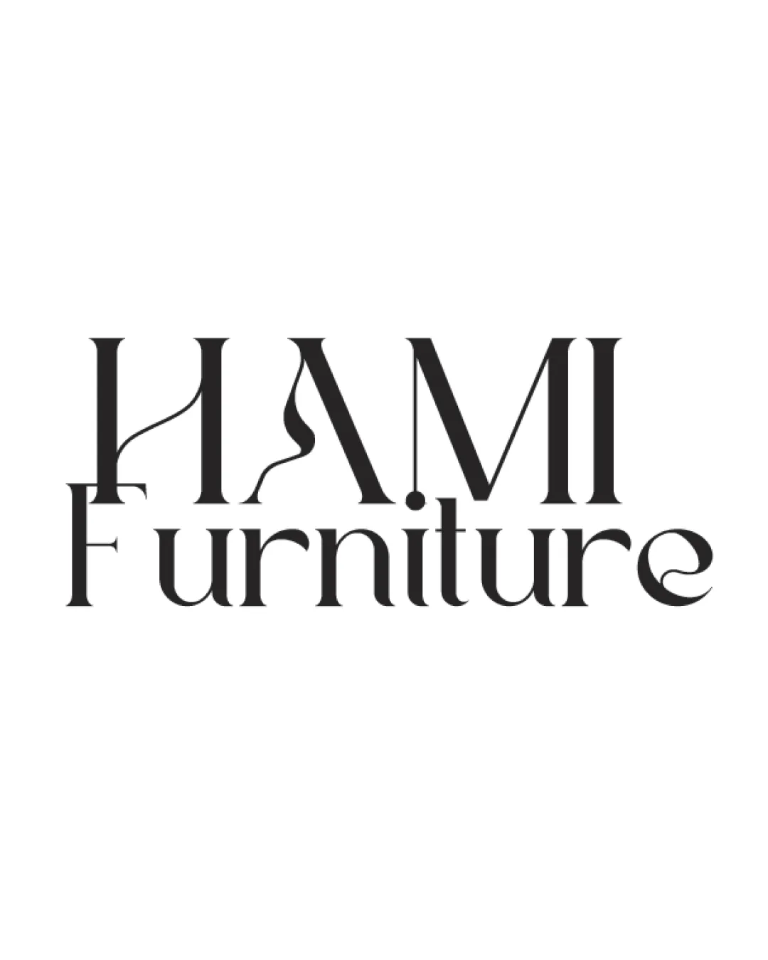
Try it Now!Logo review of HAMI Furniture
 Logo analysis by AI
Recognized style:
Logo type:
Detected symbol:
Detected text:
Business industry:
Review requested by JuBoostibizz
**If AI can recognize or misinterpret it, so can people.
Structured logo review
Legibility
![]() The text 'HAMI Furniture' is mostly readable.
The text 'HAMI Furniture' is mostly readable.
![]() The decorative elements on the letters might slightly hinder readability at smaller sizes.
The decorative elements on the letters might slightly hinder readability at smaller sizes.
Scalability versatility
![]() The logo's simplicity aids in scalability.
The logo's simplicity aids in scalability.
![]() The thin lines and decorative curves may lose clarity on small surfaces.
The thin lines and decorative curves may lose clarity on small surfaces.
200x250 px
100×125 px
50×62 px
Balance alignment
![]() The alignment between 'HAMI' and 'Furniture' is well balanced.
The alignment between 'HAMI' and 'Furniture' is well balanced.
![]() The varying line thickness could slightly affect visual balance.
The varying line thickness could slightly affect visual balance.

Originality
![]() The elegant letter styling is distinctive.
The elegant letter styling is distinctive.
![]() It somewhat relies on a standard serif font style.
It somewhat relies on a standard serif font style.
Aesthetic look
![]() The logo looks aesthetically pleasing and professional.
The logo looks aesthetically pleasing and professional.
![]() None detected.
None detected.
Cultural sensitivity dual meaning
![]() No cultural sensitivity issues detected.
No cultural sensitivity issues detected.
![]() None detected.
None detected.
Color harmony
![]() Black color ensures high contrast and versatility.
Black color ensures high contrast and versatility.
![]() None detected.
None detected.