Wondering how your logo performs? 🧐
Get professional logo reviews in seconds and catch design issues in time.
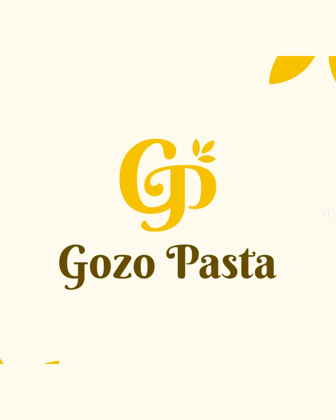
Try it Now!Logo review of Gozo Pasta
 Logo analysis by AI
Recognized style:
Logo type:
Detected symbol:
Detected text:
Business industry:
Review requested by Graphstorm
**If AI can recognize or misinterpret it, so can people.
Structured logo review
Legibility
![]() The text 'Gozo Pasta' is clear and readable.
The text 'Gozo Pasta' is clear and readable.
![]() The swirl in the letter 'G' might slightly hinder quick readability.
The swirl in the letter 'G' might slightly hinder quick readability.
Scalability versatility
![]() The logo is simple and should scale well.
The logo is simple and should scale well.
![]() The thin lines in the monogram may lose detail at smaller sizes.
The thin lines in the monogram may lose detail at smaller sizes.
200x250 px
100×125 px
50×62 px
Balance alignment
![]() The monogram and the wordmark are well aligned.
The monogram and the wordmark are well aligned.
![]() The leaf may slightly unbalance the 'P' if scaled too large.
The leaf may slightly unbalance the 'P' if scaled too large.

Originality
![]() The leaf addition gives a unique touch to the monogram.
The leaf addition gives a unique touch to the monogram.
![]() The overall concept of using initials is common.
The overall concept of using initials is common.
Logomark wordmark fit
![]() The monogram and text complement each other well.
The monogram and text complement each other well.
Aesthetic look
![]() The logo has a cohesive and attractive look.
The logo has a cohesive and attractive look.
Cultural sensitivity dual meaning
![]() No cultural sensitivity issues detected.
No cultural sensitivity issues detected.
Color harmony
![]() The use of yellow and brown feels warm and inviting.
The use of yellow and brown feels warm and inviting.
![]() The contrast could be improved for more impact.
The contrast could be improved for more impact.