Wondering how your logo performs? 🧐
Get professional logo reviews in seconds and catch design issues in time.
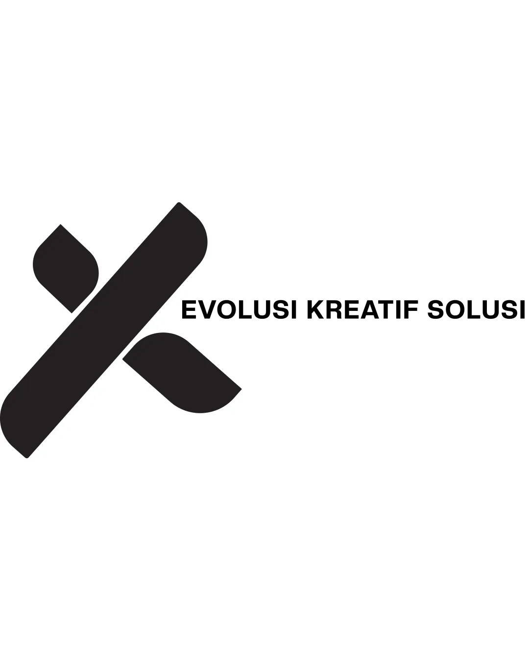
Try it Now!Logo review of EVOLUSI KREATIF SOLUSI
 Logo analysis by AI
Logo type:
Style:
Detected symbol:
Detected text:
Business industry:
Review requested by Creativehead
**If AI can recognize or misinterpret it, so can people.
Structured logo review
Legibility
![]() Clear and bold typeface
Clear and bold typeface![]() Easy to read
Easy to read
Scalability versatility
![]() Minimal detail ensuring clarity at small sizes
Minimal detail ensuring clarity at small sizes![]() Works well in monochrome
Works well in monochrome
![]() Might lose some impact in very small sizes due to thin spaces in the symbol
Might lose some impact in very small sizes due to thin spaces in the symbol
200x250 px
100×125 px
50×62 px
Balance alignment
![]() Good visual balance between symbol and text
Good visual balance between symbol and text![]() Aligned and evenly spaced
Aligned and evenly spaced
![]() Slight misalignment in perception due to angled symbol
Slight misalignment in perception due to angled symbol

Originality
![]() Unique abstract representation of 'K'
Unique abstract representation of 'K'![]() Simple yet effective
Simple yet effective
![]() Might appear generic in abstract lettermarks
Might appear generic in abstract lettermarks
Logomark wordmark fit
![]() Cohesive style between symbol and text
Cohesive style between symbol and text![]() Harmonious sizing match
Harmonious sizing match
Aesthetic look
![]() Modern and clean aesthetic
Modern and clean aesthetic![]() Strong visual identity
Strong visual identity
Dual meaning and misinterpretations
![]() No inappropriate symbols detected
No inappropriate symbols detected
Color harmony
![]() Monochrome design ensures no color clash
Monochrome design ensures no color clash