Wondering how your logo performs? 🧐
Get professional logo reviews in seconds and catch design issues in time.
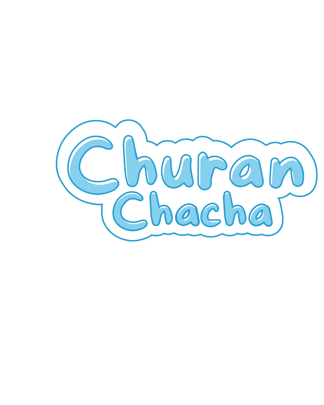
Try it Now!Logo review of Churan Chacha
 Logo analysis by AI
Logo type:
Style:
Detected text:
Business industry:
Review requested by Ch19
**If AI can recognize or misinterpret it, so can people.
Structured logo review
Legibility
![]() Text is large, clear, and easily readable.
Text is large, clear, and easily readable.![]() Good color contrast between text fill and outline.
Good color contrast between text fill and outline.
![]() Some letters intersect slightly with the outline, which could reduce clarity at very small sizes.
Some letters intersect slightly with the outline, which could reduce clarity at very small sizes.
Scalability versatility
![]() Simple shape helps with basic scalability.
Simple shape helps with basic scalability.![]() Will work well on packaging, digital banners, and kid-focused branding.
Will work well on packaging, digital banners, and kid-focused branding.
![]() The outline may become indistinct at very small sizes such as favicons or embroidery.
The outline may become indistinct at very small sizes such as favicons or embroidery.![]() The playful style may not adapt seamlessly for more serious or premium brand extensions.
The playful style may not adapt seamlessly for more serious or premium brand extensions.
200x250 px
100×125 px
50×62 px
Balance alignment
![]() Good horizontal balance between both words.
Good horizontal balance between both words.![]() Bubble outline visually unifies the two words.
Bubble outline visually unifies the two words.
![]() The ‘Churan’ text appears noticeably larger than ‘Chacha,’ which may affect visual hierarchy.
The ‘Churan’ text appears noticeably larger than ‘Chacha,’ which may affect visual hierarchy.![]() Irregular spacing in the bubble outline can create a slightly uneven feel.
Irregular spacing in the bubble outline can create a slightly uneven feel.

Originality
![]() The playful, outlined wordmark provides a lighthearted tone.
The playful, outlined wordmark provides a lighthearted tone.![]() Non-standard font lends a friendly, approachable aesthetic.
Non-standard font lends a friendly, approachable aesthetic.
![]() No symbol or unique illustrative element—relies completely on generic playful font.
No symbol or unique illustrative element—relies completely on generic playful font.![]() Wordmark+outline approach is somewhat common in child/snack branding.
Wordmark+outline approach is somewhat common in child/snack branding.
Aesthetic look
![]() Color palette is visually pleasant and suitable for a youthful/food brand.
Color palette is visually pleasant and suitable for a youthful/food brand.![]() Round shapes and hand-drawn effect convey fun and friendliness.
Round shapes and hand-drawn effect convey fun and friendliness.
![]() The design is a bit basic and could be mistaken for a template.
The design is a bit basic and could be mistaken for a template.![]() Outline looks amateurish due to varying thickness and inconsistent spacing.
Outline looks amateurish due to varying thickness and inconsistent spacing.
Dual meaning and misinterpretations
![]() No inappropriate shapes or accidental imagery detected.
No inappropriate shapes or accidental imagery detected.![]() Safe for all audiences.
Safe for all audiences.
Color harmony
![]() Limited color use keeps the design unified.
Limited color use keeps the design unified.![]() Blue tone is calming and consistent across logo.
Blue tone is calming and consistent across logo.
Jordan
#A9DDF7
Picton Blue
#36B5E4
White
#FFFFFF