Wondering how your logo performs? 🧐
Get professional logo reviews in seconds and catch design issues in time.
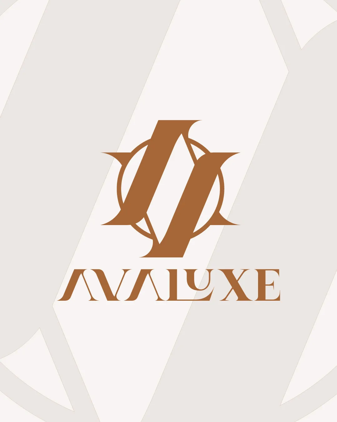
Try it Now!Logo review of AVALUXE
 Logo analysis by AI
Recognized style:
Logo type:
Detected symbol:
Detected text:
Business industry:
Review requested by Graphstorm
**If AI can recognize or misinterpret it, so can people.
Structured logo review
Legibility
![]() The serif font gives an elegant look.
The serif font gives an elegant look.
![]() The intricate design might reduce legibility at smaller sizes.
The intricate design might reduce legibility at smaller sizes.
Scalability versatility
![]() Simple color and design make it versatile.
Simple color and design make it versatile.
![]() The detailed emblem may lose clarity when scaled down.
The detailed emblem may lose clarity when scaled down.
200x250 px
100×125 px
50×62 px
Balance alignment
![]() The logo maintains a well-balanced structure.
The logo maintains a well-balanced structure.

Originality
![]() Unique intertwining of letters within a circular emblem.
Unique intertwining of letters within a circular emblem.
![]() Circular emblem is a commonly used feature.
Circular emblem is a commonly used feature.
Logomark wordmark fit
![]() The monogram and text complement each other well.
The monogram and text complement each other well.
Aesthetic look
![]() The logo looks aesthetic, it gives the vibe of a professional logo.
The logo looks aesthetic, it gives the vibe of a professional logo.
Cultural sensitivity dual meaning
![]() No cultural sensitivity issues detected.
No cultural sensitivity issues detected.
Color harmony
![]() Monochromatic scheme is elegant and fits the brand image.
Monochromatic scheme is elegant and fits the brand image.