Wondering how your logo performs? 🧐
Get professional logo reviews in seconds and catch design issues in time.
Try it Now!Logo review of AURUM SCENTS
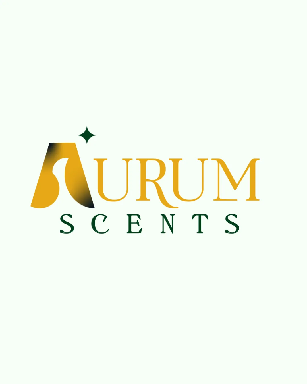
 Logo analysis by AI
Logo type:
Style:
Detected symbol:
Detected text:
Business industry:
Review requested by Olamilekan
**If AI can recognize or misinterpret it, so can people.
Structured logo review
Legibility
Text is clear and readable.
Font choice complements the brand name.
Scalability versatility
Suitable for packaging and larger formats.
Gradient may not reproduce well at smaller sizes.
Detail in the 'A' could be lost in very small formats.

200x250 px

100×125 px

50×62 px
Balance alignment
Overall balanced composition.
Good alignment between text elements.
The logo's star element may feel slightly detached.


Originality
Unique use of a stylized 'A'.
Creative gradient application.
The star element is somewhat generic.
Logomark wordmark fit
Great cohesion between logomark and wordmark.
Consistent style across elements.
Aesthetic look
Elegant and modern aesthetic.
Sophisticated color palette.
Gradient might appear dated over time.
Dual meaning and misinterpretations
No inappropriate symbolism detected.
Color harmony
Harmonious use of gold and green tones.
Colors reflect sophistication.
Gradient might complicate color consistency.


