Wondering how your logo performs? 🧐
Get professional logo reviews in seconds and catch design issues in time.
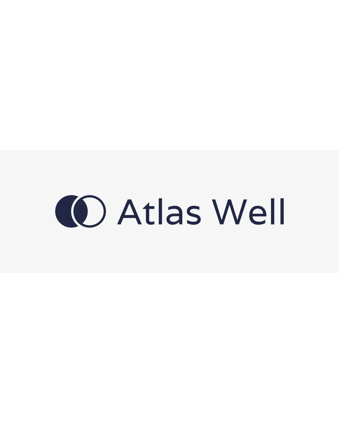
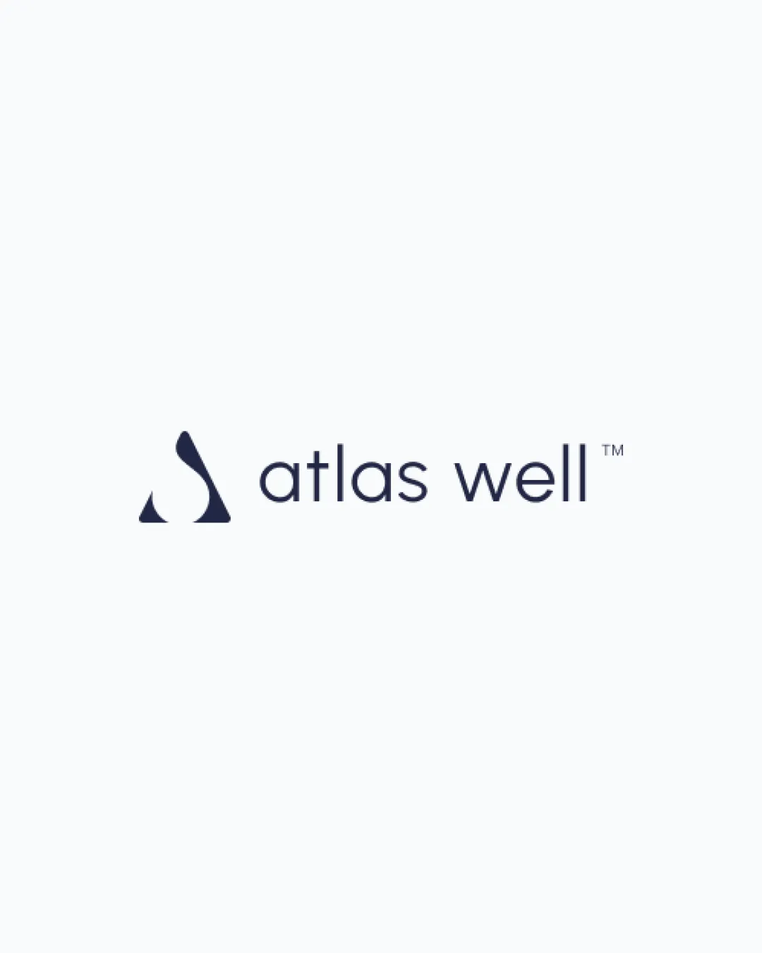
Try it Now!Logo review of atlas well
 Logo analysis by AI
Logo type:
Style:
Detected symbol:
Negative space:
Detected text:
Business industry:
Review requested by Atlaswell
**If AI can recognize or misinterpret it, so can people.
Structured logo review
Legibility
![]() Text is clear and easy to read
Text is clear and easy to read![]() Consistent and modern sans-serif typeface enhances professionalism
Consistent and modern sans-serif typeface enhances professionalism
Scalability versatility
![]() Simplicity ensures clarity across a wide range of sizes
Simplicity ensures clarity across a wide range of sizes![]() Icon is distinguishable even when small, suitable for app icons and business cards
Icon is distinguishable even when small, suitable for app icons and business cards
![]() Very thin letter strokes may lose legibility on embroidery or signage at extremely small scales
Very thin letter strokes may lose legibility on embroidery or signage at extremely small scales
200x250 px
100×125 px
50×62 px
Balance alignment
![]() Excellent horizontal alignment of icon and wordmark
Excellent horizontal alignment of icon and wordmark![]() Visual balance between the icon and text, no elements overpowering each other
Visual balance between the icon and text, no elements overpowering each other

Originality
![]() Abstract mark is distinctive with a unique geometric interpretation
Abstract mark is distinctive with a unique geometric interpretation![]() Subtle negative space integration adds creative flair
Subtle negative space integration adds creative flair
![]() General geometric droplet/triangle motif is modestly common in the wellness and water-related sectors
General geometric droplet/triangle motif is modestly common in the wellness and water-related sectors
Logomark wordmark fit
![]() Harmonious relationship between icon and wordmark style, matching minimal aesthetics
Harmonious relationship between icon and wordmark style, matching minimal aesthetics![]() Proportions are well considered
Proportions are well considered
Aesthetic look
![]() Minimalist approach offers a premium and calming impression
Minimalist approach offers a premium and calming impression![]() Clean lines and spacing ensure it feels upscale and trustworthy
Clean lines and spacing ensure it feels upscale and trustworthy
Dual meaning and misinterpretations
![]() No inappropriate or accidental symbolism detected
No inappropriate or accidental symbolism detected
Color harmony
![]() Limited, professional palette yields high contrast and sophistication
Limited, professional palette yields high contrast and sophistication
Gunmetal
#222B3A
White Smoke
#F7F7F7