Wondering how your logo performs? 🧐
Get professional logo reviews in seconds and catch design issues in time.
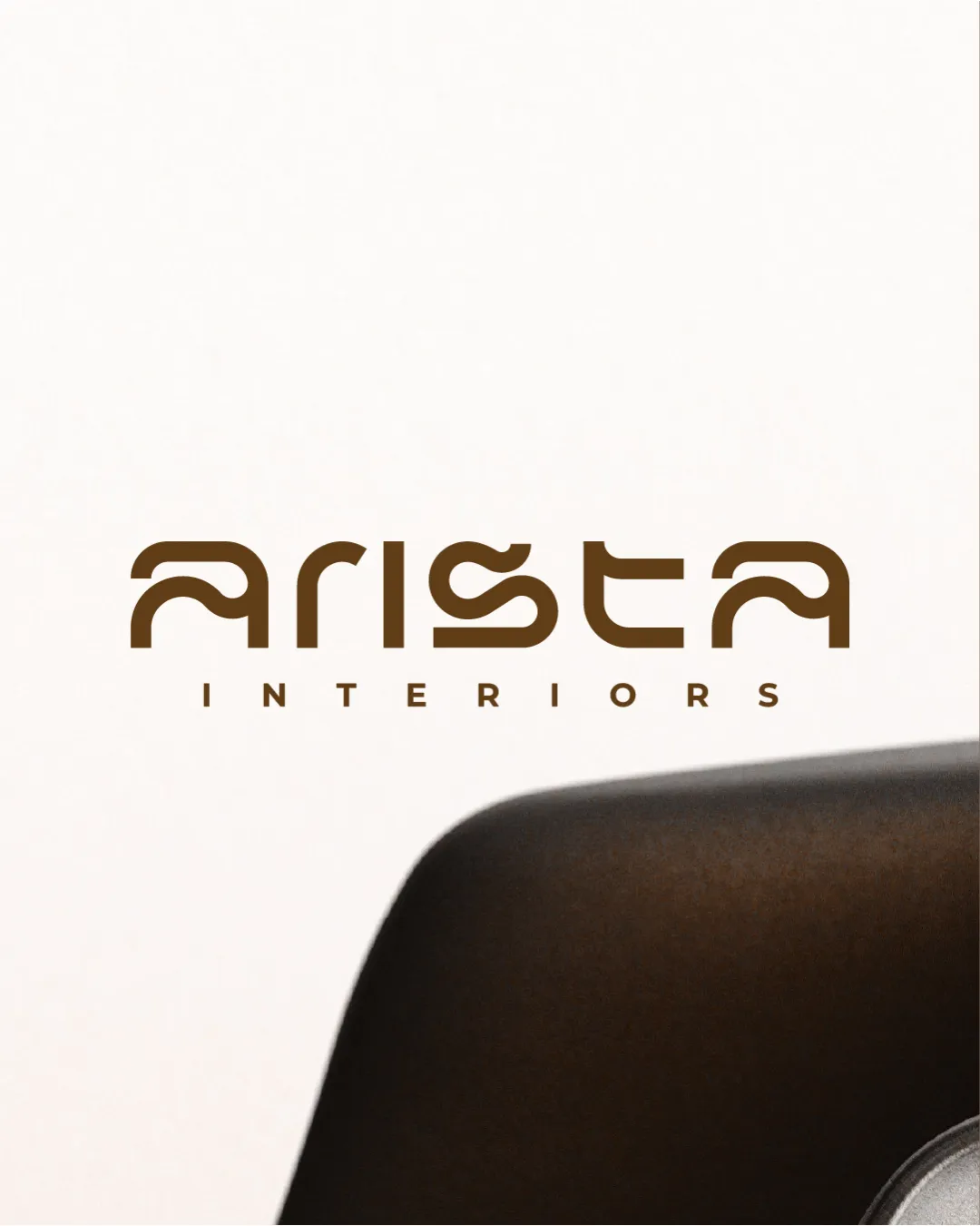
Try it Now!Logo review of ARISTA INTERIORS
 Logo analysis by AI
Recognized style:
Logo type:
Detected text:
Business industry:
Review requested by Graphstorm
**If AI can recognize or misinterpret it, so can people.
Structured logo review
Legibility
![]() The business name 'Arista Interiors' is mostly clear with a distinctive font style.
The business name 'Arista Interiors' is mostly clear with a distinctive font style.
![]() The stylized font may cause slight readability issues at a glance.
The stylized font may cause slight readability issues at a glance.
Scalability versatility
![]() The design's simplicity ensures it is versatile across different applications.
The design's simplicity ensures it is versatile across different applications.
200x250 px
100×125 px
50×62 px
Balance alignment
![]() The text is well-aligned, creating a balanced look.
The text is well-aligned, creating a balanced look.

Originality
![]() The unique typography offers a creative touch to the wordmark.
The unique typography offers a creative touch to the wordmark.
![]() The font style might not be unique enough to stand out in oversaturated markets.
The font style might not be unique enough to stand out in oversaturated markets.
Aesthetic look
![]() The logo is aesthetically pleasing with a clean, professional appearance.
The logo is aesthetically pleasing with a clean, professional appearance.
![]() The minimalistic style may not convey a warm or inviting feel for interiors.
The minimalistic style may not convey a warm or inviting feel for interiors.
Cultural sensitivity dual meaning
![]() No cultural sensitivity issues detected.
No cultural sensitivity issues detected.
Color harmony
![]() The brown color creates a warm, sophisticated tone suitable for interiors.
The brown color creates a warm, sophisticated tone suitable for interiors.