Wondering how your logo performs? 🧐
Get professional logo reviews in seconds and catch design issues in time.
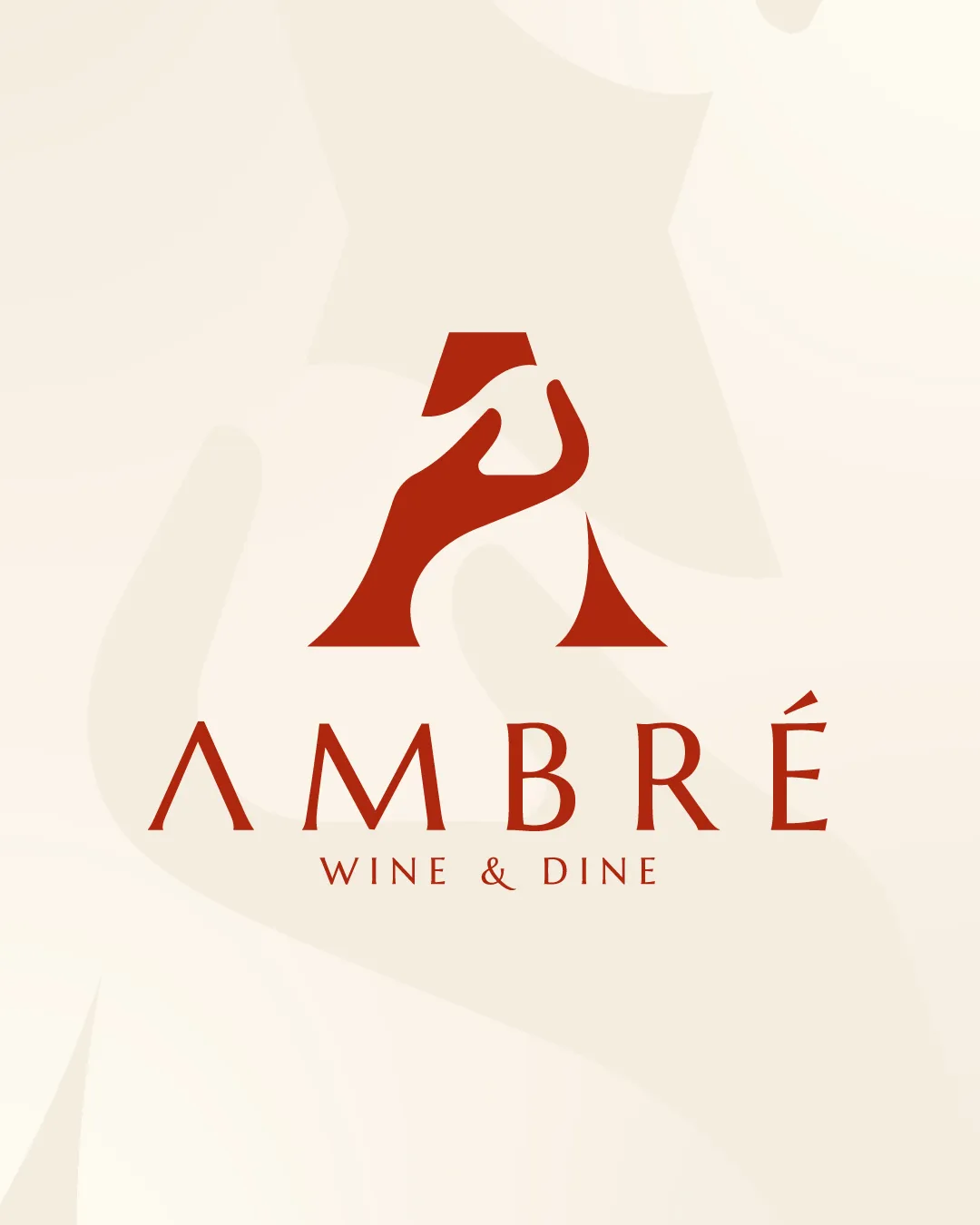
Try it Now!Logo review of AMBÉRÉ WINE & DINE
 Logo analysis by AI
Recognized style:
Logo type:
Detected symbol:
Detected text:
Business industry:
Review requested by Graphstorm
**If AI can recognize or misinterpret it, so can people.
Structured logo review
Legibility
![]() I assume the business name is AMBÉRÉ, with the tagline WINE & DINE.
I assume the business name is AMBÉRÉ, with the tagline WINE & DINE.
Scalability versatility
![]() The bold logomark improves versatility across digital, print, and other applications.
The bold logomark improves versatility across digital, print, and other applications.
200x250 px
100×125 px
50×62 px
Balance alignment
![]() The logomark and wordmark have balanced alignment.
The logomark and wordmark have balanced alignment.

Originality
![]() The mix of geometric and organic shapes is fairly unique.
The mix of geometric and organic shapes is fairly unique.
Aesthetic look
![]() The logo looks aesthetic, it gives the vibe of a professional logo.
The logo looks aesthetic, it gives the vibe of a professional logo.
Cultural sensitivity dual meaning
![]() No cultural sensitivity issues detected.
No cultural sensitivity issues detected.
Color harmony
![]() The red color creates a perfect balance, making it ideal for the brand.
The red color creates a perfect balance, making it ideal for the brand.