 View review
Logo score
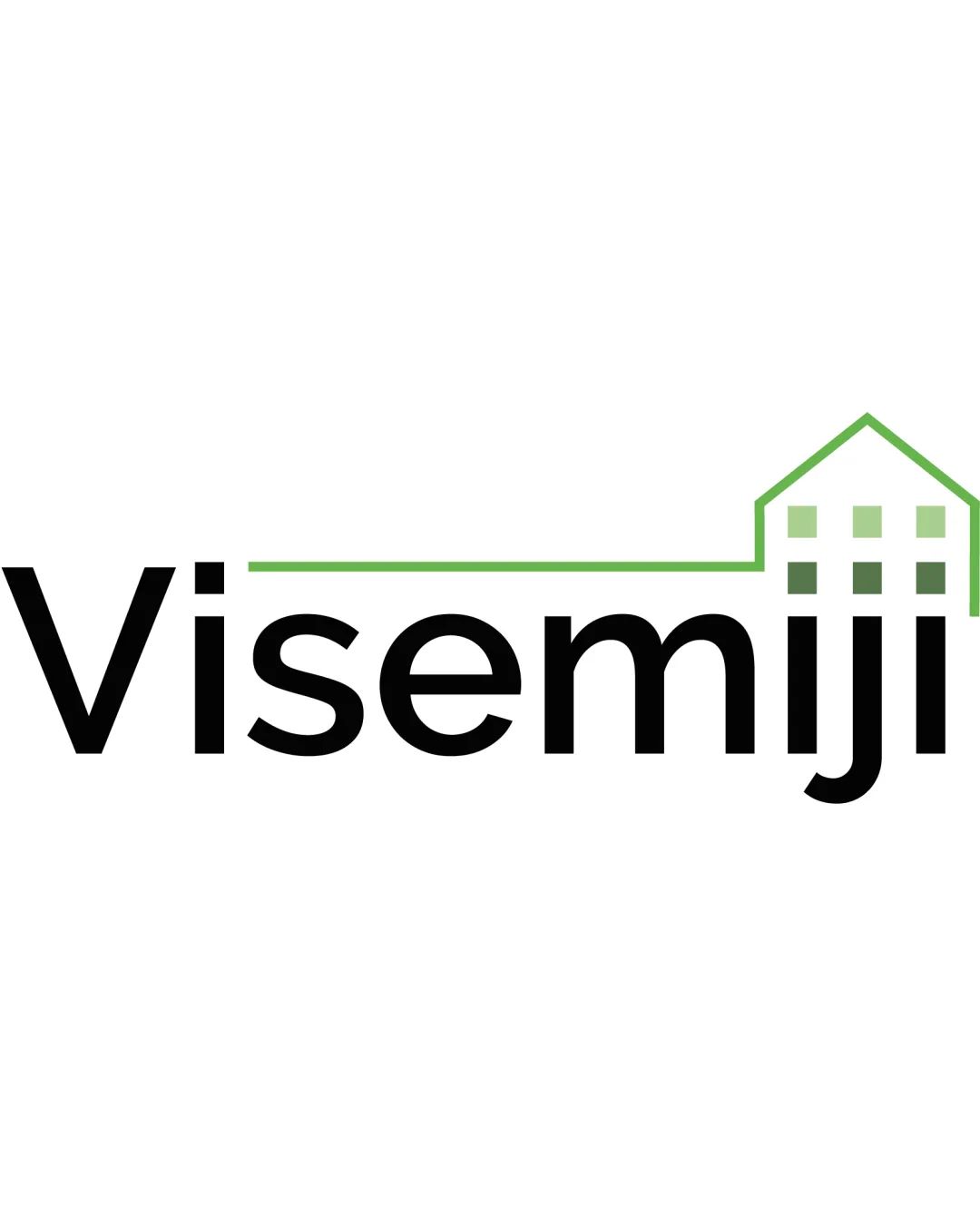
Logo review ofVisemiji
Review the detailed scores below to see what is working and what should be refined first.
Legibility
Originality
Color
Balance
Scale
Detailed review
Logo performance breakdown
Legibility
![]() The typography is clear and highly readable.
The typography is clear and highly readable.![]() Letterspacing and font weight are balanced.
Letterspacing and font weight are balanced.
Originality
![]() Custom integration of a house with the text gives a mild sense of uniqueness.
Custom integration of a house with the text gives a mild sense of uniqueness.
![]() House outline is a generic symbol in real estate logos.
House outline is a generic symbol in real estate logos.![]() Window/grid details are clichéd and do not add a fresh or creative touch.
Window/grid details are clichéd and do not add a fresh or creative touch.
Color harmony
![]() Two-tone (black and green) with white negative space is harmonious.
Two-tone (black and green) with white negative space is harmonious.![]() Strong contrast with excellent professionalism.
Strong contrast with excellent professionalism.
Black
#000000
Olivetone
#7CB342
White
#FFFFFF
Balance alignment
![]() Balance between wordmark and house outline is visually decent.
Balance between wordmark and house outline is visually decent.![]() Green house seamlessly extends from text baseline.
Green house seamlessly extends from text baseline.
![]() Right side feels slightly heavier due to stacked house elements and spacing.
Right side feels slightly heavier due to stacked house elements and spacing.![]() Lack of baseline alignment between the roofline and the wordmark may disrupt flow.
Lack of baseline alignment between the roofline and the wordmark may disrupt flow.

Scalability
![]() Minimal details allow good scaling for most applications.
Minimal details allow good scaling for most applications.![]() Will be recognizable on business cards and moderate sizes like packaging or digital assets.
Will be recognizable on business cards and moderate sizes like packaging or digital assets.
![]() Thin green outline on the house may lose clarity at favicon or embroidery scale.
Thin green outline on the house may lose clarity at favicon or embroidery scale.![]() House window details become indistinct at very small sizes.
House window details become indistinct at very small sizes.
200x250 px
100×125 px
50×62 px
Misinterpretations
![]() No inappropriate or misleading visual interpretations.
No inappropriate or misleading visual interpretations.
Symbol & text fit
![]() Consistent modern style between the typeface and the house symbol.
Consistent modern style between the typeface and the house symbol.
![]() Color match enhances unity.
Color match enhances unity.
![]() House mark is slightly less bold than the text; could create visual dissonance, especially on larger signage.
House mark is slightly less bold than the text; could create visual dissonance, especially on larger signage.
Try your own review
Review my logo
Wondering how your logo performs?
Get a clear logo score, key risks, and priority fix ideas before your client or audience sees it.
Keep exploring