 View review
Logo score
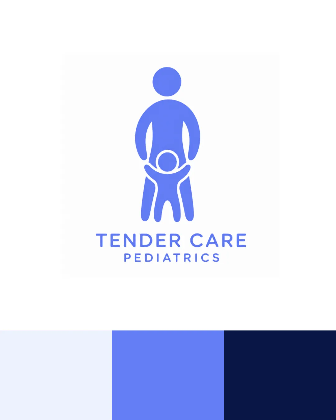
Logo review ofTender Care Pediatrics
High-risk visual misinterpretation detected. Resolve this before presenting the logo.
Legibility
Originality
Color
Balance
Scale
Action plan
What to fix first
The most important fixes to handle before polishing the full presentation.
1
Fix possible misinterpretation
High priorityRemove the possible unintended or inappropriate visual reading before refining anything else.
Impact: High · Effort: Medium
Detailed review
Logo performance breakdown
Legibility
![]() Text is clear and easy to read
Text is clear and easy to read![]() Strong contrast with background
Strong contrast with background
Originality
![]() Friendly, reassuring visual message
Friendly, reassuring visual message
![]() Abstract figures are a common trope in pediatrics and health logos
Abstract figures are a common trope in pediatrics and health logos
Color harmony
![]() Soothing blue palette fits healthcare
Soothing blue palette fits healthcare![]() Good contrast and color unity
Good contrast and color unity
Athens Blue
#DEE9FA
Cornflower Blue
#6A89EC
Tangaroa
#07133A
Balance alignment
![]() Centered composition creates visual stability
Centered composition creates visual stability![]() Symbol and text are well proportioned
Symbol and text are well proportioned

Scalability
![]() Simple shapes scale well
Simple shapes scale well![]() Minimal detail translates to small sizes
Minimal detail translates to small sizes
![]() Thin line details between arms and torso may fill in at very small sizes
Thin line details between arms and torso may fill in at very small sizes
200x250 px
100×125 px
50×62 px
Misinterpretations
![]() Intentional figure design with embracing gesture
Intentional figure design with embracing gesture
![]() At a quick glance, the arm and leg shapes could be ambiguously read as anatomical forms, but not strongly inappropriate
At a quick glance, the arm and leg shapes could be ambiguously read as anatomical forms, but not strongly inappropriate
Logo structure & brief match
![]() Logo mark and wordmark feel cohesive and well-matched
Logo mark and wordmark feel cohesive and well-matched
![]() Industry: The logo fits a pediatrics healthcare business with its caring, child-focused visual language and calming colors.
Industry: The logo fits a pediatrics healthcare business with its caring, child-focused visual language and calming colors.
Try your own review
Review my logo
Wondering how your logo performs?
Get a clear logo score, key risks, and priority fix ideas before your client or audience sees it.
Keep exploring