 View review
Logo score
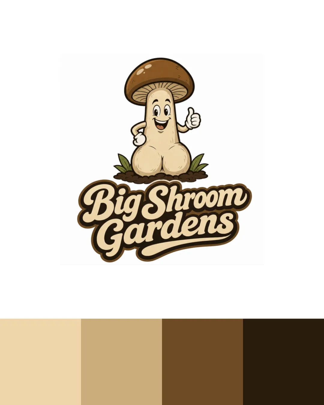
Logo review ofBig Shroom Gardens
High-risk visual misinterpretation detected. Resolve this before presenting the logo.
Legibility
Originality
Color
Balance
Scale
Action plan
What to fix first
The most important fixes to handle before polishing the full presentation.
1
Fix possible misinterpretation
High priorityMushroom mascot shape and pose strongly resemble male genitalia, creating a high risk of embarrassing misinterpretation
Impact: High · Effort: Medium
2
Test new mascot and illustration with neutral viewers at thumbnail sizes for both clarity and misread avoidance.
Medium priorityEnsures future revisions will not trigger similar concerns.
Impact: Prevents Repeat Of Misinterpretation Issue · Effort: Medium
Detailed review
Logo performance breakdown
Legibility
![]() Bold, rounded script is highly readable
Bold, rounded script is highly readable![]() Good color contrast against background
Good color contrast against background
Originality
![]() Playful character adds a unique touch
Playful character adds a unique touch
![]() Mushroom mascot concept is not highly original in this context
Mushroom mascot concept is not highly original in this context
Color harmony
![]() Natural brown palette fits the theme
Natural brown palette fits the theme![]() Colors are harmonious and cohesive
Colors are harmonious and cohesive
Champagne
#EDD4A2
Teak
#C1A16E
Shingle Fawn
#7C5322
Marlin
#38280E
Balance alignment
![]() Text and mascot well-centered and visually tied together
Text and mascot well-centered and visually tied together
![]() Mascot position may slightly dominate the composition
Mascot position may slightly dominate the composition

Scalability
![]() Mascot and text are distinct shapes with bold outlines
Mascot and text are distinct shapes with bold outlines
![]() Mascot has details that may lose clarity at small sizes
Mascot has details that may lose clarity at small sizes![]() Fine inner linework in the mushroom could blur in small uses
Fine inner linework in the mushroom could blur in small uses
200x250 px
100×125 px
50×62 px
Misinterpretations
![]() Mushroom mascot shape and pose strongly resemble male genitalia, creating a high risk of embarrassing misinterpretation
Mushroom mascot shape and pose strongly resemble male genitalia, creating a high risk of embarrassing misinterpretation
Logo structure & brief match
![]() Mascot and wordmark style match well—both rounded, friendly
Mascot and wordmark style match well—both rounded, friendly
![]() Mascot and text compete slightly for attention
Mascot and text compete slightly for attention
![]() Agriculture/farming/edible Mushroom Branding: Theme and colors fit, but mascot form is inappropriate for client-facing or broad public use due to misreading risk
Agriculture/farming/edible Mushroom Branding: Theme and colors fit, but mascot form is inappropriate for client-facing or broad public use due to misreading risk
Try your own review
Review my logo
Wondering how your logo performs?
Get a clear logo score, key risks, and priority fix ideas before your client or audience sees it.
Keep exploring